![[Showoff/Rate] All Pics I made in the last time](https://www.ownedcore.com/forums/images/styles/OwnedCoreFX/addimg/menu4.svg)
1.:
2.:
3.:
4.:
5.:
6.:
7.:
Please rate! Thank you =)

![[Showoff/Rate] All Pics I made in the last time](https://www.ownedcore.com/forums/./ocpbanners/1/0/6/3/8/1/6/1e102dbc1865060efdd7bf3ae1edf5cc.jpg)
![[Showoff/Rate] All Pics I made in the last time](https://www.ownedcore.com/assets/mm/images/wits.png "TradeSafe Middleman")
![[Showoff/Rate] All Pics I made in the last time](https://www.ownedcore.com/forums/images/styles/OwnedCoreFX/addimg/wicc.png "CoreCoins")

Shout-Out
User Tag List
Results 1 to 13 of 13
-
09-01-2008 #1
 Banned
- Reputation
- 52
- Join Date
- Nov 2007
- Posts
- 677
- Thanks G/R
- 0/0
- Trade Feedback
- 0 (0%)
- Mentioned
- 0 Post(s)
- Tagged
- 0 Thread(s)
[Showoff/Rate] All Pics I made in the last time
Last edited by sheepking; 09-01-2008 at 02:44 PM.
![[Showoff/Rate] All Pics I made in the last time](https://www.ownedcore.com/images/ba/g/b2.gif)
-
09-01-2008 #2
Active Member

- Reputation
- 39
- Join Date
- Mar 2008
- Posts
- 264
- Thanks G/R
- 0/0
- Trade Feedback
- 0 (0%)
- Mentioned
- 6 Post(s)
- Tagged
- 0 Thread(s)
wow you are really good- ill giv you an 8/10

-
09-01-2008 #3
Banned
- Reputation
- 52
- Join Date
- Nov 2007
- Posts
- 677
- Thanks G/R
- 0/0
- Trade Feedback
- 0 (0%)
- Mentioned
- 0 Post(s)
- Tagged
- 0 Thread(s)
Thank youOriginally Posted by Ameretsu

-
09-01-2008 #4
Banned
- Reputation
- 179
- Join Date
- Jan 2008
- Posts
- 1,396
- Thanks G/R
- 0/0
- Trade Feedback
- 0 (0%)
- Mentioned
- 0 Post(s)
- Tagged
- 0 Thread(s)
#1 - Too much text... more focal and sharpening. Best overall.
Others - Need more blending, more effects, more color, more focal, etc. I don't really like that style.
-
09-01-2008 #5
Banned
- Reputation
- 52
- Join Date
- Nov 2007
- Posts
- 677
- Thanks G/R
- 0/0
- Trade Feedback
- 0 (0%)
- Mentioned
- 0 Post(s)
- Tagged
- 0 Thread(s)
Thanks for your Critics. But tell me how to make it better! Tell me what effects and what the hell a focal is!Originally Posted by Clain
New Wallpaper:

-
09-02-2008 #6
Member
- Reputation
- 24
- Join Date
- Dec 2007
- Posts
- 524
- Thanks G/R
- 0/0
- Trade Feedback
- 0 (0%)
- Mentioned
- 0 Post(s)
- Tagged
- 0 Thread(s)


The focal is something in the signature that stands out the most. Mostly the main parts of a render. It is usually more sharpened then the rest of the signature. Like in the wallpaper u just posted above ^ all the renders are pretty sharpened and nothing done to them. so it is hard to look/focus and make something standout of the wallpaper

-
09-02-2008 #7
Banned
- Reputation
- 52
- Join Date
- Nov 2007
- Posts
- 677
- Thanks G/R
- 0/0
- Trade Feedback
- 0 (0%)
- Mentioned
- 0 Post(s)
- Tagged
- 0 Thread(s)
Humm, yeah, but I dont know how to do this... Maybe you could show me?
-
09-02-2008 #8
Member
- Reputation
- 24
- Join Date
- Dec 2007
- Posts
- 524
- Thanks G/R
- 0/0
- Trade Feedback
- 0 (0%)
- Mentioned
- 0 Post(s)
- Tagged
- 0 Thread(s)
definitely. Well not tonight. i need to read a lot more before school tomorrow. and idk how this first week will go yet so i will see when i have some time
-
09-02-2008 #9
Banned
- Reputation
- 52
- Join Date
- Nov 2007
- Posts
- 677
- Thanks G/R
- 0/0
- Trade Feedback
- 0 (0%)
- Mentioned
- 0 Post(s)
- Tagged
- 0 Thread(s)
Is this one better?

-
09-02-2008 #10
Member
- Reputation
- 24
- Join Date
- Dec 2007
- Posts
- 524
- Thanks G/R
- 0/0
- Trade Feedback
- 0 (0%)
- Mentioned
- 0 Post(s)
- Tagged
- 0 Thread(s)
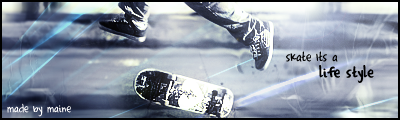
better and i kinda like it. Spend some more time on the text. Try out making it on overlay and copy that layer a couple of times. it sometimes comes out good.
Oh and for the skate signature u wanted. do u want me to put ur name into it
-
09-02-2008 #11
Active Member
- Reputation
- 190
- Join Date
- Nov 2006
- Posts
- 588
- Thanks G/R
- 0/0
- Trade Feedback
- 0 (0%)
- Mentioned
- 0 Post(s)
- Tagged
- 0 Thread(s)
Nice i like em

-
09-03-2008 #12
Banned
- Reputation
- 52
- Join Date
- Nov 2007
- Posts
- 677
- Thanks G/R
- 0/0
- Trade Feedback
- 0 (0%)
- Mentioned
- 0 Post(s)
- Tagged
- 0 Thread(s)
Hmm thanks will try out...Originally Posted by Maine
And to te Skate signature: noez, put your name on it or sheepking and then somewhere made by maine
Fat thank you
-
09-03-2008 #13
Member
- Reputation
- 24
- Join Date
- Dec 2007
- Posts
- 524
- Thanks G/R
- 0/0
- Trade Feedback
- 0 (0%)
- Mentioned
- 0 Post(s)
- Tagged
- 0 Thread(s)
Here you are


 Reply With Quote
Similar Threads
-
Nov 09, 06 Was the last time I saw my character, I need some advice here...
By Ryu7766 in forum World of Warcraft GeneralReplies: 8Last Post: 02-11-2017, 05:14 PM -
[Showoff[[Rate]Just a Quick Sig I made
By Juicyz in forum Art & Graphic DesignReplies: 7Last Post: 06-16-2008, 11:50 PM -
[SHOWOFF] Some sigs I made voer the past few days
By m0rbidang3l in forum Art & Graphic DesignReplies: 15Last Post: 06-09-2008, 08:35 AM -
[showoff/rate]My Background picture i jsut made :D
By aznboy in forum Art & Graphic DesignReplies: 2Last Post: 06-05-2008, 04:50 PM -
[Rate/showoff] new random sigs ive made :D
By Anarchy [RD] in forum Art & Graphic DesignReplies: 14Last Post: 03-29-2008, 02:18 PM
-
OwnedCore Forums
casino news World of Warcraft Pokemon GO MMO Overwatch RTS Casino reviews bc game bc game -
casino
Casino Gambling Online casinos Casino en ligne vercel livescore bc game lovable vercel bc game no deposit bonus codes stake Top 10 Casinos Casino reviews Bitcoin casino Lucky8 1xbit heycasino BumpTop Beta Key - 1 need help. was banned Friends old account - Account Temp ban Banned or Perma Banned WoW Account giveaway - Problem with a locked If I have a scammd TCG phishing site -
CoreCoins
CoreCoins CoreCoins FAQ Shout-Out Banner Ads -
My OwnedCore
My Profile Notifications Settings Buy CoreCoins About Us


Privacy Policy | Cookie Policy | Terms | Contact Us
Available Payment Methods:-
![[Showoff/Rate] All Pics I made in the last time](https://www.ownedcore.com/images/paybutton/paypal.png)
![[Showoff/Rate] All Pics I made in the last time](https://www.ownedcore.com/images/paybutton/skrill.png)
![[Showoff/Rate] All Pics I made in the last time](https://www.ownedcore.com/images/paybutton/payop.png)
-
Casino
mwr life | canada | mwr life | mwr life | mwr life | mystake | Bitstarz Tournament | mwr life | iLucki Casino | Blockchain gambling | mwr life | X | Top 5 canadian online casinos 2025 | Mirax Casino | mwr life | Free casino games | stake | here | Aviator game casino | MRQ Casino | mwr life | mwr life | mwr life | mwr life | CryptoRoyal Casino | mwr life | Shuffle Casino | travel advantage | HashLucky Casino | mwr | freebet tanpa | Instant Payout Methods