![[Show Off/Rate] Killzone](https://www.ownedcore.com/forums/images/styles/OwnedCoreFX/addimg/menu4.svg)
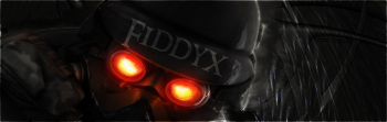
Rate please? dont flame, im just seeing what style i do best
Without Border=
With Border=

![[Show Off/Rate] Killzone](https://www.ownedcore.com/forums/./ocpbanners/1/2/9/8/0/2/2/01d9781faec8bfe3abf9095ac9e57d1e.jpg)
![[Show Off/Rate] Killzone](https://www.ownedcore.com/assets/mm/images/wits.png "TradeSafe Middleman")
![[Show Off/Rate] Killzone](https://www.ownedcore.com/forums/images/styles/OwnedCoreFX/addimg/wicc.png "CoreCoins")

User Tag List
Thread: [Show Off/Rate] Killzone
Results 1 to 9 of 9
-
04-17-2008 #1
 Active Member

- Reputation
- 32
- Join Date
- Aug 2007
- Posts
- 244
- Thanks G/R
- 0/0
- Trade Feedback
- 0 (0%)
- Mentioned
- 0 Post(s)
- Tagged
- 0 Thread(s)


[Show Off/Rate] Killzone
Last edited by .Cyong; 04-17-2008 at 06:45 PM.


![[Show Off/Rate] Killzone](https://www.ownedcore.com/images/ba/g/b2.gif)
-
04-17-2008 #2
Contributor


- Reputation
- 267
- Join Date
- Dec 2006
- Posts
- 792
- Thanks G/R
- 2/3
- Trade Feedback
- 0 (0%)
- Mentioned
- 0 Post(s)
- Tagged
- 0 Thread(s)
me gusta!
hao!
nice!
I like the subtle text on the helm. Border looks better IMO
-
04-17-2008 #3
Active Member
- Reputation
- 34
- Join Date
- Dec 2006
- Posts
- 298
- Thanks G/R
- 0/0
- Trade Feedback
- 0 (0%)
- Mentioned
- 0 Post(s)
- Tagged
- 0 Thread(s)
Nice Fiddyx you are releasing a lot of stuff gratz... I like this style for you, it fits
 JuicyFruitz

DA Gift From Mr. Blain
-
04-17-2008 #4
Active Member
- Reputation
- 32
- Join Date
- Aug 2007
- Posts
- 244
- Thanks G/R
- 0/0
- Trade Feedback
- 0 (0%)
- Mentioned
- 0 Post(s)
- Tagged
- 0 Thread(s)
yay
 ty guys
-
04-17-2008 #5
Member
- Reputation
- 1
- Join Date
- Nov 2006
- Posts
- 30
- Thanks G/R
- 0/0
- Trade Feedback
- 0 (0%)
- Mentioned
- 0 Post(s)
- Tagged
- 0 Thread(s)
border looks a little strange, think its maybe too simple?
-
04-18-2008 #6
Member
- Reputation
- 93
- Join Date
- Apr 2007
- Posts
- 447
- Thanks G/R
- 0/0
- Trade Feedback
- 0 (0%)
- Mentioned
- 0 Post(s)
- Tagged
- 0 Thread(s)
Not really enough goin on in this for me..

-
04-18-2008 #7
Member
- Reputation
- 1
- Join Date
- Apr 2008
- Posts
- 3
- Thanks G/R
- 0/0
- Trade Feedback
- 0 (0%)
- Mentioned
- 0 Post(s)
- Tagged
- 0 Thread(s)
Looks good.
-
04-18-2008 #8
Member
- Reputation
- 143
- Join Date
- Sep 2007
- Posts
- 656
- Thanks G/R
- 0/0
- Trade Feedback
- 0 (0%)
- Mentioned
- 0 Post(s)
- Tagged
- 0 Thread(s)
looks preety nice but just to simple. because the whole sig is so dark it really looks like its lacking in detail. i think it would be nice if you contrasted this again the "traditional sig" and instead of adding shadows to the edges add light to the edges or at least one side. you just need some white in there (or a brightish colour) to provide some depth to it as the darkness makes it look really flat.
perhaps consider adding light on the right of the sig, if you look at the render the right side of it is slightly illuminated. this would fit with the flow of the sig and help with depth. perhaps make the light slightly blurred (perhaps motion blur) to give some kind of feel of movement. or with a smoke brush (or a brush in general) create some smoke from the render silhouetting over the light a bit.
also would have been nice if you transformed the text slightly so it bent with the curves of the helmet
but as always i think border is better, it just generally helps to make it looks more finished.

Love isn't an emotion or an instinct - it is an Art
-
04-18-2008 #9
Elite User

- Reputation
- 368
- Join Date
- Sep 2007
- Posts
- 380
- Thanks G/R
- 0/0
- Trade Feedback
- 0 (0%)
- Mentioned
- 0 Post(s)
- Tagged
- 0 Thread(s)
I like the one without border more.


 Reply With Quote
Similar Threads
-
[Show-Off / Rate / Feedback / Question]
By Reshnaak in forum Art & Graphic DesignReplies: 3Last Post: 03-23-2008, 04:07 PM -
[Show off/Rate] ModNMan's Latest
By modnman in forum Art & Graphic DesignReplies: 3Last Post: 03-22-2008, 11:12 AM -
[Show Off] [Rate] Kool Avatars
By Illidan1 in forum Art & Graphic DesignReplies: 11Last Post: 02-23-2008, 11:49 AM -
[Show-Off][Rate] A new WP i made.
By Lord-kapser in forum Art & Graphic DesignReplies: 5Last Post: 02-22-2008, 08:19 AM -
[Show-Off][Rate] Errage finally decided to attempt an Avatar!
By Errage in forum Art & Graphic DesignReplies: 5Last Post: 11-22-2007, 01:30 PM
-
OwnedCore Forums
casino news World of Warcraft Pokemon GO MMO Overwatch RTS Casino reviews www.planet-casino.com lucky 8 lucky8 no deposit codes bc game bc game lucky8 -
casino
Casino Gambling Online casinos Casino en ligne bc game bc game bc game no deposit bonus codes roobet Top 10 Casinos Casino reviews Bitcoin casino Paypal Casino Lucky8 1xbit heycasino Empty EU account inactive PvP Rogue EU 70 rogue owns? What to do with a PayPal Trouble Level 80 DK, 72 mage US [METHOD] Scam using Donator rank ? [70] US account 3 months -
CoreCoins
CoreCoins CoreCoins FAQ Shout-Out Banner Ads -
My OwnedCore
My Profile Notifications Settings Buy CoreCoins About Us


Privacy Policy | Cookie Policy | Terms | Contact Us
Available Payment Methods:-
![[Show Off/Rate] Killzone](https://www.ownedcore.com/images/paybutton/paypal.png)
![[Show Off/Rate] Killzone](https://www.ownedcore.com/images/paybutton/skrill.png)
![[Show Off/Rate] Killzone](https://www.ownedcore.com/images/paybutton/payop.png)