![[Show-Off] My new Sig. please comment.](https://www.ownedcore.com/forums/images/styles/OwnedCoreFX/addimg/menu4.svg)
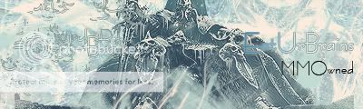
I just made this new sig, let me know what you think.
(Its my current sig)
and yes, i already know its big.

![[Show-Off] My new Sig. please comment.](https://www.ownedcore.com/forums/./ocpbanners/1/0/6/3/8/1/6/1e102dbc1865060efdd7bf3ae1edf5cc.jpg)
![[Show-Off] My new Sig. please comment.](https://www.ownedcore.com/assets/mm/images/wits.png "TradeSafe Middleman")
![[Show-Off] My new Sig. please comment.](https://www.ownedcore.com/forums/images/styles/OwnedCoreFX/addimg/wicc.png "CoreCoins")

User Tag List
Results 1 to 11 of 11
-
01-06-2008 #1
 Contributor


- Reputation
- 169
- Join Date
- Apr 2007
- Posts
- 487
- Thanks G/R
- 0/0
- Trade Feedback
- 0 (0%)
- Mentioned
- 0 Post(s)
- Tagged
- 0 Thread(s)

[Show-Off] My new Sig. please comment.
![[Show-Off] My new Sig. please comment.](https://www.ownedcore.com/images/ba/g/b2.gif)
-
01-06-2008 #2
Member
- Reputation
- 143
- Join Date
- Sep 2007
- Posts
- 656
- Thanks G/R
- 0/0
- Trade Feedback
- 0 (0%)
- Mentioned
- 0 Post(s)
- Tagged
- 0 Thread(s)
its not to big btw. i would say the sig looks preety nice, alot of c4ds around the render but it does well. maybe try add some c4ds discretely into the background to give it a bit more depth as it looks a bit flat. otherwise looks different and preety good
-
01-06-2008 #3
Member
- Reputation
- 6
- Join Date
- Nov 2006
- Posts
- 61
- Thanks G/R
- 0/0
- Trade Feedback
- 0 (0%)
- Mentioned
- 0 Post(s)
- Tagged
- 0 Thread(s)
To me it looks like a render, clouds, and a filter on the clouds.
Maybe a bit harsh if you are just starting to make sigs.
-
01-06-2008 #4
Contributor
- Reputation
- 169
- Join Date
- Apr 2007
- Posts
- 487
- Thanks G/R
- 0/0
- Trade Feedback
- 0 (0%)
- Mentioned
- 0 Post(s)
- Tagged
- 0 Thread(s)
nah, im not just starting. i have much better, but for about 3min or work, i like it.Originally Posted by Flamingo

and your wrong completely on my process.
-
01-06-2008 #5
Banned

- Reputation
- 136
- Join Date
- Jul 2007
- Posts
- 833
- Thanks G/R
- 0/0
- Trade Feedback
- 0 (0%)
- Mentioned
- 0 Post(s)
- Tagged
- 0 Thread(s)

its good, looks like you used the smudge tool in the BG an lighting on the render. simple, but really good.
-
01-06-2008 #6
Contributor
- Reputation
- 169
- Join Date
- Apr 2007
- Posts
- 487
- Thanks G/R
- 0/0
- Trade Feedback
- 0 (0%)
- Mentioned
- 0 Post(s)
- Tagged
- 0 Thread(s)
getting warmerOriginally Posted by XcatalystX
-
01-06-2008 #7
Contributor
- Reputation
- 119
- Join Date
- Oct 2006
- Posts
- 1,175
- Thanks G/R
- 0/0
- Trade Feedback
- 0 (0%)
- Mentioned
- 0 Post(s)
- Tagged
- 0 Thread(s)
its very simple as everyone says it looks like you
clouds, red layer put it on color, render, render to light effects
but still very nice keep up the work !Last edited by EliMob441; 01-06-2008 at 10:14 PM.

-
01-07-2008 #8
Member
- Reputation
- 12
- Join Date
- Feb 2007
- Posts
- 165
- Thanks G/R
- 0/0
- Trade Feedback
- 0 (0%)
- Mentioned
- 0 Post(s)
- Tagged
- 0 Thread(s)
I like it but I have no expierience in that sort of thing
-
01-07-2008 #9
Active Member

- Reputation
- 55
- Join Date
- Jan 2007
- Posts
- 504
- Thanks G/R
- 0/0
- Trade Feedback
- 0 (0%)
- Mentioned
- 0 Post(s)
- Tagged
- 0 Thread(s)
Lol Same mines lil plain but yea i like the sig Cryt

 NoT A ZomBie~BuT iLL~EaTuRBrainS
-
01-07-2008 #10
 !!jeULyJf8ld1

- Reputation
- 538
- Join Date
- Feb 2007
- Posts
- 2,254
- Thanks G/R
- 0/1
- Trade Feedback
- 0 (0%)
- Mentioned
- 0 Post(s)
- Tagged
- 0 Thread(s)

Try to blend a bit more the render with (or is it already in the stock?) the C4D. Maybe make the render and background connect a bit, make some brushes of the same collor go over the render. Maybe also removing a channel, making it look colorized.
19/5/2013
-
01-07-2008 #11
Contributor
- Reputation
- 214
- Join Date
- Sep 2007
- Posts
- 434
- Thanks G/R
- 0/0
- Trade Feedback
- 0 (0%)
- Mentioned
- 0 Post(s)
- Tagged
- 0 Thread(s)
hmm a bit Color correction of the render wouldnt have been bad^^

 Reply With Quote
Similar Threads
-
[Show Off/Rate]New Sig
By Thirtteen in forum Art & Graphic DesignReplies: 1Last Post: 10-26-2008, 03:40 AM -
[Show-off] My new sig by me :)
By mchugh in forum Art & Graphic DesignReplies: 11Last Post: 04-07-2008, 02:43 PM -
[Show-off] My new sig
By -xepher- in forum Art & Graphic DesignReplies: 5Last Post: 02-26-2008, 07:14 PM -
[Show-Off] My new sig
By -xepher- in forum Art & Graphic DesignReplies: 9Last Post: 02-23-2008, 05:59 AM -
[Rate/Show-Off] Some new sigs i made
By Piersd in forum Art & Graphic DesignReplies: 3Last Post: 02-10-2008, 04:25 AM
-
OwnedCore Forums
casino news World of Warcraft Pokemon GO MMO Overwatch RTS Casino reviews www.planet-casino.com lucky 8 lucky8 no deposit codes bc game bc game lucky8 -
casino
Casino Gambling Online casinos Casino en ligne bc game bc game bc game no deposit bonus codes roobet Top 10 Casinos Casino reviews Bitcoin casino Paypal Casino Lucky8 1xbit heycasino Account Transfering Account Renting? Level 80 DK, 72 mage US [US] 2 WoW Accounts In Markee Dragon LF professional lookin ID Quick Question. Blizzard newsletter how was money sent? -
CoreCoins
CoreCoins CoreCoins FAQ Shout-Out Banner Ads -
My OwnedCore
My Profile Notifications Settings Buy CoreCoins About Us


Privacy Policy | Cookie Policy | Terms | Contact Us
Available Payment Methods:-
![[Show-Off] My new Sig. please comment.](https://www.ownedcore.com/images/paybutton/paypal.png)
![[Show-Off] My new Sig. please comment.](https://www.ownedcore.com/images/paybutton/skrill.png)
![[Show-Off] My new Sig. please comment.](https://www.ownedcore.com/images/paybutton/payop.png)
-
Casino
amazon | amazon | amazon | amazon | amazon | amazon | amazon | amazon | amazon | amazon | amazon | amazon | amazon | amazon | amazon | amazon | amazon | amazon | amazon | amazon | amazon | amazon | amazon | amazon | amazon | amazon | amazon | amazon | amazon | amazon | amazon | amazon | amazon | amazon | amazon | amazon | amazon | amazon | amazon | amazon | amazon | amazon | amazon | amazon | amazon | amazon | amazon | amazon | amazon | amazon | amazon | amazon | amazon | amazon | amazon | amazon | amazon | amazon | amazon | amazon