
This was a tutorial made by a friend of mine, however, the signature was made by me. He just looked at the layers, and then wrote down what I did.
The one that has "Ricky" on it is mine.
If there is a demand for more tutorials, I'd be happy to make them.


Shout-Out
User Tag List
Results 1 to 7 of 7
-
07-18-2011 #1
 Active Member

- Reputation
- 27
- Join Date
- Jul 2008
- Posts
- 311
- Thanks G/R
- 0/0
- Trade Feedback
- 0 (0%)
- Mentioned
- 0 Post(s)
- Tagged
- 0 Thread(s)
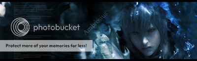
A Final Fantasy 7 Crysis Core signature
Last edited by Namor; 07-18-2011 at 02:00 PM.
Editable signature, at last!

-
07-19-2011 #2
Active Member
- Reputation
- 27
- Join Date
- Jul 2008
- Posts
- 311
- Thanks G/R
- 0/0
- Trade Feedback
- 0 (0%)
- Mentioned
- 0 Post(s)
- Tagged
- 0 Thread(s)
Y u view, but no comment!?
Editable signature, at last!
-
07-19-2011 #3
 Contributor

- Reputation
- 121
- Join Date
- Aug 2008
- Posts
- 605
- Thanks G/R
- 0/0
- Trade Feedback
- 0 (0%)
- Mentioned
- 0 Post(s)
- Tagged
- 0 Thread(s)
Idk, I personally don't like the sig. Sorry, man. Needs more depth, flow, a better color scheme, and the render is in a spot that creates too much negative space to me. Just my 2c.
I WAS DRILL ROLLED BY GZ. AND I LOVED IT.

-
07-19-2011 #4
Active Member
- Reputation
- 27
- Join Date
- Jul 2008
- Posts
- 311
- Thanks G/R
- 0/0
- Trade Feedback
- 0 (0%)
- Mentioned
- 0 Post(s)
- Tagged
- 0 Thread(s)
I guess it's about perception, because I see a decent level of consistant movement, and some could argue that the negative space around the text merely adds emphasis to the focus, which would be the render.
But no one's right, they're just matters of opinion.Last edited by Namor; 07-19-2011 at 12:10 PM.
Editable signature, at last!
-
07-19-2011 #5
Legendary

- Reputation
- 783
- Join Date
- Mar 2008
- Posts
- 3,377
- Thanks G/R
- 1/2
- Trade Feedback
- 0 (0%)
- Mentioned
- 0 Post(s)
- Tagged
- 0 Thread(s)
Thanks for the tutorial. The signature, however, is not my favorite. Your main problem is focus. Bright, white spots take away that focus from the render and the render is awfully dark as well. Not to mention that it it is so far out towards the right side that it looks as if you just threw it in there, disregarding its location. The signature doesn't attract me at all since it's just another fancy render and smudge signature with adjustment layers. I'm sorry, but that's really what it is and as such there is already too many tutorials of the kind.
As far as the tutorial itself goes, I know it's not you who made it, but it is very poor. The font has horrible readability. Tutorial text shouldn't have that. Sans-serif, all caps and an odd font is never good when it comes to body text - there is a reason all book authors use a serif font such as Times New Roman or Garamond. It is easy to read. Tutorial text is meant to inform you, not impress you by it's appearance.
The one who wrote the tutorial hardly explains anything. Sure, you can copy everything and have a similar signature as yours but you won't be able to use the skills you've been taught for other creations as the author doesn't explain WHY he does things, just what he does. A good tutorial shows you what you need to do, how you do it and why you do it. Not just one or the other. He hardly gives any details either, making it very hard for beginners to follow. For example: "Re add the stock of course set to lighten press ctrl+u hit colorize and make it a nice fitting color". What does the lighten mode do? Why would you use that, and not linear dodge or screen? What's a "fitting color"? These things are all subject to change as the renders used change. Explanations are quite frankly horrible.
The common style used in the signature, the bad explanations and the unplanned tutorial is overall quite sub-par. I'm sorry for being harsh on you, but I'm just giving you my honest opinion here and as such, you can choose to ignore it as it's mostly my opinion and not an objective fact. Constructive criticism is never bad, though.
Thanks for the effort regardless and be sure to stick around and show us some new stuff later on. Tell your friend to practice some more on explanations and look at other tutorials that has many views for inspiration
Take care.
Freelance Digital Artist
https://reflectionartwork.deviantart.com
You did not desert me
My brothers in arms
-
07-19-2011 #6
Active Member
- Reputation
- 27
- Join Date
- Jul 2008
- Posts
- 311
- Thanks G/R
- 0/0
- Trade Feedback
- 0 (0%)
- Mentioned
- 0 Post(s)
- Tagged
- 0 Thread(s)
Definitely not arguable. Criticism very much appreciated.
Editable signature, at last!
-
07-19-2011 #7
 Sergeant
- Reputation
- 22
- Join Date
- Jul 2011
- Posts
- 43
- Thanks G/R
- 0/0
- Trade Feedback
- 0 (0%)
- Mentioned
- 0 Post(s)
- Tagged
- 0 Thread(s)

 Great CC as usual, straight to the point.Originally Posted by Reflection


 Reply With Quote
Similar Threads
-
Final Fantasy 7
By Orious in forum World of Warcraft ExplorationReplies: 9Last Post: 08-29-2007, 12:25 PM -
FInal Fantasy
By cbauer1439 in forum Gaming ChatReplies: 14Last Post: 06-16-2007, 02:41 PM -
Final Fantasy XI
By sonofjohn in forum Community ChatReplies: 3Last Post: 05-25-2007, 05:58 PM -
Final Fantasy XI Free Servers?
By Shizmaster in forum Gaming ChatReplies: 0Last Post: 05-08-2007, 10:47 AM -
Final Fantasy VIII (FF8) Window Mode
By Vladinator in forum Community ChatReplies: 0Last Post: 03-23-2007, 02:36 PM
-
OwnedCore Forums
casino news World of Warcraft Pokemon GO MMO Overwatch RTS Casino reviews www.planet-casino.com lucky 8 lucky8 no deposit codes bc game bc game lucky8 -
casino
Casino Gambling Online casinos Casino en ligne bc game bc game bc game no deposit bonus codes roobet Top 10 Casinos Casino reviews Bitcoin casino Paypal Casino Lucky8 1xbit heycasino Need help now!! Paypal Free Proxy Acces(Browser Can any of you make any Free US account, 29 How do I get a WOTLK Cd US WoW Accounts Need Help please Scam Help Rules (w/ new 70 Troll Rogue Pvp realm -
CoreCoins
CoreCoins CoreCoins FAQ Shout-Out Banner Ads -
My OwnedCore
My Profile Notifications Settings Buy CoreCoins About Us


Privacy Policy | Cookie Policy | Terms | Contact Us
Available Payment Methods:-


