![[Showoff] Latest Signature.](https://www.ownedcore.com/forums/images/styles/OwnedCoreFX/addimg/menu4.svg)
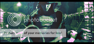
I've only been using photoshop for like 1-2 weeks now. This is my latest work:
Just would like to see what you guys think, no flaming please.
I know the text is bad, pointers would be awesome on how to improve that.

![[Showoff] Latest Signature.](https://www.ownedcore.com/forums/./ocpbanners/1/0/6/3/8/1/6/1e102dbc1865060efdd7bf3ae1edf5cc.jpg)
![[Showoff] Latest Signature.](https://www.ownedcore.com/assets/mm/images/wits.png "TradeSafe Middleman")
![[Showoff] Latest Signature.](https://www.ownedcore.com/forums/images/styles/OwnedCoreFX/addimg/wicc.png "CoreCoins")

Shout-Out
User Tag List
Thread: [Showoff] Latest Signature.
Results 1 to 6 of 6
-
05-17-2010 #1
 Contributor

- Reputation
- 91
- Join Date
- Feb 2008
- Posts
- 1,103
- Thanks G/R
- 0/1
- Trade Feedback
- 0 (0%)
- Mentioned
- 0 Post(s)
- Tagged
- 0 Thread(s)
[Showoff] Latest Signature.
 Death to all but Metal.
![[Showoff] Latest Signature.](https://www.ownedcore.com/images/ba/g/b2.gif)
-
05-17-2010 #2
Active Member

- Reputation
- 40
- Join Date
- Nov 2008
- Posts
- 186
- Thanks G/R
- 0/0
- Trade Feedback
- 0 (0%)
- Mentioned
- 0 Post(s)
- Tagged
- 0 Thread(s)
Very good for a beginner mate, you have a good eye and you can see what is working well together as the overall flow of the signature is pretty nice. Going to give contructive criticism but in no way taking away from the fact you did a good job

What I would suggest is maybe adding a bit more emphasis onto the render. Making the background to fit the render rather than making a background and then putting a render on is also a good idea.
Your backgrounds look like it was made using brushes, try to stay away from this to much and use brushes to enhance your piece rather than relying on them to create a background (I used to rely on brushes a hell of a lot, wish someone woulda told me :P).
Lastly when it comes to text you should stay away from grungey looking fonts (in some cases it can look good) and stick with simple looking ones but work on blending them nicely.

I've just made something quickly to show you an example, it isn't well blended but having layers can help with this e.g. putting it under certain layers, over them etc. Where I've put RENDER you could put what the render is (I don't know what it is so I could't) like SPIDERMAN or something. All I did was pick a green from the render and used a white for your name and added a drop shadow but I really struggle with text so maybe don't take my advice :P

With this one I used a gradient overlay with colours from the signature.
Hope this was of some help and keep up the good work, sorry for the long post :P
-
05-18-2010 #3
Contributor
- Reputation
- 91
- Join Date
- Feb 2008
- Posts
- 1,103
- Thanks G/R
- 0/1
- Trade Feedback
- 0 (0%)
- Mentioned
- 0 Post(s)
- Tagged
- 0 Thread(s)
Thank you. Your text looks x10 better then me. And for the background I covered it with the image and blurred it, did some grunge brushing and set it to overlay. Added a C4D and one brush of stars. Btw what font did you use?
Death to all but Metal.
-
05-18-2010 #4
Active Member
- Reputation
- 40
- Join Date
- Nov 2008
- Posts
- 186
- Thanks G/R
- 0/0
- Trade Feedback
- 0 (0%)
- Mentioned
- 0 Post(s)
- Tagged
- 0 Thread(s)
I used Gill Sans (MT Condensed) if I remember correctly.
I remember finding them fonts was a pain (couple of years ago, maybe not now) so if you can't find them and want them just give me a PM and I'll send you them.
Keep up the good work
-
05-18-2010 #5
 Established Member
- Reputation
- 72
- Join Date
- Aug 2009
- Posts
- 321
- Thanks G/R
- 0/0
- Trade Feedback
- 0 (0%)
- Mentioned
- 0 Post(s)
- Tagged
- 0 Thread(s)
Nice very good mate, also i'm trying to improve my Photoshop skills and was wondering was tutorials do you use (if you use any). Thanks and could you post link.
-
05-18-2010 #6
Legendary

- Reputation
- 783
- Join Date
- Mar 2008
- Posts
- 3,377
- Thanks G/R
- 1/2
- Trade Feedback
- 0 (0%)
- Mentioned
- 0 Post(s)
- Tagged
- 0 Thread(s)
Any random search for signature tutorial on deviantart will suffice, tbh. Some great ones there. (Tip: Sort by popularity)
Freelance Digital Artist
https://reflectionartwork.deviantart.com
You did not desert me
My brothers in arms


 Reply With Quote
Similar Threads
-
[Showoff]Some Signatures
By Narudan in forum Art & Graphic DesignReplies: 3Last Post: 03-29-2008, 09:37 AM -
[Show-Off] Latest Signature
By Krip in forum Art & Graphic DesignReplies: 8Last Post: 03-24-2008, 02:36 AM -
[Service / Showoff] Forum Signatures
By Wind in forum World of Warcraft GeneralReplies: 2Last Post: 01-17-2008, 06:50 AM -
[Showoff] Some signatures I made
By Minimized in forum Art & Graphic DesignReplies: 6Last Post: 01-13-2008, 05:38 PM -
[Rate/Showoff] First Signature
By The Metal in forum Art & Graphic DesignReplies: 9Last Post: 01-13-2008, 05:36 AM
-
OwnedCore Forums
casino news World of Warcraft Pokemon GO MMO Overwatch RTS Casino reviews www.planet-casino.com lucky 8 lucky8 no deposit codes bc game bc game lucky8 -
casino
Casino Gambling Online casinos Casino en ligne bc game bc game bc game no deposit bonus codes roobet Top 10 Casinos Casino reviews Bitcoin casino Paypal Casino Lucky8 1xbit heycasino Question about Free 5x70 account Neth'zul's 1-on-1 [US] Account giveaway Need help... Need a good site 2 EU Accounts - 80's How to find a program to logs on pc? -
CoreCoins
CoreCoins CoreCoins FAQ Shout-Out Banner Ads -
My OwnedCore
My Profile Notifications Settings Buy CoreCoins About Us


Privacy Policy | Cookie Policy | Terms | Contact Us
Available Payment Methods:-
![[Showoff] Latest Signature.](https://www.ownedcore.com/images/paybutton/paypal.png)
![[Showoff] Latest Signature.](https://www.ownedcore.com/images/paybutton/skrill.png)
![[Showoff] Latest Signature.](https://www.ownedcore.com/images/paybutton/payop.png)
-
Casino
vave | casino | casino | amazon | casino | amazon | casino | casino | vave | casino | casino | casino | amazon | amazon | mystake | casino | casino | casino | casino | casino | casino | casino | casino | vave | casino | amazon | casino | casino | casino | casino | amazon | amazon | amazon | casino | amazon | amazon | amazon | amazon | casino | amazon | casino | amazon | amazon | casino | casino | casino | casino | casino | mystake | casino | casino | amazon | casino | amazon | amazon | amazon | vave | amazon | casino | casino