![[Service] Vemonous's Sig service :D](https://www.ownedcore.com/forums/images/styles/OwnedCoreFX/addimg/menu4.svg)
Awesome sig, thanks
+4 rep

![[Service] Vemonous's Sig service :D](https://www.ownedcore.com/forums/./ocpbanners/1/2/9/8/0/2/2/01d9781faec8bfe3abf9095ac9e57d1e.jpg)
![[Service] Vemonous's Sig service :D](https://www.ownedcore.com/assets/mm/images/wits.png "TradeSafe Middleman")
![[Service] Vemonous's Sig service :D](https://www.ownedcore.com/forums/images/styles/OwnedCoreFX/addimg/wicc.png "CoreCoins")

User Tag List
Results 46 to 60 of 70
-
04-11-2010 #46
 Contributor

- Reputation
- 172
- Join Date
- Mar 2007
- Posts
- 1,327
- Thanks G/R
- 0/0
- Trade Feedback
- 0 (0%)
- Mentioned
- 0 Post(s)
- Tagged
- 0 Thread(s)

![[Service] Vemonous's Sig service :D](https://www.ownedcore.com/images/ba/g/b2.gif)
-
04-11-2010 #47
Contributor
- Reputation
- 93
- Join Date
- Dec 2007
- Posts
- 649
- Thanks G/R
- 0/1
- Trade Feedback
- 0 (0%)
- Mentioned
- 0 Post(s)
- Tagged
- 0 Thread(s)
sure thingOriginally Posted by F0rwArd


-
04-11-2010 #48
Sergeant
- Reputation
- 9
- Join Date
- Mar 2010
- Posts
- 42
- Thanks G/R
- 0/0
- Trade Feedback
- 0 (0%)
- Mentioned
- 0 Post(s)
- Tagged
- 0 Thread(s)
OMFG i love it!!!!!!
ty sooo much XD
-
04-12-2010 #49
Contributor
- Reputation
- 93
- Join Date
- Dec 2007
- Posts
- 649
- Thanks G/R
- 0/1
- Trade Feedback
- 0 (0%)
- Mentioned
- 0 Post(s)
- Tagged
- 0 Thread(s)
no prob..... still takin requests
-
04-12-2010 #50
Banned

- Reputation
- 136
- Join Date
- Jul 2007
- Posts
- 833
- Thanks G/R
- 0/0
- Trade Feedback
- 0 (0%)
- Mentioned
- 0 Post(s)
- Tagged
- 0 Thread(s)


Images: Planet Renders Gallery: Click image to close this window
Colours: lime greens,blacks, and greys
Text: XC4T
Subtext: Contributor
C4D's: ur choice
Border Type: your choice
-
04-12-2010 #51
Contributor
- Reputation
- 93
- Join Date
- Dec 2007
- Posts
- 649
- Thanks G/R
- 0/1
- Trade Feedback
- 0 (0%)
- Mentioned
- 0 Post(s)
- Tagged
- 0 Thread(s)
done! lemme know if you want anything changed...

-
04-12-2010 #52
Banned
- Reputation
- 136
- Join Date
- Jul 2007
- Posts
- 833
- Thanks G/R
- 0/0
- Trade Feedback
- 0 (0%)
- Mentioned
- 0 Post(s)
- Tagged
- 0 Thread(s)
SWEET !! + 3 reps
-
04-12-2010 #53
Legendary

- Reputation
- 783
- Join Date
- Mar 2008
- Posts
- 3,377
- Thanks G/R
- 1/2
- Trade Feedback
- 0 (0%)
- Mentioned
- 0 Post(s)
- Tagged
- 0 Thread(s)
I love your signatures syplex (congratulations on contributor, by the way!) but I feel that some could be less monotone and feature a little bit more color than just a strong blue, strong green, etc. Much like your Jessica Alba signature where the subtle pink adds a whole new dimension to the signature itself.
Last edited by Reflection; 04-12-2010 at 09:42 AM.
Freelance Digital Artist
https://reflectionartwork.deviantart.com
You did not desert me
My brothers in arms
-
04-12-2010 #54
Banned
- Reputation
- 365
- Join Date
- Aug 2007
- Posts
- 1,725
- Thanks G/R
- 0/0
- Trade Feedback
- 0 (0%)
- Mentioned
- 0 Post(s)
- Tagged
- 0 Thread(s)
also your text sucks lol!111Originally Posted by reflection
-
04-12-2010 #55
Banned
- Reputation
- 136
- Join Date
- Jul 2007
- Posts
- 833
- Thanks G/R
- 0/0
- Trade Feedback
- 0 (0%)
- Mentioned
- 0 Post(s)
- Tagged
- 0 Thread(s)
ya, i admit ur really good, but refelection is right :/ an Narudan, lol his text is fine, its not to sharp or flashy
-
04-12-2010 #56
Contributor
- Reputation
- 240
- Join Date
- Aug 2008
- Posts
- 996
- Thanks G/R
- 0/1
- Trade Feedback
- 3 (100%)
- Mentioned
- 0 Post(s)
- Tagged
- 0 Thread(s)
Images: Planet Renders Gallery - Information OR or
Planet Renders Gallery - PC Game Renders/World of Warcraft
Something like 7its tauren one, I REALLY like that one
SORRY I COULDNT FIND A IMAGE I REALLY LIKED!
Colours: Greenish, blue, anything. Just make it look unique.
Text: RyeRye (in like a greenish color)
Subtext: Contributer (in the blue color)
C4D's: Doesn't matter.
Border Type: your choice
Size: Can it be the size of C4T's current signature?
And also, can you do 2-3 versions?
And also an avatar please? Unique avatars, with like something cool about it, But in the avatar, have somewhere text saying RyeRye.Last edited by RyeRye; 04-12-2010 at 02:58 PM.

-
04-12-2010 #57
Contributor
- Reputation
- 93
- Join Date
- Dec 2007
- Posts
- 649
- Thanks G/R
- 0/1
- Trade Feedback
- 0 (0%)
- Mentioned
- 0 Post(s)
- Tagged
- 0 Thread(s)
Originally Posted by Reflection
Originally Posted by Narudan
Originally Posted by XC4T4LY5TX
 mm i see what you mean reflection... but have a look at the sig before i colour it... it wouldnt have been any of the colours he had wanted... and it looks rubbish... now with that sig being those red, blues and orange colours mainly... how would i implement lime greens/blacks/greys as he requested... thats what stumped me after i finished.. so i chose to re-colour it with colour balance...

and making it less monotone makes only a minor difference anyway :confused:

as for my text i dunno what to do = /
ill get it done after i get back home tonight rye rye sorry i got school and then work... = /Originally Posted by RyeRye
Last edited by Syplex23; 04-12-2010 at 04:42 PM.
-
04-12-2010 #58
Contributor
- Reputation
- 240
- Join Date
- Aug 2008
- Posts
- 996
- Thanks G/R
- 0/1
- Trade Feedback
- 3 (100%)
- Mentioned
- 0 Post(s)
- Tagged
- 0 Thread(s)
Take your time bro, +Repx3 in advance
-
04-13-2010 #59
Banned
- Reputation
- 365
- Join Date
- Aug 2007
- Posts
- 1,725
- Thanks G/R
- 0/0
- Trade Feedback
- 0 (0%)
- Mentioned
- 0 Post(s)
- Tagged
- 0 Thread(s)
Look at Rye Ryes current sig. I like that textOriginally Posted by Syplex23
Also this one from piersd


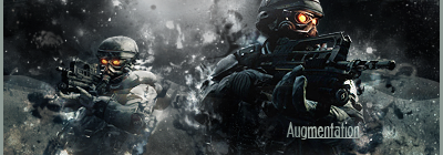
lol that are my sigs.
Text stands out clear without disrupting the flow too much (well maybe it does in the second one). That means - No outline, no gradient. Smooth text doesnt look good in smudge/grunge sigs. Theres a clipping mask on very low opacity on 'augmentation' to make it look dirty.
Ignore specific requests about colors. Thats what I always did
The new sig is better but the light is a little too hard now and the text stands out even more. You could drag the textlayer under some splatter layers to blend it in.
-
04-13-2010 #60
Contributor
- Reputation
- 91
- Join Date
- Feb 2008
- Posts
- 1,103
- Thanks G/R
- 0/1
- Trade Feedback
- 0 (0%)
- Mentioned
- 0 Post(s)
- Tagged
- 0 Thread(s)
Image: Something to do with God of War, or some kind of demonic thing, what ever you can find easier.
Colours: Darkish.
Text: Alj03 (something that works well with a dark theme for the colour)
Subtext: MMOwned (something that works well with a dark theme for the colour)
And what ever else you think looks good.
Thanks in advance. Death to all but Metal.


 Reply With Quote
Similar Threads
-
[SERVICE] Vemonous's Sig factory
By Syplex23 in forum Art & Graphic DesignReplies: 43Last Post: 07-11-2008, 06:44 AM -
Phaze's Sig/Avatar Service
By Phase228 in forum Art & Graphic DesignReplies: 46Last Post: 07-15-2007, 05:12 PM -
Sacrifice avatar/sig service
By Sacrifice in forum Art & Graphic DesignReplies: 18Last Post: 07-13-2007, 11:20 AM -
Gankstir's Sig Service
By Gankstir in forum Art & Graphic DesignReplies: 53Last Post: 07-01-2007, 06:13 PM -
Dued02's Sig service
By dued02 in forum Art & Graphic DesignReplies: 49Last Post: 06-10-2007, 06:34 PM
-
OwnedCore Forums
casino news World of Warcraft Pokemon GO MMO Overwatch RTS Casino reviews www.planet-casino.com sportbetworld no deposit codes bc game bc game -
casino
Casino Gambling Online casinos Casino en ligne bc game bc game bc game no deposit bonus codes roobet Top 10 Casinos Casino reviews Bitcoin casino Paypal Casino Lucky8 1xbit heycasino [Service] Recalling [Help] Scam Related. 40 warrior on maelstrom [Help]Sold an account LF< Scammed Accounts To no more banning for Paypal payment Looking for legit [QUESTION]Recalling a -
CoreCoins
CoreCoins CoreCoins FAQ Shout-Out Banner Ads -
My OwnedCore
My Profile Notifications Settings Buy CoreCoins About Us


Privacy Policy | Cookie Policy | Terms | Contact Us
Available Payment Methods:-
![[Service] Vemonous's Sig service :D](https://www.ownedcore.com/images/paybutton/paypal.png)
![[Service] Vemonous's Sig service :D](https://www.ownedcore.com/images/paybutton/skrill.png)
![[Service] Vemonous's Sig service :D](https://www.ownedcore.com/images/paybutton/payop.png)
-
Casino
canada | travel advantage | CryptoRoyal Casino | HashLucky Casino | mwr life | travel advantage | mwr | mwr life | here | travel advantage | MRQ Casino | Mirax Casino | Aviator game casino | Free casino games | here | mwr | Instant Payout Methods | travel advantage | mwr | mwr life | Bitstarz Tournament | Top 5 canadian online casinos 2025 | mwr life | iLucki Casino | mwrlife | travel advantage | freebet tanpa | Blockchain gambling | mwr | mystake | Shuffle Casino | mwr