![[ShowOff] Assasins creed sigs](https://www.ownedcore.com/forums/images/styles/OwnedCoreFX/addimg/menu4.svg)
Hay. Heres some of my most recent sigs
(I know that the ripple is a little bit bright but i couldn't rly change it.)
Rate 'n cc plz

![[ShowOff] Assasins creed sigs](https://www.ownedcore.com/forums/./ocpbanners/1/2/9/8/0/2/2/01d9781faec8bfe3abf9095ac9e57d1e.jpg)
![[ShowOff] Assasins creed sigs](https://www.ownedcore.com/assets/mm/images/wits.png "TradeSafe Middleman")
![[ShowOff] Assasins creed sigs](https://www.ownedcore.com/forums/images/styles/OwnedCoreFX/addimg/wicc.png "CoreCoins")

User Tag List
Thread: [ShowOff] Assasins creed sigs
Results 1 to 15 of 16
-
02-20-2010 #1
![[the Sills]'s Avatar](https://www.ownedcore.com/forums/customavatars/avatar423650_26.gif "[the Sills]'s Avatar") Contributor
Contributor![[the Sills] is offline](https://www.ownedcore.com/forums/images/styles/OwnedCoreFX/statusicon/user-offline.png)

- Reputation
- 132
- Join Date
- Jan 2009
- Posts
- 681
- Thanks G/R
- 0/0
- Trade Feedback
- 0 (0%)
- Mentioned
- 0 Post(s)
- Tagged
- 0 Thread(s)
[ShowOff] Assasins creed sigs
Last edited by [the Sills]; 02-21-2010 at 09:49 AM.
![[ShowOff] Assasins creed sigs](https://www.ownedcore.com/images/ba/g/b2.gif)
-
02-20-2010 #2
 Active Member

- Reputation
- 17
- Join Date
- Aug 2006
- Posts
- 165
- Thanks G/R
- 0/0
- Trade Feedback
- 0 (0%)
- Mentioned
- 0 Post(s)
- Tagged
- 0 Thread(s)
Nice! First one is awesome, but a bit big for a sig :P
Should be a awesome wallpaper aswell imhohttps://evassac.deviantart.com <-- Comments please
https://lord-alucard.gfxartist.com
-
02-20-2010 #3
Contributor
- Reputation
- 132
- Join Date
- Jan 2009
- Posts
- 681
- Thanks G/R
- 0/0
- Trade Feedback
- 0 (0%)
- Mentioned
- 0 Post(s)
- Tagged
- 0 Thread(s)
Well, the first one is not rly made to be a sig, just tried to get better and try some other sizes
-
02-20-2010 #4
Banned
- Reputation
- 229
- Join Date
- Jun 2008
- Posts
- 990
- Thanks G/R
- 0/0
- Trade Feedback
- 0 (0%)
- Mentioned
- 0 Post(s)
- Tagged
- 0 Thread(s)


Secound one is best for sure. The first one is too messy. Just work a bit on the text.
-
02-20-2010 #5
Contributor
- Reputation
- 132
- Join Date
- Jan 2009
- Posts
- 681
- Thanks G/R
- 0/0
- Trade Feedback
- 0 (0%)
- Mentioned
- 0 Post(s)
- Tagged
- 0 Thread(s)
The texts always been what i've thought is hardest... Kinda never looks good :S
The second one is very messy, i see now.. Well, i did it from a tut so i guess its a messy style or sth :P
kktnxbaii
-
02-21-2010 #6
Member
- Reputation
- 1
- Join Date
- Jan 2009
- Posts
- 18
- Thanks G/R
- 0/0
- Trade Feedback
- 0 (0%)
- Mentioned
- 0 Post(s)
- Tagged
- 0 Thread(s)
very beautifull
-
02-21-2010 #7
Contributor
- Reputation
- 132
- Join Date
- Jan 2009
- Posts
- 681
- Thanks G/R
- 0/0
- Trade Feedback
- 0 (0%)
- Mentioned
- 0 Post(s)
- Tagged
- 0 Thread(s)
Originally Posted by marcspc
Thx sir.
(tehfillz)
-
02-21-2010 #8
Contributor
- Reputation
- 132
- Join Date
- Jan 2009
- Posts
- 681
- Thanks G/R
- 0/0
- Trade Feedback
- 0 (0%)
- Mentioned
- 0 Post(s)
- Tagged
- 0 Thread(s)
Added a new one
-
02-21-2010 #9
Legendary

- Reputation
- 783
- Join Date
- Mar 2008
- Posts
- 3,377
- Thanks G/R
- 1/2
- Trade Feedback
- 0 (0%)
- Mentioned
- 0 Post(s)
- Tagged
- 0 Thread(s)
The new one is very good, text could be better though.
Freelance Digital Artist
https://reflectionartwork.deviantart.com
You did not desert me
My brothers in arms
-
02-21-2010 #10
Contributor
- Reputation
- 132
- Join Date
- Jan 2009
- Posts
- 681
- Thanks G/R
- 0/0
- Trade Feedback
- 0 (0%)
- Mentioned
- 0 Post(s)
- Tagged
- 0 Thread(s)
Yeah, the text is a bit off.. ill try to improve it... Tnx refle
edit: changed textLast edited by [the Sills]; 02-21-2010 at 09:49 AM.
-
02-21-2010 #11
Legendary
- Reputation
- 783
- Join Date
- Mar 2008
- Posts
- 3,377
- Thanks G/R
- 1/2
- Trade Feedback
- 0 (0%)
- Mentioned
- 0 Post(s)
- Tagged
- 0 Thread(s)
Looks good, great work.
Freelance Digital Artist
https://reflectionartwork.deviantart.com
You did not desert me
My brothers in arms
-
02-23-2010 #12
Contributor
- Reputation
- 288
- Join Date
- Nov 2007
- Posts
- 1,819
- Thanks G/R
- 0/4
- Trade Feedback
- 3 (100%)
- Mentioned
- 0 Post(s)
- Tagged
- 0 Thread(s)
I love that first one, that is really sexy.
The second one is really crowded, i dont really like it.
The third one is subtle and nice (:

-
02-25-2010 #13
 Member
- Reputation
- 8
- Join Date
- Aug 2008
- Posts
- 98
- Thanks G/R
- 0/0
- Trade Feedback
- 0 (0%)
- Mentioned
- 0 Post(s)
- Tagged
- 0 Thread(s)
Lets have a proper C&C since the people above are either too lazy to do one or just crap at doing em.Originally Posted by [the Sills]
So lets start, from A to C (Ascending to descending).
Just a note, they're all too big for a sig. I mean jesus, not even mine are above 350x130px dimensions (WxH)
A)
Nice stunning looking sig however the apply imaged splatter brushes on the right side ruin the entire effect of the sig and its well too big to even be classed as a signature. Needs alot of work on depth and render blending but overall in good quality. The text could do with some work, text is by far the hardest of all sigs; position and blending effects are essential and as a tag maker you want to make every text as simple as possible. Tip: I only use a gradient map and seperate text layers for each word.
B)
It is well too messy, the ripple that is behind the render ruins the entire sig in general and again its just too big to be even classed as a signature; even if you put your name on it. Theres too much going on when it comes to the background; I mean it doesn't all flow. There is no artistic flur in its design/creation and looks like a randomly bunch of C4Ds put into a big background with some awful render blending which the render isnt even blended and the ripple around the render is just a big no no. Could do alot better, especially with image A. There is a lack of depth as well and lighting.
C)
So lets begin with this one, i can see alot of render blending but i think the left section of the image is far too empty, even the text there doesn't seem to help at all. There is no depth and as far as i'm aware; you focused too much on blending the render than overall background. There is a serious lack of lighting because i believe that this would look so much better if there was lighting. With the lighting creates the focus and that is such a better render and again with image B, just looks like a bunch of C4Ds, filters slapped onto an image and i know by looking at your previous work, you can do a whole lot better.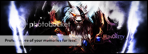
-GFX At it's finest-
-
02-26-2010 #14
 Bawx Lurker


- Reputation
- 351
- Join Date
- Oct 2009
- Posts
- 769
- Thanks G/R
- 2/0
- Trade Feedback
- 1 (100%)
- Mentioned
- 0 Post(s)
- Tagged
- 0 Thread(s)
i like the last one, gj
-
02-27-2010 #15
Private
- Reputation
- 1
- Join Date
- Feb 2010
- Posts
- 10
- Thanks G/R
- 0/0
- Trade Feedback
- 0 (0%)
- Mentioned
- 0 Post(s)
- Tagged
- 0 Thread(s)
I like Third one..................


 Reply With Quote
Similar Threads
-
[Rate/Showoff] Kinda new sig
By samsta458 in forum Art & Graphic DesignReplies: 1Last Post: 02-29-2008, 09:38 AM -
[Showoff] First PS Sig
By Mirror in forum Art & Graphic DesignReplies: 2Last Post: 02-07-2008, 11:26 PM -
[Showoff] New Myth Sig (Has a Naga Pally in it :D)
By Myth. in forum Art & Graphic DesignReplies: 4Last Post: 02-05-2008, 05:57 PM -
[Showoff] Wareagle920's Sig
By SectorSeven in forum Art & Graphic DesignReplies: 5Last Post: 02-05-2008, 08:47 AM -
[Showoff] Myth (New sig!)
By Myth. in forum Art & Graphic DesignReplies: 6Last Post: 02-04-2008, 01:11 AM
-
OwnedCore Forums
casino news World of Warcraft Pokemon GO MMO Overwatch RTS Casino reviews www.planet-casino.com lucky 8 lucky8 no deposit codes bc game bc game lucky8 -
casino
Casino Gambling Online casinos Casino en ligne bc game bc game bc game no deposit bonus codes roobet Top 10 Casinos Casino reviews Bitcoin casino Paypal Casino Lucky8 1xbit heycasino Need some rep on markee Indicted? give away 2 70 lvl, and Giving away EU account, Paypal [Help]During Blizzard Paypal - Limited Acces Comments, gamecard vid Need account for -
CoreCoins
CoreCoins CoreCoins FAQ Shout-Out Banner Ads -
My OwnedCore
My Profile Notifications Settings Buy CoreCoins About Us


Privacy Policy | Cookie Policy | Terms | Contact Us
Available Payment Methods:-
![[ShowOff] Assasins creed sigs](https://www.ownedcore.com/images/paybutton/paypal.png)
![[ShowOff] Assasins creed sigs](https://www.ownedcore.com/images/paybutton/skrill.png)
![[ShowOff] Assasins creed sigs](https://www.ownedcore.com/images/paybutton/payop.png)
-
Casino
casino | casino | casino | casino | casino | amazon | vave | amazon | amazon | amazon | casino | casino | amazon | casino | amazon | casino | casino | amazon | casino | amazon | casino | casino | amazon | amazon | casino | casino | casino | casino | casino | casino | amazon | casino | casino | casino | casino | vave | amazon | vave | amazon | amazon | amazon | casino | casino | amazon | casino | amazon | casino | amazon | casino | amazon | mystake | vave | amazon | casino | amazon | casino | casino | casino | casino | mystake