![[Showoff] Myth (New sig!)](https://www.ownedcore.com/forums/images/styles/OwnedCoreFX/addimg/menu4.svg)
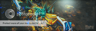
Hey guys, just started to get back into sigs again after taking a break. This is my newest one, tell me what I should change/fix/take out. I think the border needs work but not sure... Please rate x/10 and help me find what should be improved(Check out my other newer thread too, I have a brand new sig using a brand new style there)
Here's one with the text on lower opacity


![[Showoff] Myth (New sig!)](https://www.ownedcore.com/forums/./ocpbanners/1/0/6/3/8/1/6/1e102dbc1865060efdd7bf3ae1edf5cc.jpg)
![[Showoff] Myth (New sig!)](https://www.ownedcore.com/assets/mm/images/wits.png "TradeSafe Middleman")
![[Showoff] Myth (New sig!)](https://www.ownedcore.com/forums/images/styles/OwnedCoreFX/addimg/wicc.png "CoreCoins")

Shout-Out
User Tag List
Thread: [Showoff] Myth (New sig!)
Results 1 to 7 of 7
-
02-03-2008 #1
 Member
- Reputation
- 6
- Join Date
- Dec 2006
- Posts
- 87
- Thanks G/R
- 0/0
- Trade Feedback
- 0 (0%)
- Mentioned
- 0 Post(s)
- Tagged
- 0 Thread(s)

[Showoff] Myth (New sig!)
Last edited by Myth.; 02-04-2008 at 03:44 PM.
![[Showoff] Myth (New sig!)](https://www.ownedcore.com/images/ba/g/b2.gif)
-
02-03-2008 #2
Member
- Reputation
- 81
- Join Date
- Jan 2008
- Posts
- 237
- Thanks G/R
- 0/0
- Trade Feedback
- 0 (0%)
- Mentioned
- 0 Post(s)
- Tagged
- 0 Thread(s)
uhh i dont think the blue-ish bit at the left side goes with the rest of the sig
Do You Love Me MaryJane
-
02-03-2008 #3
Member
- Reputation
- 6
- Join Date
- Dec 2006
- Posts
- 87
- Thanks G/R
- 0/0
- Trade Feedback
- 0 (0%)
- Mentioned
- 0 Post(s)
- Tagged
- 0 Thread(s)
Thanks for the suggestion, I appreciate it. (Can't fix it now, it's a C4D I used and I applied image so many times after that I would have to redo the sig to fix it :waveOriginally Posted by chron123
 So 1-10 what do you think it is? Please be honest, no matter how mean it is. lol
-
02-03-2008 #4
Member
- Reputation
- 81
- Join Date
- Jan 2008
- Posts
- 237
- Thanks G/R
- 0/0
- Trade Feedback
- 0 (0%)
- Mentioned
- 0 Post(s)
- Tagged
- 0 Thread(s)
7/10 id give it
Do You Love Me MaryJane
-
02-03-2008 #5
Banned
- Reputation
- 179
- Join Date
- Jan 2008
- Posts
- 1,396
- Thanks G/R
- 0/0
- Trade Feedback
- 0 (0%)
- Mentioned
- 0 Post(s)
- Tagged
- 0 Thread(s)
I like it. 7/10. Only thing I dont like is the blue c4d you used. Also you could lower the opticty on the text.
-
02-04-2008 #6
Member
- Reputation
- 6
- Join Date
- Dec 2006
- Posts
- 87
- Thanks G/R
- 0/0
- Trade Feedback
- 0 (0%)
- Mentioned
- 0 Post(s)
- Tagged
- 0 Thread(s)
Thanks for the feedback, and clainsux I took a try at lowering the opacity. It turned more gray-ish so idk how I feel about it mabye I need to smudge a little bit to blend more (put it in original post). I can't judge my work as well as others can judge it what do you think about the lowered opacity on the text (better then original or not)? Anyways, I'm making a new sig so i'll check back here later
Last edited by Myth.; 02-04-2008 at 01:13 AM.
-
02-04-2008 #7
Member
- Reputation
- 6
- Join Date
- Dec 2006
- Posts
- 87
- Thanks G/R
- 0/0
- Trade Feedback
- 0 (0%)
- Mentioned
- 0 Post(s)
- Tagged
- 0 Thread(s)
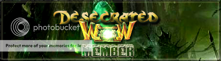
Here's another one I did the same style using something Warcraft related, I think the first one might be better. Trying a different style next.

Last edited by Myth.; 02-04-2008 at 01:14 AM.


 Reply With Quote
Similar Threads
-
[SHOWOFF] My New Sig!!!
By m0rbidang3l in forum Art & Graphic DesignReplies: 1Last Post: 11-05-2008, 11:59 PM -
[Showoff] uhm, new sig?
By Piersd in forum Art & Graphic DesignReplies: 6Last Post: 10-27-2008, 10:35 AM -
[Showoff] Few New Sigs
By aisha.wolfgang in forum Art & Graphic DesignReplies: 7Last Post: 10-25-2008, 01:24 AM -
[Showoff] My new sig
By C-Death in forum Art & Graphic DesignReplies: 6Last Post: 08-01-2008, 10:55 PM -
[Rate/Showoff] Kinda new sig
By samsta458 in forum Art & Graphic DesignReplies: 1Last Post: 02-29-2008, 09:38 AM
-
OwnedCore Forums
casino news World of Warcraft Pokemon GO MMO Overwatch RTS Casino reviews bc game bc game -
casino
Casino Gambling Online casinos Casino en ligne vercel livescore bc game lovable vercel bc game no deposit bonus codes stake Top 10 Casinos Casino reviews Bitcoin casino Lucky8 1xbit heycasino I CANNOT get an account Another US Gamecard Need some1 to recall ASAP Severity of phishing [EPIC] Phisher Help Get the word out 4 acivated eu accounts 2 Frozen US User/Pw, had Account Giveaway (DK + -
CoreCoins
CoreCoins CoreCoins FAQ Shout-Out Banner Ads -
My OwnedCore
My Profile Notifications Settings Buy CoreCoins About Us


Privacy Policy | Cookie Policy | Terms | Contact Us
Available Payment Methods:-
![[Showoff] Myth (New sig!)](https://www.ownedcore.com/images/paybutton/paypal.png)
![[Showoff] Myth (New sig!)](https://www.ownedcore.com/images/paybutton/skrill.png)
![[Showoff] Myth (New sig!)](https://www.ownedcore.com/images/paybutton/payop.png)
-
Casino
mwr life | Blockchain gambling | freebet tanpa | mwr life | canada | Top 5 canadian online casinos 2025 | mwr life | mwr life | iLucki Casino | mwr | travel advantage | Instant Payout Methods | mwr life | mwr life | here | X | stake | MRQ Casino | mwr life | Free casino games | mwr life | Shuffle Casino | Mirax Casino | mwr life | Bitstarz Tournament | Aviator game casino | mwr life | CryptoRoyal Casino | mwr life | mystake | mwr life | HashLucky Casino