![[CnC] Samus Signature, Stalker Sign added.](https://www.ownedcore.com/forums/images/styles/OwnedCoreFX/addimg/menu4.svg)
Hey everyone,
This is my latest signature, please tell me what you think about it.
EDIT:
I have added another signature, please comment and criticize this one too.
2nd EDIT:
I made another one, black and white this time.
Would be awesome if you could rate this one too,
Thanks

![[CnC] Samus Signature, Stalker Sign added.](https://www.ownedcore.com/forums/./ocpbanners/1/2/9/8/0/2/2/01d9781faec8bfe3abf9095ac9e57d1e.jpg)
![[CnC] Samus Signature, Stalker Sign added.](https://www.ownedcore.com/assets/mm/images/wits.png "TradeSafe Middleman")
![[CnC] Samus Signature, Stalker Sign added.](https://www.ownedcore.com/forums/images/styles/OwnedCoreFX/addimg/wicc.png "CoreCoins")

Shout-Out
User Tag List
Results 1 to 10 of 10
-
08-09-2009 #1
 Contributor

- Reputation
- 129
- Join Date
- Jul 2009
- Posts
- 225
- Thanks G/R
- 0/0
- Trade Feedback
- 0 (0%)
- Mentioned
- 0 Post(s)
- Tagged
- 0 Thread(s)
[CnC] 3 Signatures
Last edited by orangepig; 08-10-2009 at 03:17 PM.
![[CnC] Samus Signature, Stalker Sign added.](https://www.ownedcore.com/images/ba/g/b2.gif)
-
08-09-2009 #2
Contributor
- Reputation
- 129
- Join Date
- Jul 2009
- Posts
- 225
- Thanks G/R
- 0/0
- Trade Feedback
- 0 (0%)
- Mentioned
- 0 Post(s)
- Tagged
- 0 Thread(s)
41 views, 0 replies. Common rate it :s
-
08-09-2009 #3
Legendary

- Reputation
- 783
- Join Date
- Mar 2008
- Posts
- 3,377
- Thanks G/R
- 1/2
- Trade Feedback
- 0 (0%)
- Mentioned
- 0 Post(s)
- Tagged
- 0 Thread(s)
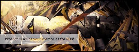
Text I like. Kinda thrown off by the rough edges of the render, more specifically to the left of it. It doesn't really fit. The lightning source is misplaced. Notice the glow on her head? Realistically it's reflected by a light more on top of her, not to the right.
Freelance Digital Artist
https://reflectionartwork.deviantart.com
You did not desert me
My brothers in arms
-
08-09-2009 #4
Banned
- Reputation
- 81
- Join Date
- Apr 2009
- Posts
- 694
- Thanks G/R
- 0/0
- Trade Feedback
- 0 (0%)
- Mentioned
- 0 Post(s)
- Tagged
- 0 Thread(s)

I agree with the light source mis-placement.
But i like the render.
I do not like how the left of the signature is
empty however.
7/10
~ Zore
-
08-10-2009 #5
Contributor
- Reputation
- 129
- Join Date
- Jul 2009
- Posts
- 225
- Thanks G/R
- 0/0
- Trade Feedback
- 0 (0%)
- Mentioned
- 0 Post(s)
- Tagged
- 0 Thread(s)
ok, I'll think about that thanks, btw added another signature in my main post.
-
08-10-2009 #6
Contributor
- Reputation
- 184
- Join Date
- Sep 2006
- Posts
- 459
- Thanks G/R
- 0/0
- Trade Feedback
- 0 (0%)
- Mentioned
- 0 Post(s)
- Tagged
- 0 Thread(s)
Like before, you should fall back on the sharpening on the render. Other wise, good placement of text and focal.
-
08-10-2009 #7
Member
- Reputation
- 4
- Join Date
- May 2009
- Posts
- 53
- Thanks G/R
- 0/0
- Trade Feedback
- 0 (0%)
- Mentioned
- 0 Post(s)
- Tagged
- 0 Thread(s)
very nice!
first 2 i give 8/10 because the big brown thing on the first oen and the grey thing on the 2nd one (C4D i think xD)
10/10 for last.. i thinkits epic
-
08-10-2009 #8
Banned
- Reputation
- 81
- Join Date
- Apr 2009
- Posts
- 694
- Thanks G/R
- 0/0
- Trade Feedback
- 0 (0%)
- Mentioned
- 0 Post(s)
- Tagged
- 0 Thread(s)
Very nice signatures.
Love the second.
~ Zore
-
08-11-2009 #9
Legendary
- Reputation
- 783
- Join Date
- Mar 2008
- Posts
- 3,377
- Thanks G/R
- 1/2
- Trade Feedback
- 0 (0%)
- Mentioned
- 0 Post(s)
- Tagged
- 0 Thread(s)
Last one is great, lightning is a little off and I'd rather have the splatters not as blurred as they are. They would fit better being the same level of depth as the render, in my opinion. Great work!
Freelance Digital Artist
https://reflectionartwork.deviantart.com
You did not desert me
My brothers in arms
-
08-11-2009 #10
Member
- Reputation
- 6
- Join Date
- Jul 2007
- Posts
- 99
- Thanks G/R
- 0/0
- Trade Feedback
- 0 (0%)
- Mentioned
- 0 Post(s)
- Tagged
- 0 Thread(s)

You whore c4d's haha.
Text and depth is good. 1st is 8/10, 2nd is 7.5/10 and third is 7/10.Gfx


 Reply With Quote
Similar Threads
-
[Signature] [Showoff] Animated Samus Signature
By [Kronus] in forum Art & Graphic DesignReplies: 10Last Post: 06-24-2010, 06:56 PM -
[Signature] [Request] Name Added to Signature + a Avatar
By BaboonX in forum Art & Graphic DesignReplies: 3Last Post: 05-30-2010, 05:35 AM -
[Tutorial] Adding Videos To Signatures
By Distanced in forum Art & Graphic DesignReplies: 6Last Post: 05-04-2009, 11:38 PM -
[Rate] Samus signature
By PrimoPie in forum Art & Graphic DesignReplies: 10Last Post: 06-30-2008, 09:08 PM
-
OwnedCore Forums
casino news World of Warcraft Pokemon GO MMO Overwatch RTS Casino reviews www.planet-casino.com lucky 8 lucky8 no deposit codes bc game bc game lucky8 -
casino
Casino Gambling Online casinos Casino en ligne bc game bc game bc game no deposit bonus codes roobet Top 10 Casinos Casino reviews Bitcoin casino Paypal Casino Lucky8 1xbit heycasino [Question] Program name need help Different companys 70 Troll Rogue Pvp realm Help! What can he do? small request about an [URGENT] Transfer Just need a small bit of Will this gm scam work? -
CoreCoins
CoreCoins CoreCoins FAQ Shout-Out Banner Ads -
My OwnedCore
My Profile Notifications Settings Buy CoreCoins About Us


Privacy Policy | Cookie Policy | Terms | Contact Us
Available Payment Methods:-
![[CnC] Samus Signature, Stalker Sign added.](https://www.ownedcore.com/images/paybutton/paypal.png)
![[CnC] Samus Signature, Stalker Sign added.](https://www.ownedcore.com/images/paybutton/skrill.png)
![[CnC] Samus Signature, Stalker Sign added.](https://www.ownedcore.com/images/paybutton/payop.png)
-
Casino
vave | casino | casino | casino | casino | casino | casino | casino | amazon | casino | casino | amazon | casino | casino | mystake | amazon | casino | casino | casino | amazon | casino | amazon | casino | amazon | casino | amazon | amazon | vave | casino | amazon | amazon | casino | casino | mystake | casino | vave | casino | casino | casino | amazon | casino | amazon | casino | amazon | casino | casino | amazon | amazon | casino | casino | amazon | amazon | amazon | casino | mystake | casino | amazon | amazon | amazon | casino