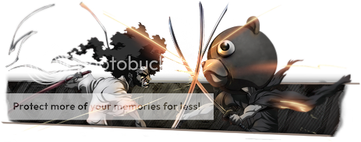
Awesome, I like that last one. :]
Yep the tut is very harddddd lol. That's why I skipped the last steps of it.
Shout-Out
User Tag List
Thread: [Showoff/Rate] New Sigs
Results 16 to 21 of 21
-
07-02-2009 #16
 Legendary

- Reputation
- 624
- Join Date
- Feb 2007
- Posts
- 1,760
- Thanks G/R
- 0/1
- Trade Feedback
- 0 (0%)
- Mentioned
- 0 Post(s)
- Tagged
- 0 Thread(s)

-------------------------------------------
Retired Model Editor - Graphic Designer - Cameraman - Video Editor
Flamewalker.deviantart.com / youtube.com/redmammothproduction
-
07-02-2009 #17Banned

- Reputation
- 52
- Join Date
- Nov 2007
- Posts
- 677
- Thanks G/R
- 0/0
- Trade Feedback
- 0 (0%)
- Mentioned
- 0 Post(s)
- Tagged
- 0 Thread(s)
-
07-02-2009 #18Member

- Reputation
- 1
- Join Date
- Jun 2009
- Posts
- 22
- Thanks G/R
- 0/0
- Trade Feedback
- 0 (0%)
- Mentioned
- 0 Post(s)
- Tagged
- 0 Thread(s)
these absolutely kill your michael jackson one, so good job there. your text still needs some work though. and you seem to be a victim of FHS(floating head syndrome). try to keep from only using the heads of renders when you can- get a little torso in there. of all of them, i like the music one the best, but it could use a tad more contrast on the body of the gentleman holding the guitar and you could stand to lose the part that says sheepking. 6.5/10, 5/10, 6.5/10, 7.5/10, and for the redo on the army render 4/10(the floating head looks way worse with that brightness).
5 isn't bad, it's average, so don't get upset at me please >_<
i know i have your MJ one a 7/10 before, but i reconsidered.
you do them frequently enough that with the cnc you get here you should have no problem getting even better pretty quick, so never worry about neg. crtiticism.
-
07-03-2009 #19Banned

- Reputation
- 52
- Join Date
- Nov 2007
- Posts
- 677
- Thanks G/R
- 0/0
- Trade Feedback
- 0 (0%)
- Mentioned
- 0 Post(s)
- Tagged
- 0 Thread(s)
No, no, thank you

I just didn't add Contrast to the Guy holding the Guitar because the focan should be the guitar
-
07-03-2009 #20Legendary


- Reputation
- 783
- Join Date
- Mar 2008
- Posts
- 3,377
- Thanks G/R
- 1/2
- Trade Feedback
- 0 (0%)
- Mentioned
- 0 Post(s)
- Tagged
- 0 Thread(s)
To be honest I didn't even see that it was a guitar at first. Looked like abstract shapes. The head is near impossible to see without seeing the actual stock first.
Freelance Digital Artist
https://reflectionartwork.deviantart.com
You did not desert me
My brothers in arms
-
07-03-2009 #21Banned

- Reputation
- 52
- Join Date
- Nov 2007
- Posts
- 677
- Thanks G/R
- 0/0
- Trade Feedback
- 0 (0%)
- Mentioned
- 0 Post(s)
- Tagged
- 0 Thread(s)
lol. Thats why I made it look like that. I don't want to have a Guitar Player on my Sig. I want the Guitar. But it looks better if theres someone with the guitar. You dont need to recognize this guy.
Similar Threads
-
[Showoff & Rate] New Sig made in PS:CS4
By XC4T4LY5TX in forum Art & Graphic DesignReplies: 4Last Post: 02-11-2010, 08:45 AM -
[Rate/Showoff] Kinda new sig
By samsta458 in forum Art & Graphic DesignReplies: 1Last Post: 02-29-2008, 09:38 AM -
[Rate] New Sig
By Cheesy in forum Art & Graphic DesignReplies: 7Last Post: 01-21-2008, 10:20 AM -
Rate new sig
By EliMob441 in forum Art & Graphic DesignReplies: 5Last Post: 10-04-2007, 12:26 AM -
Rate New Sigs
By GoombaMan in forum Art & Graphic DesignReplies: 1Last Post: 09-19-2007, 05:14 PM
![[Showoff/Rate] New Sigs](https://www.ownedcore.com/forums/images/styles/OwnedCoreFX/addimg/menu4.svg)

![[Showoff/Rate] New Sigs](https://www.ownedcore.com/forums/./ocpbanners/1/2/9/8/0/2/2/01d9781faec8bfe3abf9095ac9e57d1e.jpg)
![TradeSafe Middleman [Showoff/Rate] New Sigs](https://www.ownedcore.com/assets/mm/images/wits.png)
![CoreCoins [Showoff/Rate] New Sigs](https://www.ownedcore.com/forums/images/styles/OwnedCoreFX/addimg/wicc.png)


 Reply With Quote
![[Showoff/Rate] New Sigs](https://www.ownedcore.com/images/ba/g/b2.gif)


![[Showoff/Rate] New Sigs](https://www.ownedcore.com/images/paybutton/paypal.png)
![[Showoff/Rate] New Sigs](https://www.ownedcore.com/images/paybutton/skrill.png)
![[Showoff/Rate] New Sigs](https://www.ownedcore.com/images/paybutton/payop.png)