![[showoff] new sigs](https://www.ownedcore.com/forums/images/styles/OwnedCoreFX/addimg/menu4.svg)
all of them were created after 11pm
c&c, dont rate

![[showoff] new sigs](https://www.ownedcore.com/forums/./ocpbanners/1/2/9/8/0/2/2/01d9781faec8bfe3abf9095ac9e57d1e.jpg)
![[showoff] new sigs](https://www.ownedcore.com/assets/mm/images/wits.png "TradeSafe Middleman")
![[showoff] new sigs](https://www.ownedcore.com/forums/images/styles/OwnedCoreFX/addimg/wicc.png "CoreCoins")

Shout-Out
User Tag List
Thread: [showoff] new sigs
Results 1 to 13 of 13
-
05-22-2009 #1
 Banned
- Reputation
- 365
- Join Date
- Aug 2007
- Posts
- 1,725
- Thanks G/R
- 0/0
- Trade Feedback
- 0 (0%)
- Mentioned
- 0 Post(s)
- Tagged
- 0 Thread(s)
[showoff] new sigs
![[showoff] new sigs](https://www.ownedcore.com/images/ba/g/b2.gif)
-
05-23-2009 #2
Legendary

- Reputation
- 783
- Join Date
- Mar 2008
- Posts
- 3,377
- Thanks G/R
- 1/2
- Trade Feedback
- 0 (0%)
- Mentioned
- 0 Post(s)
- Tagged
- 0 Thread(s)
Win. Just not a fan of the number one's text.
Freelance Digital Artist
https://reflectionartwork.deviantart.com
You did not desert me
My brothers in arms
-
05-23-2009 #3
Active Member

- Reputation
- 21
- Join Date
- Jan 2007
- Posts
- 233
- Thanks G/R
- 0/0
- Trade Feedback
- 0 (0%)
- Mentioned
- 0 Post(s)
- Tagged
- 0 Thread(s)

Holy **** Your are amazing

The second one looks sick, keep it up
-Lord-kapser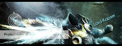
-
05-23-2009 #4
Banned
- Reputation
- 500
- Join Date
- Mar 2008
- Posts
- 1,323
- Thanks G/R
- 0/0
- Trade Feedback
- 0 (0%)
- Mentioned
- 0 Post(s)
- Tagged
- 0 Thread(s)

Youve lost it. Fail on the first 2. Win on the 3rd.

-
05-23-2009 #5
Member
- Reputation
- 10
- Join Date
- May 2009
- Posts
- 65
- Thanks G/R
- 0/0
- Trade Feedback
- 0 (0%)
- Mentioned
- 0 Post(s)
- Tagged
- 0 Thread(s)
i love #2, great style
Former Glider. Graphics Designer.

-
05-25-2009 #6
Banned
- Reputation
- 365
- Join Date
- Aug 2007
- Posts
- 1,725
- Thanks G/R
- 0/0
- Trade Feedback
- 0 (0%)
- Mentioned
- 0 Post(s)
- Tagged
- 0 Thread(s)
bumb
are my sigs that boring
i need cnc even if you just say "ugly" or "boring"
in b4 ugly and boring
-
05-25-2009 #7
Banned
- Reputation
- 145
- Join Date
- Jan 2009
- Posts
- 745
- Thanks G/R
- 0/0
- Trade Feedback
- 0 (0%)
- Mentioned
- 0 Post(s)
- Tagged
- 0 Thread(s)
The text of the first is bad IMO,it doesent blend in at all.
The second is pure WIN!
Third is good,but text is little hard-to-read.
-
05-25-2009 #8
Active Member
- Reputation
- 34
- Join Date
- Mar 2009
- Posts
- 192
- Thanks G/R
- 0/0
- Trade Feedback
- 0 (0%)
- Mentioned
- 0 Post(s)
- Tagged
- 0 Thread(s)
#3 is epic

I don't like #1 and #2, a bit too mutch of everything.
(They are still all nice, and better than I ever could do)
-
05-25-2009 #9
Banned
- Reputation
- 81
- Join Date
- Apr 2009
- Posts
- 694
- Thanks G/R
- 0/0
- Trade Feedback
- 0 (0%)
- Mentioned
- 0 Post(s)
- Tagged
- 0 Thread(s)
I agree with everyone else, the third signature is very good.
Great job
-
05-26-2009 #10
Banned
- Reputation
- 365
- Join Date
- Aug 2007
- Posts
- 1,725
- Thanks G/R
- 0/0
- Trade Feedback
- 0 (0%)
- Mentioned
- 0 Post(s)
- Tagged
- 0 Thread(s)
I tried something new on the text of the first,Originally Posted by SalfauroS
maybe that kind of text would look better in another sig
And i think the text in 3 is fine, is it hard to read because it is so small or just because i calibrated my monitor wrongly and the sig is too bright?^^
Yes thats also my opinion, especially #2.Originally Posted by PIN
I'm trying to get away from using c4ds that much
-
05-26-2009 #11
 Contributor
- Reputation
- 156
- Join Date
- Apr 2008
- Posts
- 1,134
- Thanks G/R
- 0/0
- Trade Feedback
- 0 (0%)
- Mentioned
- 0 Post(s)
- Tagged
- 0 Thread(s)
They are good but I didn't like Torch Bearer with purple. Otherwise, 9/10 all of them, and the last is 9.5/10 because I liked the font, effects and borders more than in the other two.

-
05-30-2009 #12
 King - AMG

- Reputation
- 415
- Join Date
- Aug 2008
- Posts
- 812
- Thanks G/R
- 1/2
- Trade Feedback
- 0 (0%)
- Mentioned
- 0 Post(s)
- Tagged
- 0 Thread(s)
strenthen the image in the 1st on more detail and change text
second one: the hand on the left side of the sig the effects looks a bit flat there but like th n lolo text thing
Love 3: is faultless, only criticism shes not naked.
-
05-31-2009 #13
Member
- Reputation
- 34
- Join Date
- Nov 2008
- Posts
- 320
- Thanks G/R
- 0/0
- Trade Feedback
- 0 (0%)
- Mentioned
- 0 Post(s)
- Tagged
- 0 Thread(s)
Originally Posted by Toxicity12
huh... have not seen you in the graphics section for some time.
I personally have to agree, #1 and #2 are pretty busy and my eyes are easily distracted.
I love #3 but I think the lighting on the left side is pretty strong.
Huh... sorry my centered text is sooooooo hard to read... :wave:

n00b GFX artistAn artist must be willing to criticize their own work.


 Reply With Quote
Similar Threads
-
[SHOWOFF] New Sig, Simply But Elegant
By evann in forum Art & Graphic DesignReplies: 1Last Post: 06-07-2008, 04:58 PM -
[Showoff] new sig
By Waspp in forum Art & Graphic DesignReplies: 1Last Post: 05-17-2008, 05:11 AM -
[Showoff] New Sig
By cgrock in forum Art & Graphic DesignReplies: 0Last Post: 03-29-2008, 11:15 AM -
[Showoff] ~New Sig~
By SpookyMan92 in forum Art & Graphic DesignReplies: 5Last Post: 02-26-2008, 10:31 PM -
[Showoff] New Sigs/Website Stuff
By sublimepwns in forum Art & Graphic DesignReplies: 0Last Post: 01-07-2008, 12:47 AM
-
OwnedCore Forums
casino news World of Warcraft Pokemon GO MMO Overwatch RTS Casino reviews www.planet-casino.com sportbetworld no deposit codes bc game bc game -
casino
Casino Gambling Online casinos Casino en ligne bc game bc game bc game no deposit bonus codes roobet Top 10 Casinos Casino reviews Bitcoin casino Paypal Casino Lucky8 1xbit heycasino Help plz!! Questions. URGENT! Guildbank + char transfer Blizz [Service] Will Recall Frozen US 70 Horde [Question] Scammed Money Looking For Partner Someone with Youtube -
CoreCoins
CoreCoins CoreCoins FAQ Shout-Out Banner Ads -
My OwnedCore
My Profile Notifications Settings Buy CoreCoins About Us


Privacy Policy | Cookie Policy | Terms | Contact Us
Available Payment Methods:-
![[showoff] new sigs](https://www.ownedcore.com/images/paybutton/paypal.png)
![[showoff] new sigs](https://www.ownedcore.com/images/paybutton/skrill.png)
![[showoff] new sigs](https://www.ownedcore.com/images/paybutton/payop.png)
-
Casino
Mirax Casino | Shuffle Casino | Top 5 canadian online casinos 2025 | iLucki Casino | CryptoRoyal Casino | travel advantage | Aviator game casino | MRQ Casino | canada | travel advantage | mwrlife | HashLucky Casino | mwr life | travel advantage | Free casino games | mwr | travel advantage | mwr life | mwr | Bitstarz Tournament | Instant Payout Methods | freebet tanpa | mwr | mystake | here | Blockchain gambling | mwr | mwr life | mwr | here | mwr life | travel advantage