![[Showoff] Iron Man sig](https://www.ownedcore.com/forums/images/styles/OwnedCoreFX/addimg/menu4.svg)
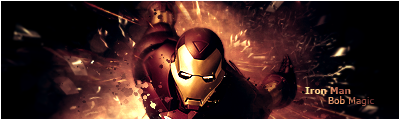
Hey guys! really getting into the whole sig thing making a few a day nowwhat do you think of my latest
took bits from a tutorial and a few of my own ideas

![[Showoff] Iron Man sig](https://www.ownedcore.com/forums/./ocpbanners/1/2/9/8/0/2/2/01d9781faec8bfe3abf9095ac9e57d1e.jpg)
![[Showoff] Iron Man sig](https://www.ownedcore.com/assets/mm/images/wits.png "TradeSafe Middleman")
![[Showoff] Iron Man sig](https://www.ownedcore.com/forums/images/styles/OwnedCoreFX/addimg/wicc.png "CoreCoins")

User Tag List
Thread: [Showoff] Iron Man sig
Results 1 to 6 of 6
-
03-23-2009 #1
 Member
- Reputation
- 93
- Join Date
- Apr 2007
- Posts
- 447
- Thanks G/R
- 0/0
- Trade Feedback
- 0 (0%)
- Mentioned
- 0 Post(s)
- Tagged
- 0 Thread(s)
[Showoff] Iron Man sig

![[Showoff] Iron Man sig](https://www.ownedcore.com/images/ba/g/b2.gif)
-
03-23-2009 #2
Member
- Reputation
- 34
- Join Date
- Nov 2008
- Posts
- 320
- Thanks G/R
- 0/0
- Trade Feedback
- 0 (0%)
- Mentioned
- 0 Post(s)
- Tagged
- 0 Thread(s)

I personally don't like the location of your text :S that is just me though, other than that is looks great


n00b GFX artistAn artist must be willing to criticize their own work.
-
03-23-2009 #3
Contributor

- Reputation
- 111
- Join Date
- Jan 2007
- Posts
- 723
- Thanks G/R
- 0/0
- Trade Feedback
- 0 (0%)
- Mentioned
- 0 Post(s)
- Tagged
- 0 Thread(s)
Yeah, I agree, text could be placed better.

-
03-23-2009 #4
Member
- Reputation
- 34
- Join Date
- Nov 2008
- Posts
- 320
- Thanks G/R
- 0/0
- Trade Feedback
- 0 (0%)
- Mentioned
- 0 Post(s)
- Tagged
- 0 Thread(s)
I would put it above the shoulder on the left in the black area.
n00b GFX artistAn artist must be willing to criticize their own work.
-
03-24-2009 #5
Active Member

- Reputation
- 34
- Join Date
- Dec 2006
- Posts
- 298
- Thanks G/R
- 0/0
- Trade Feedback
- 0 (0%)
- Mentioned
- 0 Post(s)
- Tagged
- 0 Thread(s)
im guessing you used the TuT at GFXvoid by RachetnClank? LOL? looks sorta like it

DA Gift From Mr. Blain
-
03-24-2009 #6
Member
- Reputation
- 93
- Join Date
- Apr 2007
- Posts
- 447
- Thanks G/R
- 0/0
- Trade Feedback
- 0 (0%)
- Mentioned
- 0 Post(s)
- Tagged
- 0 Thread(s)
yeah but i added my own elements and used gradient maps a different render, some clipping masks and a bit more depth

 Reply With Quote
Similar Threads
-
[Showoff] Iron Man/ Spiderman Drawing's
By Proxes in forum Art & Graphic DesignReplies: 9Last Post: 05-13-2010, 03:54 PM -
[Showoff] Iron man sig
By C-Death in forum Art & Graphic DesignReplies: 0Last Post: 10-18-2008, 08:32 AM -
[Showoff] Iron Man Vertical Sig
By PrimoPie in forum Art & Graphic DesignReplies: 5Last Post: 08-01-2008, 02:44 PM -
[Showoff] Wareagle920's Sig
By SectorSeven in forum Art & Graphic DesignReplies: 5Last Post: 02-05-2008, 08:47 AM -
[Showoff] Myth (New sig!)
By Myth. in forum Art & Graphic DesignReplies: 6Last Post: 02-04-2008, 01:11 AM
-
OwnedCore Forums
casino news World of Warcraft Pokemon GO MMO Overwatch RTS Casino reviews www.planet-casino.com lucky 8 lucky8 no deposit codes bc game bc game lucky8 -
casino
Casino Gambling Online casinos Casino en ligne bc game bc game bc game no deposit bonus codes roobet Top 10 Casinos Casino reviews Bitcoin casino Paypal Casino Lucky8 1xbit heycasino Anyone know how to scam Stealing gold - safest [SERVICE] Free WoW EU or [US] Active account. LF Scam trainer! Money scamming [Need Anyone willing to help My youtube scam! Need a scam fo wow French -
CoreCoins
CoreCoins CoreCoins FAQ Shout-Out Banner Ads -
My OwnedCore
My Profile Notifications Settings Buy CoreCoins About Us


Privacy Policy | Cookie Policy | Terms | Contact Us
Available Payment Methods:-
![[Showoff] Iron Man sig](https://www.ownedcore.com/images/paybutton/paypal.png)
![[Showoff] Iron Man sig](https://www.ownedcore.com/images/paybutton/skrill.png)
![[Showoff] Iron Man sig](https://www.ownedcore.com/images/paybutton/payop.png)
-
Casino
amazon | amazon | amazon | amazon | amazon | amazon | casino | amazon | vave | mystake | amazon | amazon | amazon | amazon | amazon | vave | amazon | amazon | mystake | casino | amazon | mystake | amazon | casino | amazon | amazon | amazon | mystake | vave | mystake | amazon | amazon | vave | mystake | mystake | amazon | mystake | casino | amazon | casino | amazon | amazon | amazon | mystake | casino | vave | casino | amazon | amazon | casino | amazon | amazon | amazon | casino | casino | amazon | amazon | casino | amazon | amazon