![[2nd showoff] The Catalyst Album](https://www.ownedcore.com/forums/images/styles/OwnedCoreFX/addimg/menu4.svg)
ALL OF THESE WERE MADE BY ME, All are posted by date they were made.

![[2nd showoff] The Catalyst Album](https://www.ownedcore.com/forums/./ocpbanners/1/2/9/8/0/2/2/01d9781faec8bfe3abf9095ac9e57d1e.jpg)
![[2nd showoff] The Catalyst Album](https://www.ownedcore.com/assets/mm/images/wits.png "TradeSafe Middleman")
![[2nd showoff] The Catalyst Album](https://www.ownedcore.com/forums/images/styles/OwnedCoreFX/addimg/wicc.png "CoreCoins")

Shout-Out
User Tag List
Thread: [2nd showoff] The Catalyst Album
Results 1 to 8 of 8
-
01-25-2009 #1
 Banned

- Reputation
- 136
- Join Date
- Jul 2007
- Posts
- 833
- Thanks G/R
- 0/0
- Trade Feedback
- 0 (0%)
- Mentioned
- 0 Post(s)
- Tagged
- 0 Thread(s)


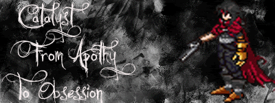
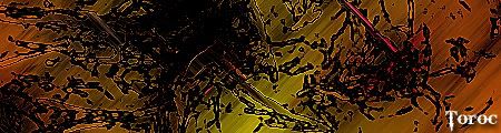
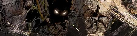
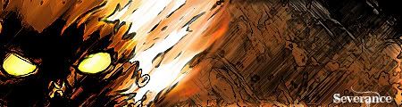
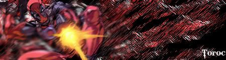
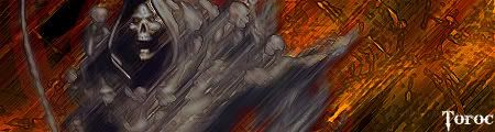
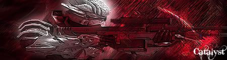
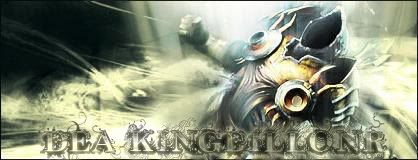
[2nd showoff] The Catalyst Album
![[2nd showoff] The Catalyst Album](https://www.ownedcore.com/images/ba/g/b2.gif)
-
01-25-2009 #2
Banned
- Reputation
- 18
- Join Date
- Jun 2007
- Posts
- 123
- Thanks G/R
- 0/0
- Trade Feedback
- 0 (0%)
- Mentioned
- 0 Post(s)
- Tagged
- 0 Thread(s)
Good job men!But i think mine can beat all of yours :P!
-
01-25-2009 #3
Banned
- Reputation
- 136
- Join Date
- Jul 2007
- Posts
- 833
- Thanks G/R
- 0/0
- Trade Feedback
- 0 (0%)
- Mentioned
- 0 Post(s)
- Tagged
- 0 Thread(s)
lol i bet, but ive only been doing this for like a year an a half, i havent mastered by technique yet. but thx for the comment
-
01-25-2009 #4
Contributor

- Reputation
- 196
- Join Date
- Mar 2007
- Posts
- 960
- Thanks G/R
- 0/0
- Trade Feedback
- 0 (0%)
- Mentioned
- 0 Post(s)
- Tagged
- 0 Thread(s)
i would suggest not making your background out of filters, not using fractals or c4ds and get some different fonts.
also look up some tuts.
edit: oh yeah, dont use so many effects on your text i.e bevel, glow, shadow

-
01-25-2009 #5
Member
- Reputation
- 34
- Join Date
- Nov 2008
- Posts
- 320
- Thanks G/R
- 0/0
- Trade Feedback
- 0 (0%)
- Mentioned
- 0 Post(s)
- Tagged
- 0 Thread(s)
vouch. There were a couple which I had a hard time figuring out what the focal point is as well.. my eye is more drawn to a random part of the sig and not the focal.Originally Posted by Piersd


n00b GFX artistAn artist must be willing to criticize their own work.
-
01-30-2009 #6
Banned
- Reputation
- 136
- Join Date
- Jul 2007
- Posts
- 833
- Thanks G/R
- 0/0
- Trade Feedback
- 0 (0%)
- Mentioned
- 0 Post(s)
- Tagged
- 0 Thread(s)
I just normally go with what i think looks good, i dont really focus on focal points, more of what appeals to me as an artist. But it couldnt hurt to look over a few Sig tuts, let alone some photoshop Tuts also for some cooler effects. im still trying to get my slides in .bmp images to go smooth
-
01-30-2009 #7
Member
- Reputation
- 34
- Join Date
- Nov 2008
- Posts
- 320
- Thanks G/R
- 0/0
- Trade Feedback
- 0 (0%)
- Mentioned
- 0 Post(s)
- Tagged
- 0 Thread(s)
well a big part of art in general is a focal point. You don't think Van Gogh's Starry night is such a beautiful painting simply because of they way he uses the brush to capture the breeze do you? It is named starry night because its the theme, as wel as a focal point. Look at how the colors of the sky contrast from the colors of the town drawing your attention to the start in the sky. Another good point regarding the painting is his use of light. Van Gogh had a fascination with yellow and the essence of light. Looking at how he uses the light with the focal point, it brings out the hills lining the town and draws out that cypress tree helping to balance the picture. Granted you seem to have a good sense of lighting, but lacking a scource of light in some of your sigs.Originally Posted by XcatalystX
Not trying to be harsh or anything, but just a thought when you start creating definitive focal points.
n00b GFX artistAn artist must be willing to criticize their own work.
-
01-31-2009 #8
Contributor
- Reputation
- 259
- Join Date
- Nov 2006
- Posts
- 2,602
- Thanks G/R
- 0/0
- Trade Feedback
- 2 (100%)
- Mentioned
- 0 Post(s)
- Tagged
- 0 Thread(s)
http://i285.photobucket.com/albums/l...pacemaker2.jpg
Is one I like the most.THIS SIGNATURE IS IN VIALOATION OF SITE RULES, PLEASE FIX ME!
-Fault


 Reply With Quote
Similar Threads
-
[Showoff] The Joker
By Chenquie in forum World of Warcraft Model EditingReplies: 31Last Post: 10-02-2008, 10:09 PM -
[Showoff] The Windseekers Crest
By Gibraltar in forum World of Warcraft Model EditingReplies: 23Last Post: 09-08-2008, 05:02 AM -
[Showoff] The Maine (New Sig)
By Maine in forum Art & Graphic DesignReplies: 8Last Post: 08-28-2008, 05:45 PM -
[Showoff] The BEST Edits
By Demonkunga in forum World of Warcraft Model EditingReplies: 93Last Post: 07-07-2008, 11:57 AM -
[Showoff] The drakes grew up! D:
By xXDr00dXx in forum World of Warcraft Model EditingReplies: 19Last Post: 06-02-2008, 04:40 PM
-
OwnedCore Forums
casino news World of Warcraft Pokemon GO MMO Overwatch RTS Casino reviews www.planet-casino.com lucky 8 lucky8 no deposit codes bc game bc game lucky8 -
casino
Casino Gambling Online casinos Casino en ligne bc game bc game bc game no deposit bonus codes roobet Top 10 Casinos Casino reviews Bitcoin casino Paypal Casino Lucky8 1xbit heycasino small request about an Recalling an account EU account scams help Account got scammed will [Help] Ardamax Keylogger Wow gold buyer? Securing Account Worst Case Situation [Help] Gold scamming for -
CoreCoins
CoreCoins CoreCoins FAQ Shout-Out Banner Ads -
My OwnedCore
My Profile Notifications Settings Buy CoreCoins About Us


Privacy Policy | Cookie Policy | Terms | Contact Us
Available Payment Methods:-
![[2nd showoff] The Catalyst Album](https://www.ownedcore.com/images/paybutton/paypal.png)
![[2nd showoff] The Catalyst Album](https://www.ownedcore.com/images/paybutton/skrill.png)
![[2nd showoff] The Catalyst Album](https://www.ownedcore.com/images/paybutton/payop.png)