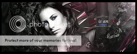
heres my latest sig
please tell me what you think or what i can do to improve it
also please rate it from scale of 1-10
thanks,
Vem
Shout-Out
User Tag List
Thread: [Show off/Rate] my new sig
Results 1 to 7 of 7
-
04-26-2008 #1Contributor


- Reputation
- 93
- Join Date
- Dec 2007
- Posts
- 649
- Thanks G/R
- 0/1
- Trade Feedback
- 0 (0%)
- Mentioned
- 0 Post(s)
- Tagged
- 0 Thread(s)
[Show off/Rate] my new sig

-
04-27-2008 #2Contributor


- Reputation
- 196
- Join Date
- Mar 2007
- Posts
- 960
- Thanks G/R
- 0/0
- Trade Feedback
- 0 (0%)
- Mentioned
- 0 Post(s)
- Tagged
- 0 Thread(s)
i like the background, though i think the background could have some brighter greens in it, to fit in with yoshi (maybe make the left side a bit darker).
one other thing, all the dots on yoshi. i'm not sure if its smudging or something, but it makes yoshi look diseased O.o.
if its on a different layer, pull out the eraser and put the flow down really low and erase over the dots, making them less visible .
.

-
04-27-2008 #3Member

- Reputation
- 6
- Join Date
- Mar 2008
- Posts
- 37
- Thanks G/R
- 0/0
- Trade Feedback
- 0 (0%)
- Mentioned
- 0 Post(s)
- Tagged
- 0 Thread(s)
I would give you 5/10. There is so much to improve, you can make it more neater and you have put too much things, make it so it is easy to see what's going or what's the purpose of it. Good try.
-
04-27-2008 #4Contributor


- Reputation
- 93
- Join Date
- Dec 2007
- Posts
- 649
- Thanks G/R
- 0/1
- Trade Feedback
- 0 (0%)
- Mentioned
- 0 Post(s)
- Tagged
- 0 Thread(s)
well i tried to make him ride of into the light out of a hole. but my smudging screwed everything up but by smudging it more would cover up the mess i did and it worked also what do you mean by i put too much things?

-
04-27-2008 #5Member

- Reputation
- 4
- Join Date
- Apr 2008
- Posts
- 24
- Thanks G/R
- 0/0
- Trade Feedback
- 0 (0%)
- Mentioned
- 0 Post(s)
- Tagged
- 0 Thread(s)
with contrasting dots like that i usually prefer them with a hard edged brush, but idk how it would look so yeah :P
anyway i dont really think that the dots over his face are a good addition, and imo you need more lighting, not just the bright part at the top, but make the bottom left areas darker so it look like its in shadow.
anyway apart from that it looks good, nice one
-
04-27-2008 #6Active Member


- Reputation
- 34
- Join Date
- Dec 2006
- Posts
- 298
- Thanks G/R
- 0/0
- Trade Feedback
- 0 (0%)
- Mentioned
- 0 Post(s)
- Tagged
- 0 Thread(s)
10/10 I really like it!!!!!!!!!!!!! 0.0

DA Gift From Mr. Blain
-
04-27-2008 #7Member

- Reputation
- 143
- Join Date
- Sep 2007
- Posts
- 656
- Thanks G/R
- 0/0
- Trade Feedback
- 0 (0%)
- Mentioned
- 0 Post(s)
- Tagged
- 0 Thread(s)
wow i think it looks wicked. probably helps that i really like green but still not taking anything away from it i think it looks nice.i like the messy kind of feel to it, but it still looks controlled and as though its all done on purpose. the splatter brushes work well to help blend it and in a way help to give it a bit of movement feel.
i like how it feels as though the renders heading towards the light, this also helps with the movement. theres great flow to the sig because of the colour choices and brushing. the effects around the light and lines on the left are nice. i really like the back wheel of the render, just seems to have nice depth and movement to it. the text matches the sig well.
overall i cant see anything to improve on, perhaps the light could be slightly less focused(strong) but thats just been really picky trying to look for an improvement. perhaps get rid of some of the shadows on the right? on the left it works as its the render getting in the way of the light dispersion but on the right it shouldn't really have any black bits, so make it a bit brighter around there and then it will help with the depth of the sig a bit more i think. also perhaps lower the shadows on left a bit so they are more in the bottom left, just so that because of the angle of the light hitting the render its more realistic, but as i say thats just picky stuff

Love isn't an emotion or an instinct - it is an Art
Similar Threads
-
[Show-Off & Rate] Back from sig training
By Bjfox in forum Art & Graphic DesignReplies: 27Last Post: 06-28-2009, 10:08 PM -
[show-off + Rate] Bjfox new sig
By Bjfox in forum Art & Graphic DesignReplies: 4Last Post: 06-16-2009, 08:38 PM -
[Show-off/CC] 2 new sigs
By Piersd in forum Art & Graphic DesignReplies: 6Last Post: 07-11-2008, 05:40 AM -
[Show off / Rate] My new signature and Avatar :)
By Shinyshoes in forum Art & Graphic DesignReplies: 7Last Post: 03-30-2008, 05:03 AM -
[Show-Off][Rate] A new WP i made.
By Lord-kapser in forum Art & Graphic DesignReplies: 5Last Post: 02-22-2008, 08:19 AM
![[Show off/Rate] my new sig](https://www.ownedcore.com/forums/images/styles/OwnedCoreFX/addimg/menu4.svg)

![[Show off/Rate] my new sig](https://www.ownedcore.com/forums/./ocpbanners/1/2/9/8/0/2/2/01d9781faec8bfe3abf9095ac9e57d1e.jpg)
![TradeSafe Middleman [Show off/Rate] my new sig](https://www.ownedcore.com/assets/mm/images/wits.png)
![CoreCoins [Show off/Rate] my new sig](https://www.ownedcore.com/forums/images/styles/OwnedCoreFX/addimg/wicc.png)


 Reply With Quote
![[Show off/Rate] my new sig](https://www.ownedcore.com/images/ba/g/b2.gif)


![[Show off/Rate] my new sig](https://www.ownedcore.com/images/paybutton/paypal.png)
![[Show off/Rate] my new sig](https://www.ownedcore.com/images/paybutton/skrill.png)
![[Show off/Rate] my new sig](https://www.ownedcore.com/images/paybutton/payop.png)