
This thread is for all members to post their likes/dislikes with the new skin.
Some things already noted:
- Shoutbox and new post text areas need to be darker. (Issues with white text using the WYSIWYG editor) Fixed. Blue border is a temporary shade
- Logo is a bit off color. (Transparency issue)
- Users rep is not shown in posts. FIXED
- User online/offline images need to be fixed. FIXED
Also note: The rep/report/etc buttons are reverted back to the original vBulletin pictures, and placement. (Top right of each post)
Rep = Scales picture.
Report = ! sign picture.
Please keep things civil.


User Tag List
Results 1 to 15 of 67
-
03-18-2009 #1
 Angry Penguin

- Reputation
- 1388
- Join Date
- Jan 2008
- Posts
- 2,750
- Thanks G/R
- 0/13
- Trade Feedback
- 0 (0%)
- Mentioned
- 0 Post(s)
- Tagged
- 0 Thread(s)
New skin discussion! (Post your likes/dislikes here please)
Last edited by Apoc; 03-19-2009 at 03:48 AM.


-
03-18-2009 #2
 Contributor


- Reputation
- 94
- Join Date
- Jan 2007
- Posts
- 2,832
- Thanks G/R
- 0/0
- Trade Feedback
- 0 (0%)
- Mentioned
- 0 Post(s)
- Tagged
- 0 Thread(s)
My only complaints are the hexagon forum icons, the fact that the 'Welcome, Errage.' bit is on the left, and the shade of blue is too bright for my liking, but meh. And just to be more picky, **** we look bad with our mascot being a lazy panda
Copy/paste from the Bawx.
Edit: OH GOD, THE BUTTONS, DO NOT WANT. (The rep button, infractions, "___ Is online" icon... All look like shit)
(I'm sticking with my 'Greenfox > All' decision)
Last edited by Errage; 03-18-2009 at 07:02 PM.
I used to be a Super Mod. Now I'm just Super, thanks for asking.
-
03-18-2009 #3
( ͡° ͜ʖ ͡°)

- Reputation
- 444
- Join Date
- Nov 2007
- Posts
- 1,591
- Thanks G/R
- 7/5
- Trade Feedback
- 0 (0%)
- Mentioned
- 0 Post(s)
- Tagged
- 0 Thread(s)

Also, the header on the frontpage for pictures is still green if you didn't notice
-
03-18-2009 #4
Banned
- Reputation
- 145
- Join Date
- Jan 2009
- Posts
- 745
- Thanks G/R
- 0/0
- Trade Feedback
- 0 (0%)
- Mentioned
- 0 Post(s)
- Tagged
- 0 Thread(s)
First reply

Dont like the white,when you reply,and don't like the new SCALES +REP button,but other than that,Its cool.
Panda FTW
EDIT: Not so first xD
-
03-18-2009 #5
Contributor
- Reputation
- 108
- Join Date
- Jan 2008
- Posts
- 545
- Thanks G/R
- 1/2
- Trade Feedback
- 0 (0%)
- Mentioned
- 0 Post(s)
- Tagged
- 0 Thread(s)
i like the panda
hes not lazy hes in deep meditation on owning blizz
-
03-18-2009 #6
Contributor
- Reputation
- 111
- Join Date
- Jan 2007
- Posts
- 723
- Thanks G/R
- 0/0
- Trade Feedback
- 0 (0%)
- Mentioned
- 0 Post(s)
- Tagged
- 0 Thread(s)
Don't like the light blue, hard to see rep button, can't see how much rep somebody has, most of the icons, and some of the placement,lay-out. I also hate the white textbox when posting in a thread.

-
03-18-2009 #7
 Contributor
- Reputation
- 305
- Join Date
- May 2007
- Posts
- 1,062
- Thanks G/R
- 3/4
- Trade Feedback
- 0 (0%)
- Mentioned
- 0 Post(s)
- Tagged
- 0 Thread(s)
Only that I find blue a rather offensive/aggresive color on my eyes, the green colorscheme was much more relaxing/easier to look at.
What's this madness? user_online.gif needs better transparancy/anti-aliasing too "Always code as if the guy who ends up maintaining your code will be a violent psychopath who knows where you live." - Martin Golding
"I cried a little earlier when I had to poop" - Sku
-
03-18-2009 #8
Contributor
- Reputation
- 160
- Join Date
- Sep 2007
- Posts
- 1,126
- Thanks G/R
- 0/0
- Trade Feedback
- 0 (0%)
- Mentioned
- 0 Post(s)
- Tagged
- 0 Thread(s)
I keep seeing spaces in forum names when going to WoW Emulator Server - MMOwned - World of Warcraft Exploits, Hacks, Bots and Guides
And uh.. just rep stuff. Other than that, good work
I live in a shoe
-
03-18-2009 #9
![[ Prototype ]'s Avatar](https://www.ownedcore.com/forums/customavatars/avatar17814_12.gif "[ Prototype ]'s Avatar") Member
Member
- Reputation
- 719
- Join Date
- Dec 2006
- Posts
- 844
- Thanks G/R
- 0/0
- Trade Feedback
- 0 (0%)
- Mentioned
- 0 Post(s)
- Tagged
- 0 Thread(s)
![Send a message via ICQ to [ Prototype ]](https://www.ownedcore.com/forums/images/styles/OwnedCoreFX/misc/im_icq.gif)
![Send a message via AIM to [ Prototype ]](https://www.ownedcore.com/forums/images/styles/OwnedCoreFX/misc/im_aim.gif)
![Send a message via MSN to [ Prototype ]](https://www.ownedcore.com/forums/images/styles/OwnedCoreFX/misc/im_msn.gif)
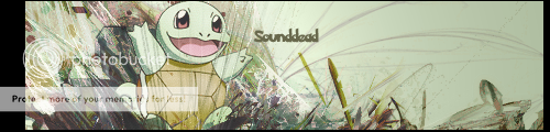
![Send a message via Yahoo to [ Prototype ]](https://www.ownedcore.com/forums/images/styles/OwnedCoreFX/misc/im_yahoo.gif) Me too.Originally Posted by Sounddead
Me too.Originally Posted by Sounddead
Well, this is great, really.
I love everything.. Except the rep button is kinda.. GONE LOL.
-
03-18-2009 #10
Contributor
- Reputation
- 171
- Join Date
- Mar 2007
- Posts
- 394
- Thanks G/R
- 0/0
- Trade Feedback
- 0 (0%)
- Mentioned
- 0 Post(s)
- Tagged
- 0 Thread(s)
I like it all except the rep/report buttons, and I think the Welcome, <name> You have xx PMs should be moved around a bit.
-
03-18-2009 #11
( ͡° ͜ʖ ͡°)
- Reputation
- 444
- Join Date
- Nov 2007
- Posts
- 1,591
- Thanks G/R
- 7/5
- Trade Feedback
- 0 (0%)
- Mentioned
- 0 Post(s)
- Tagged
- 0 Thread(s)
All you have to do for the white background is edit the CSS style
With thisCode:.wysiwyg { background: #F5F5FF; color: #000000; font: 10pt verdana, geneva, lucida, 'lucida grande', arial, helvetica, sans-serif; margin: 5px 10px 10px 10px; padding: 0px; }
https://addons.mozilla.org/en-US/firefox/addon/2108
Here's an example sytle
Code:@namespace url(http://www.w3.org/1999/xhtml); @-moz-document domain("mmowned.com") { .wysiwyg{ background: #333333 !important; color: #999999 !important; font: 10pt verdana, geneva, lucida, 'lucida grande', arial, helvetica, sans-serif !important; margin: 5px 10px 10px 10px !important; padding: 0px !important; } }

Last edited by Phygar; 03-18-2009 at 07:32 PM.
-
03-18-2009 #12
 Member
- Reputation
- 32
- Join Date
- May 2008
- Posts
- 472
- Thanks G/R
- 0/0
- Trade Feedback
- 0 (0%)
- Mentioned
- 0 Post(s)
- Tagged
- 0 Thread(s)
I like it.
-
03-18-2009 #13
Angry Penguin
- Reputation
- 1388
- Join Date
- Jan 2008
- Posts
- 2,750
- Thanks G/R
- 0/13
- Trade Feedback
- 0 (0%)
- Mentioned
- 0 Post(s)
- Tagged
- 0 Thread(s)
Would you prefer we went back to the OLD theme? (When MMOwned first started...)Originally Posted by Errage
You can complain then.
-
03-18-2009 #14
Contributor
- Reputation
- 111
- Join Date
- Jan 2007
- Posts
- 723
- Thanks G/R
- 0/0
- Trade Feedback
- 0 (0%)
- Mentioned
- 0 Post(s)
- Tagged
- 0 Thread(s)
Originally Posted by errage
please. We beg of you.
-
03-18-2009 #15
Contributor
- Reputation
- 148
- Join Date
- Mar 2007
- Posts
- 1,197
- Thanks G/R
- 1/0
- Trade Feedback
- 0 (0%)
- Mentioned
- 0 Post(s)
- Tagged
- 0 Thread(s)
I have been furiously scrutinizing this theme. here are some of the thigns id like to open talk about.
1. Make The Theme color darker, its an eyekiller bright blue.
2: change the color from dark Gray to something more sleek like the buttons.
3: fix the wasted space next to "Welcome /n"
4: There's two "FAQ" Questions in the top of the page.
5: Make +rep something other than scales, noone will find it.
6: change posting chat box from bright white
7: Make the logo panda's head tilt up so more people notice it's a panda.
8: Remove Green themed content boxes throughout the website.
9: Show rep
10: Show date/time a post was made under avatar section
11: make the _______ line before a sig darker
12: Coronate Equ1n0x King of Atlantis.


 Reply With Quote
Similar Threads
-
Post your LOL screenshots here
By polarmike76 in forum World of Warcraft GeneralReplies: 10Last Post: 06-28-2009, 02:28 PM -
Post your Text picture here
By Bbigbob in forum Community ChatReplies: 5Last Post: 05-21-2008, 05:31 AM -
Post Your Halloween Costumes Here!
By Fault in forum Community ChatReplies: 13Last Post: 10-30-2007, 09:07 PM
-
OwnedCore Forums
casino news World of Warcraft Pokemon GO MMO Overwatch RTS Casino reviews www.planet-casino.com lucky 8 lucky8 no deposit codes bc game bc game lucky8 -
casino
Casino Gambling Online casinos Casino en ligne bc game bc game bc game no deposit bonus codes roobet Top 10 Casinos Casino reviews Bitcoin casino Paypal Casino Lucky8 1xbit heycasino CLOSE your thread when Scam help ! ;( Question about after you WoW US 70 Warrior + CC How to sell... Questions. URGENT! [Request] Fake Email [HALP!] So, I got my Paypal limit usa account -
CoreCoins
CoreCoins CoreCoins FAQ Shout-Out Banner Ads -
My OwnedCore
My Profile Notifications Settings Buy CoreCoins About Us


Privacy Policy | Cookie Policy | Terms | Contact Us
Available Payment Methods:-


-
Casino
amazon | amazon | amazon | amazon | amazon | amazon | amazon | amazon | amazon | amazon | amazon | amazon | amazon | amazon | amazon | amazon | amazon | amazon | amazon | amazon | amazon | amazon | amazon | amazon | amazon | amazon | amazon | amazon | amazon | amazon | Free casino games | amazon | amazon | amazon | amazon | amazon | amazon | amazon | amazon | amazon | amazon | amazon | amazon | amazon | amazon | amazon | amazon | amazon | amazon | amazon | amazon | amazon | amazon | amazon | amazon | amazon | amazon | amazon | amazon | amazon