![[showoff/rate] kingdom hearts 2 {sora} sig](https://www.ownedcore.com/forums/images/styles/OwnedCoreFX/addimg/menu4.svg)
just made this earlier, and want to see what you people think of it
so please rate my new sig and ava pl0x


![[showoff/rate] kingdom hearts 2 {sora} sig](https://www.ownedcore.com/forums/../images/ba/9/top-1.gif)
![[showoff/rate] kingdom hearts 2 {sora} sig](https://www.ownedcore.com/assets/mm/images/wits.png "TradeSafe Middleman")
![[showoff/rate] kingdom hearts 2 {sora} sig](https://www.ownedcore.com/forums/images/styles/OwnedCoreFX/addimg/wicc.png "CoreCoins")

Shout-Out
User Tag List
Results 1 to 12 of 12
-
03-26-2008 #1
![Anarchy [RD]'s Avatar](https://www.ownedcore.com/forums/images/styles/OwnedCoreFX/addimg/noavatar.svg "Anarchy [RD]'s Avatar") Contributor
Contributor![Anarchy [RD] is offline](https://www.ownedcore.com/forums/images/styles/OwnedCoreFX/statusicon/user-offline.png)

- Reputation
- 132
- Join Date
- Jan 2008
- Posts
- 547
- Thanks G/R
- 0/2
- Trade Feedback
- 0 (0%)
- Mentioned
- 0 Post(s)
- Tagged
- 0 Thread(s)
![Send a message via ICQ to Anarchy [RD]](https://www.ownedcore.com/forums/images/styles/OwnedCoreFX/misc/im_icq.gif)
![Send a message via AIM to Anarchy [RD]](https://www.ownedcore.com/forums/images/styles/OwnedCoreFX/misc/im_aim.gif)
![Send a message via MSN to Anarchy [RD]](https://www.ownedcore.com/forums/images/styles/OwnedCoreFX/misc/im_msn.gif)
![Send a message via Yahoo to Anarchy [RD]](https://www.ownedcore.com/forums/images/styles/OwnedCoreFX/misc/im_yahoo.gif)
![Send a message via Skype™ to Anarchy [RD]](https://www.ownedcore.com/forums/images/styles/OwnedCoreFX/misc/im_skype.gif)
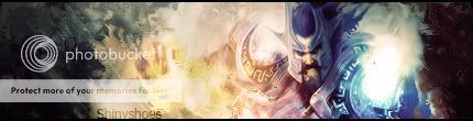
[showoff/rate] kingdom hearts 2 {sora} sig
Last edited by Anarchy [RD]; 03-26-2008 at 04:44 AM.

![[showoff/rate] kingdom hearts 2 {sora} sig](https://www.ownedcore.com/images/ba/g/b2.gif)
-
03-26-2008 #2
Active Member

- Reputation
- 24
- Join Date
- Oct 2006
- Posts
- 30
- Thanks G/R
- 0/0
- Trade Feedback
- 0 (0%)
- Mentioned
- 0 Post(s)
- Tagged
- 0 Thread(s)
btw, it's contributor NOT contributer
All your base are belong to us!
-
03-26-2008 #3
Knight-Lieutenant
- Reputation
- 20
- Join Date
- Feb 2008
- Posts
- 282
- Thanks G/R
- 0/0
- Trade Feedback
- 0 (0%)
- Mentioned
- 0 Post(s)
- Tagged
- 0 Thread(s)
Imo this is fantastic but i dont like sora with dark hair :/ and that key isnt so cool eaither ^^ but graphicly speaking it could be a little lighter with some biger/smoother lightsorces and maybe lightning him up on the side the lightning comeing from and showing on the other side.
-
03-26-2008 #4
Banned

- Reputation
- 110
- Join Date
- Dec 2007
- Posts
- 910
- Thanks G/R
- 0/0
- Trade Feedback
- 0 (0%)
- Mentioned
- 0 Post(s)
- Tagged
- 0 Thread(s)
Good game, nice signature.
-
03-26-2008 #5
Contributor
- Reputation
- 132
- Join Date
- Jan 2008
- Posts
- 547
- Thanks G/R
- 0/2
- Trade Feedback
- 0 (0%)
- Mentioned
- 0 Post(s)
- Tagged
- 0 Thread(s)
if you would like to request something please check here

http://www.mmowned.com/forums/graphi...-paradise.html
Originally Posted by Arthos
well okay, but i spell it with an "e" so shh
got anything to say about the gfx?
i wasnt realy going for the "bright, in your face" look this time aroundOriginally Posted by Waspp
i wanted something darker, but with some detail
-
03-26-2008 #6
Knight-Lieutenant
- Reputation
- 20
- Join Date
- Feb 2008
- Posts
- 282
- Thanks G/R
- 0/0
- Trade Feedback
- 0 (0%)
- Mentioned
- 0 Post(s)
- Tagged
- 0 Thread(s)
I'm just saying, Sora could be a tiny bit lighter i dont meen him shining up the picture but just so you can see his brown hair ^^ or do he have dark hair in that render?
-
03-26-2008 #7
Contributor
- Reputation
- 132
- Join Date
- Jan 2008
- Posts
- 547
- Thanks G/R
- 0/2
- Trade Feedback
- 0 (0%)
- Mentioned
- 0 Post(s)
- Tagged
- 0 Thread(s)
he had darker hair in the render lmao, thats why i picked it
i have done alot of bright sigs lately, and frankly, im getting bored of them
but thanks for the feedback
-
03-26-2008 #8
Member
- Reputation
- 143
- Join Date
- Sep 2007
- Posts
- 656
- Thanks G/R
- 0/0
- Trade Feedback
- 0 (0%)
- Mentioned
- 0 Post(s)
- Tagged
- 0 Thread(s)
for me it just looks like theres some areas that need a bit more work. the colours in the background look great but then looking across to the text it looks asthough you forgot to finish it (the white fill doesnt exactly blend with the rest of the sig.
also i think pergaps it would be nice to add a small light source onto the render just to add some depth as it looks slightly flat. to finish it off aswell with the background try smoothing it out a bit, the right hand side background looks nicely finished but then on the left it jsut looks as though it needs to be finished off. be it with smoothing out some of the scratching/brushing, or by adding some c4d subtly for added depth.
so yeah for me it feels the right hand side of the sig is more finished than the left, but i like the colour use in the background and dont think you should get rid of it

Love isn't an emotion or an instinct - it is an Art
-
03-26-2008 #9
Contributor
- Reputation
- 132
- Join Date
- Jan 2008
- Posts
- 547
- Thanks G/R
- 0/2
- Trade Feedback
- 0 (0%)
- Mentioned
- 0 Post(s)
- Tagged
- 0 Thread(s)
thankyou for your input Carlosj, il do what you said and post it here when i get time
-
03-26-2008 #10
Member
- Reputation
- 97
- Join Date
- Aug 2007
- Posts
- 636
- Thanks G/R
- 0/0
- Trade Feedback
- 0 (0%)
- Mentioned
- 0 Post(s)
- Tagged
- 0 Thread(s)
The overall concept is great. I love that game (Disney + Squaresoft = WTFBBQHAX?) You need to make more depth in the signature. Sora is obviously 3d, you want to add more light sources, and use the burn/dodge tools just a bit more, to create some nice depth. once you do that, the creativity of this sig goes off the charts
 .
.
-shiny
edit: also try to blend his lower arm down there, smudge, brush ect. Looks out of place.
oh and try to create a bit more flow, and smooth out the background.
Visit my Sig/Av Shop! (Shinyshoes=Male)
-
03-27-2008 #11
Contributor
- Reputation
- 196
- Join Date
- Mar 2007
- Posts
- 960
- Thanks G/R
- 0/0
- Trade Feedback
- 0 (0%)
- Mentioned
- 0 Post(s)
- Tagged
- 0 Thread(s)
hmmm... really all you've done is follow that tut that i made, added a picture and some tiny effects. now your using the style as your "own"... its just bugging me, like the time you used the sig i made for someone else >.>

-
03-27-2008 #12
Contributor
- Reputation
- 132
- Join Date
- Jan 2008
- Posts
- 547
- Thanks G/R
- 0/2
- Trade Feedback
- 0 (0%)
- Mentioned
- 0 Post(s)
- Tagged
- 0 Thread(s)
dude, it was once, just drop it, and i did ur TuT for some of my sig, i dont like ur style so much anymore


 Reply With Quote
Similar Threads
-
[Showoff][Rate] Second REAL Sig
By Sublimepwns_ in forum Art & Graphic DesignReplies: 3Last Post: 04-21-2008, 04:21 AM -
[Showoff][Rate] First REAL Sig
By Sublimepwns_ in forum Art & Graphic DesignReplies: 4Last Post: 04-20-2008, 07:27 PM -
[Showoff/Rate/CC] My newest sig
By Reflection in forum Art & Graphic DesignReplies: 13Last Post: 03-24-2008, 04:09 AM -
[Showoff/Rate] My newest sig
By Anarchy [RD] in forum Art & Graphic DesignReplies: 4Last Post: 03-22-2008, 04:01 PM -
[Showoff] Rate my first ever sig!
By pyrojunkie in forum Art & Graphic DesignReplies: 3Last Post: 12-12-2007, 02:03 AM
-
OwnedCore Forums
casino news World of Warcraft Pokemon GO MMO Overwatch RTS Casino reviews bc game bc game bc game bc game bc game bc game bc game bc game bc game bc game bc game bc game bc game bc game bc game bc game bc game bc game bc game bc game bc game bc game bc game bc game bc game bc game bc game bc game bc game bc game bc game bc game bc game bc game bc game bc game bc game bc game bc game bc game bc game bc game bc game bc game bc game bc game bc game bc game bc game bc game bc game -
casino
Casino Gambling Online casinos Casino en ligne bc game bc game bc game bc game bc game bc game bc game bc game bc game bc game bc game no deposit bonus codes roobet Top 10 Casinos Casino reviews Bitcoin casino Paypal Casino Lucky8 1xbit heycasino ✅Nitro Casino - Best About Online Casinos - PayPal Casino: Secure Top 5 Casino Slots ✅Bonus Paypal Casino - No deposit Bonus codes ✅Best Slots on January ✅Slotwolf Casino Bonus ✅Mbit Casino - Reviews -
CoreCoins
CoreCoins CoreCoins FAQ Shout-Out Banner Ads -
My OwnedCore
My Profile Notifications Settings Buy CoreCoins About Us


Privacy Policy | Cookie Policy | Terms | Contact Us
Available Payment Methods:-
![[showoff/rate] kingdom hearts 2 {sora} sig](https://www.ownedcore.com/images/paybutton/paypal.png)
![[showoff/rate] kingdom hearts 2 {sora} sig](https://www.ownedcore.com/images/paybutton/skrill.png)
![[showoff/rate] kingdom hearts 2 {sora} sig](https://www.ownedcore.com/images/paybutton/payop.png)
-
Casino
MrGreen | Casobet | NeedForSpin | Casino deposit offers | BitCasino | Casino | Bc Game | How to Play BlackJack Online | No deposit bonus | Oshi Casino | Drake Casino | Dublinbet | Casino Reviews | Jackpotcity | InstantPay | Betflip Casino | Slot machines | Lucky Dreams Casino | ZenCasino | Cresus Casino | Welcome Bonuses | Sportsbook | USA CASINO | Casino Bonus | Bovada casino | Bitstarz | Mystake Casino | Crypto Casino | Bonus code