User Tag List
Thread: [Rate] My Background
Results 1 to 7 of 7
-
03-03-2008 #1Banned
![[Shon3m] is offline](https://www.ownedcore.com/forums/images/styles/OwnedCoreFX/statusicon/user-offline.png)
- Reputation
- 128
- Join Date
- Apr 2007
- Posts
- 669
- Thanks G/R
- 0/0
- Trade Feedback
- 0 (0%)
- Mentioned
- 0 Post(s)
- Tagged
- 0 Thread(s)
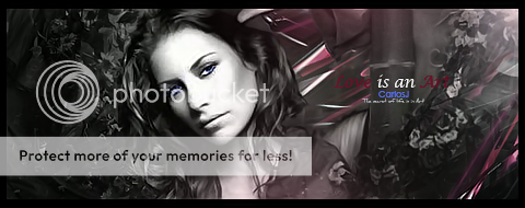
[Rate] My Background
Last edited by [Shon3m]; 03-03-2008 at 03:34 PM.
-
03-03-2008 #2Member

- Reputation
- 143
- Join Date
- Sep 2007
- Posts
- 656
- Thanks G/R
- 0/0
- Trade Feedback
- 0 (0%)
- Mentioned
- 0 Post(s)
- Tagged
- 0 Thread(s)
umm looks a bit strange with the url half hidden on the left hand side, (is that intentional or was it to hide the url of the website you got the wallpaper orignianlly from?)
the render on the left is quite poor quality and has lots of white around the edges which ruins it, otherwise i think the wallpaper is a bit basic and lacking effects but it is nice for a first atttempt, personally i'd rate it a 6/10 (maybe im being harsh because its not my kind of style though and also the render on the left lets it down a bit imo)
i would say to improve; if you want to keep the render the add a similar glow to it, this will hide the bad rendering and also fit the flow of the walpaper. make the url text readable as its half and half which doesnt really work:S and perhaps add some gradients to the background so its not a solid colour. but not bad at all if your new, just keep practising

Love isn't an emotion or an instinct - it is an Art
-
03-03-2008 #3Banned
![[Shon3m] is offline](https://www.ownedcore.com/forums/images/styles/OwnedCoreFX/statusicon/user-offline.png)
- Reputation
- 128
- Join Date
- Apr 2007
- Posts
- 669
- Thanks G/R
- 0/0
- Trade Feedback
- 0 (0%)
- Mentioned
- 0 Post(s)
- Tagged
- 0 Thread(s)
kk ty dude
-
03-03-2008 #4Contributor


- Reputation
- 119
- Join Date
- Oct 2006
- Posts
- 1,175
- Thanks G/R
- 0/0
- Trade Feedback
- 0 (0%)
- Mentioned
- 0 Post(s)
- Tagged
- 0 Thread(s)
The guy on the left is a bad cut, he has a white outline which makes it lil choppy

-
03-04-2008 #5Contributor


- Reputation
- 196
- Join Date
- Mar 2007
- Posts
- 960
- Thanks G/R
- 0/0
- Trade Feedback
- 0 (0%)
- Mentioned
- 0 Post(s)
- Tagged
- 0 Thread(s)
i don't really like the massive bright white skull, its kinda in your face. I always like to have a focal point when im making my backgrounds, the place that catches your eye.

-
03-04-2008 #6lol why u mad


- Reputation
- 374
- Join Date
- Sep 2006
- Posts
- 1,646
- Thanks G/R
- 3/1
- Trade Feedback
- 2 (100%)
- Mentioned
- 0 Post(s)
- Tagged
- 0 Thread(s)
As far as I can see, you just got wallpaper with that skull from somewhere and added that guy. Render has poor quality, and the URL sawks
 5/10, sorry.

-
03-04-2008 #7Banned
![[Shon3m] is offline](https://www.ownedcore.com/forums/images/styles/OwnedCoreFX/statusicon/user-offline.png)
- Reputation
- 128
- Join Date
- Apr 2007
- Posts
- 669
- Thanks G/R
- 0/0
- Trade Feedback
- 0 (0%)
- Mentioned
- 0 Post(s)
- Tagged
- 0 Thread(s)
no biggy this is a first :P
Similar Threads
-
Rate&CC. Background.
By Hysterical in forum Art & Graphic DesignReplies: 4Last Post: 09-09-2013, 09:11 AM -
[Showoff/Rate]Unreal Background
By sheepking in forum Art & Graphic DesignReplies: 0Last Post: 09-01-2008, 09:11 AM -
[showoff/rate]My Background picture i jsut made :D
By aznboy in forum Art & Graphic DesignReplies: 2Last Post: 06-05-2008, 04:50 PM -
[Show-off/Rate/Comment/Criticize] my newest background
By Anarchy [RD] in forum Art & Graphic DesignReplies: 4Last Post: 04-10-2008, 01:21 PM -
Damn drop rate
By LightWave in forum World of Warcraft GeneralReplies: 3Last Post: 10-20-2006, 03:36 PM
![[Rate] My Background](https://www.ownedcore.com/forums/images/styles/OwnedCoreFX/addimg/menu4.svg)

![[Rate] My Background](https://www.ownedcore.com/forums/./ocpbanners/1/2/9/8/0/2/2/01d9781faec8bfe3abf9095ac9e57d1e.jpg)
![TradeSafe Middleman [Rate] My Background](https://www.ownedcore.com/assets/mm/images/wits.png)
![CoreCoins [Rate] My Background](https://www.ownedcore.com/forums/images/styles/OwnedCoreFX/addimg/wicc.png)


 Reply With Quote
![[Rate] My Background](https://www.ownedcore.com/images/ba/g/b2.gif)


![[Rate] My Background](https://www.ownedcore.com/images/paybutton/paypal.png)
![[Rate] My Background](https://www.ownedcore.com/images/paybutton/skrill.png)
![[Rate] My Background](https://www.ownedcore.com/images/paybutton/payop.png)