![[Rate/Show-Off] Some new sigs i made](https://www.ownedcore.com/forums/images/styles/OwnedCoreFX/addimg/menu4.svg)
Title says it all... some new sigs that i made over the weekend....

![[Rate/Show-Off] Some new sigs i made](https://www.ownedcore.com/forums/../images/ba/9/top-1.gif)
![[Rate/Show-Off] Some new sigs i made](https://www.ownedcore.com/assets/mm/images/wits.png "TradeSafe Middleman")
![[Rate/Show-Off] Some new sigs i made](https://www.ownedcore.com/forums/images/styles/OwnedCoreFX/addimg/wicc.png "CoreCoins")

Shout-Out
User Tag List
Results 1 to 4 of 4
-
02-10-2008 #1
 Contributor

- Reputation
- 196
- Join Date
- Mar 2007
- Posts
- 960
- Thanks G/R
- 0/0
- Trade Feedback
- 0 (0%)
- Mentioned
- 0 Post(s)
- Tagged
- 0 Thread(s)
[Rate/Show-Off] Some new sigs i made

![[Rate/Show-Off] Some new sigs i made](https://www.ownedcore.com/images/ba/g/b2.gif)
-
02-10-2008 #2
Member
- Reputation
- 85
- Join Date
- May 2007
- Posts
- 314
- Thanks G/R
- 0/0
- Trade Feedback
- 0 (0%)
- Mentioned
- 0 Post(s)
- Tagged
- 0 Thread(s)

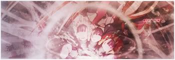
I like the first one, but the render and text is little hard to see.. But the second one is better blended, but the text is harder to read... Imo, the second is little to bright, but they both look very good, good job!
Rates:
1st: 8/10; Little to blended
2nd: 7/10; Better blended but text is hard to spot and it's too bright.
 I 'R' EPICNESS!
-
02-10-2008 #3
Contributor
- Reputation
- 196
- Join Date
- Mar 2007
- Posts
- 960
- Thanks G/R
- 0/0
- Trade Feedback
- 0 (0%)
- Mentioned
- 0 Post(s)
- Tagged
- 0 Thread(s)
wow that was quick to get a reply lol. I'm not too great with text
 . and when i tried to install some, my pooter stuffed up lol >.<
-
02-10-2008 #4
Banned
- Reputation
- 339
- Join Date
- Feb 2008
- Posts
- 431
- Thanks G/R
- 0/0
- Trade Feedback
- 0 (0%)
- Mentioned
- 0 Post(s)
- Tagged
- 0 Thread(s)
1st one is cool good work 8/10
2nd one 5/10


 Reply With Quote
Similar Threads
-
[Show-Off] Some New Work
By EviNion in forum Art & Graphic DesignReplies: 0Last Post: 07-04-2008, 12:05 AM -
[Show-off] My new sig by me :)
By mchugh in forum Art & Graphic DesignReplies: 11Last Post: 04-07-2008, 02:43 PM -
[Show-off] My new sig
By -xepher- in forum Art & Graphic DesignReplies: 5Last Post: 02-26-2008, 07:14 PM -
[Show-Off] My new sig
By -xepher- in forum Art & Graphic DesignReplies: 9Last Post: 02-23-2008, 05:59 AM -
[Show-Off] My new Sig. please comment.
By Cryt in forum Art & Graphic DesignReplies: 10Last Post: 01-07-2008, 04:30 AM
-
OwnedCore Forums
casino news World of Warcraft Pokemon GO MMO Overwatch RTS Casino reviews bc game bc game bc game bc game bc game bc game bc game bc game bc game bc game bc game bc game bc game bc game bc game bc game bc game bc game bc game bc game bc game bc game bc game bc game bc game bc game bc game bc game bc game bc game bc game bc game bc game bc game bc game bc game bc game bc game bc game bc game bc game bc game bc game bc game bc game bc game bc game bc game bc game bc game bc game -
casino
Casino Gambling Online casinos Casino en ligne bc game bc game bc game bc game bc game bc game bc game bc game bc game bc game bc game no deposit bonus codes roobet Top 10 Casinos Casino reviews Bitcoin casino Paypal Casino Lucky8 1xbit heycasino Bitstarz Casino - No ⭐ Lucky8 casino - ⭐ FatBoss Casino - ⭐Bet365 Casino - Best Best Online Casino ✅Mystake Casino - ✅Casinos en ligne - ✅Azur Casino - Bonus, ✅Royal Vegas Casino no -
CoreCoins
CoreCoins CoreCoins FAQ Shout-Out Banner Ads -
My OwnedCore
My Profile Notifications Settings Buy CoreCoins About Us


Privacy Policy | Cookie Policy | Terms | Contact Us
Available Payment Methods:-
![[Rate/Show-Off] Some new sigs i made](https://www.ownedcore.com/images/paybutton/paypal.png)
![[Rate/Show-Off] Some new sigs i made](https://www.ownedcore.com/images/paybutton/skrill.png)
![[Rate/Show-Off] Some new sigs i made](https://www.ownedcore.com/images/paybutton/payop.png)
-
Casino
Welcome Bonuses | Bovada casino | Casino Reviews | Oshi Casino | Casobet | ZenCasino | PalmSlots Casino | Dublinbet | InstantPay | Bc Game | Rollino Casino | USA CASINO | Drake Casino | Casino Bonus | Jackpotcity | Lucky8 | No deposit bonus | NeedForSpin | Crypto Casino | BitCasino | Casino | Bonus code | Lucky31 | Slot machines | BuzzLuck | Stake Casino | Bitstarz | Casino deposit offers | Sportsbook