![[Guide] Basic Do's and Dont's of GFX](https://www.ownedcore.com/forums/images/styles/OwnedCoreFX/addimg/menu4.svg)
Ok here is a basic run down on the basic Do's and Dont's of a GFX(Graphic) Artist.
This Guide is not to piss people off its just general things i see that need to be fixed, or should be fixed.
Lets begin.
Backrounds
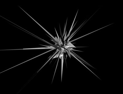
Ah this is a big one. The backround. The backround is NOT a C4D.
Example of a C4D:
This is one of the biggest mistakes i see new people make to GFX. It may look good but it holds you back and the editing can not be done as good.
A good back round is a Graniet Map, The Render it self, or a stock(a common picture)
Example of a Stock:
The Main Picture
The Main picture is the thing you want to focus on the most.
This can be a render or a stock, or maybe abstract.
Example of a Render:
Example of Stock as a main PictureFocus on Mario)
There are many things you can do to focus on the main picture if you are using a stock, cut around the main picture and you have your own render!
The C4D of the Sig
The C4D of a sig is important. You dont want color + a picture do you? You need some Action in there! The C4D holds power! Its like the Healer in a group, not much damage if holy but you need it to stay alive.
C4D as i have shown before looks funny but is very helpful.
Text and You
Text. I have seen many sigs where text just dont fit the picture. Text believe it or not has a characteristic. If your doing future, do a future theme text.
Example of Future Font:
Example of Font not Fitting:
Example of Good font Fitting
Size And You
With a Sig you dont want HUGE size, cause its distracting and shows you just dont care and are stupid.
Example of Bad Sig Size:
Example of Good Sig Size:
This is just a basic guide i didnt go into much detail.
I hope you enjoyed and learned a little:wave:

![[Guide] Basic Do's and Dont's of GFX](https://www.ownedcore.com/forums/./ocpbanners/1/0/6/3/8/1/6/1e102dbc1865060efdd7bf3ae1edf5cc.jpg)
![[Guide] Basic Do's and Dont's of GFX](https://www.ownedcore.com/assets/mm/images/wits.png "TradeSafe Middleman")
![[Guide] Basic Do's and Dont's of GFX](https://www.ownedcore.com/forums/images/styles/OwnedCoreFX/addimg/wicc.png "CoreCoins")

User Tag List
Results 1 to 13 of 13
-
01-26-2008 #1
 Angry 12yearolds FTL
- Reputation
- -3
- Join Date
- Oct 2007
- Posts
- 1,129
- Thanks G/R
- 0/0
- Trade Feedback
- 0 (0%)
- Mentioned
- 0 Post(s)
- Tagged
- 0 Thread(s)

[Guide] Basic Do's and Dont's of GFX
![[Guide] Basic Do's and Dont's of GFX](https://www.ownedcore.com/images/ba/g/b2.gif)
-
01-26-2008 #2
Member
- Reputation
- 11
- Join Date
- Nov 2007
- Posts
- 88
- Thanks G/R
- 0/0
- Trade Feedback
- 0 (0%)
- Mentioned
- 0 Post(s)
- Tagged
- 0 Thread(s)
What does C4D stand for?
Nice guide! Although I wanted to see a bigger guide, a little bit more advanced. Interested in making one? I want to know more about text fitting/chosing sicne I feel like I don't really am that good at chosing fotn and placing it "correctly" in the sig.
Keep the good work up!
Kind Regards,


Iamaids, got a problem with that?
-
01-26-2008 #3
Angry 12yearolds FTL
- Reputation
- -3
- Join Date
- Oct 2007
- Posts
- 1,129
- Thanks G/R
- 0/0
- Trade Feedback
- 0 (0%)
- Mentioned
- 0 Post(s)
- Tagged
- 0 Thread(s)
C4D: Cinematic Four Design
is a design used for effect.
I will make a more advance guide later today. This is mainly for beginners who just started and just want to try something. The New
Guide will branch into more depth in each category .
-
01-26-2008 #4
Member
- Reputation
- 11
- Join Date
- Nov 2007
- Posts
- 88
- Thanks G/R
- 0/0
- Trade Feedback
- 0 (0%)
- Mentioned
- 0 Post(s)
- Tagged
- 0 Thread(s)
Yay!
Will this guide be for Photoshop users mainly or? It seems like the most of all gfx artists are using Photoshop. I, however, use Corel Paint Shop Pro. It's somewhat different.
Btw:
And with Cinematic Four Design you can.. ? Always good to klnow what I'm missing out on or ought to start with.
Iamaids, got a problem with that?
-
01-26-2008 #5
Member
- Reputation
- 143
- Join Date
- Sep 2007
- Posts
- 656
- Thanks G/R
- 0/0
- Trade Feedback
- 0 (0%)
- Mentioned
- 0 Post(s)
- Tagged
- 0 Thread(s)
nice guide but as you are talking about 'c4d' it would be wise to correctly refer to it to avoid confusion. you like many people refer to an abstract 3d render as c4d, c4d is a program not the name of these things however it has been adopted by many as a name for them. and also i may be mistaken but i thought c4d stood for cinema 4d, not cinematic four design.
so aggiish if i am right about it being Cinema 4d some examples of what you could be making:

these are quite high quality pieces but your probably can get an idea of what you can create, with c4d you dont just create those preety abstract things you can actually create 3d objects, so tbh unless you are planning on making 3d images/designs theres no reason to get this product. but if you are interested heres a good site for tuts:
www.c4dcafe.com/
www.tutorialguide.net/3d_software/cinema_4d
but its not quick to get good pieces like shown above you will need to invest a lot of time into practicing.
so really hope this has helped you understand about what c4d actually is and thats its not just a term people use(and im preety sure its cinema 4d but i could be wrong so sorry)
-
01-26-2008 #6
Member
- Reputation
- 11
- Join Date
- Nov 2007
- Posts
- 88
- Thanks G/R
- 0/0
- Trade Feedback
- 0 (0%)
- Mentioned
- 0 Post(s)
- Tagged
- 0 Thread(s)
Still don't quite get the point of C4D. Is it necessary for making sigs or do you simply make 3D objects/pictures?
Iamaids, got a problem with that?
-
01-26-2008 #7
Member
- Reputation
- 143
- Join Date
- Sep 2007
- Posts
- 656
- Thanks G/R
- 0/0
- Trade Feedback
- 0 (0%)
- Mentioned
- 0 Post(s)
- Tagged
- 0 Thread(s)
the program C4D is for making 3d objects pictures which arent neccessary for sigs unless you want to particularly go down that style route (which not many do ) but C4D also let you create 'c4d' (abstract 3d renders)
like :
which are used alot in sigs, but these can be widely found, if you want some links i can give you some.
so in conclusion no you do not need C4D to make sigs, alot of people use 'c4d'(as a term the 3d abstract renders) in their sigs and very few make 3d images to use in their sigs. if you do feel like using 'c4d' in your sigs you can make them yourself with C4D or just download them, thats the only uses you would have with the program sig wise i think
hope that cleared it up a bit better than before, if you have more questions that i didnt make clear please say and il try help a bit better
note i use C4D to refer to Cinema 4D and 'c4d' to refer to the term that many use for the 3d abstract renders as pictured aboveLast edited by CarlosJ; 01-26-2008 at 05:09 PM.
-
01-26-2008 #8
Angry 12yearolds FTL
- Reputation
- -3
- Join Date
- Oct 2007
- Posts
- 1,129
- Thanks G/R
- 0/0
- Trade Feedback
- 0 (0%)
- Mentioned
- 0 Post(s)
- Tagged
- 0 Thread(s)
Thank you Carlosj.
Ill show you some sig examples with C4D

See his shoulders thats C4D

Same thing here

Everything here but Text and the white eraser is C4D
-
01-26-2008 #9
Contributor

- Reputation
- 196
- Join Date
- Mar 2007
- Posts
- 960
- Thanks G/R
- 0/0
- Trade Feedback
- 0 (0%)
- Mentioned
- 0 Post(s)
- Tagged
- 0 Thread(s)
man im all confused, i dunno what people are talking about when they say c4d, coz i've used c4d to make renders. But when people are saying c4d but it has a different meaning, i'm completely lost...
Most people don't go into C4d and make renders because it's too time consuming and it isn't easy. Also if you start up a sig service, it'll take ages to get through all of the people lol

-
01-27-2008 #10
Member
- Reputation
- 143
- Join Date
- Sep 2007
- Posts
- 656
- Thanks G/R
- 0/0
- Trade Feedback
- 0 (0%)
- Mentioned
- 0 Post(s)
- Tagged
- 0 Thread(s)
Originally Posted by Piersd
Thats the problem exactly, so many are using the term 'c4d' to refer to any 3d abstract render, this is wrong. C4D is a program, in this program you can make these '3d abstract renders' but you can also do it in other programs.
when people say c4d they are meaning a 3d abstract render, although this is wrong this has been commonly adapted and used by many so now people new to graphics know no difference.
so the real meaning of C4D is: a program called Cinema 4D in which you can make 3d abstract renders amongst other things
the adopted meaning of c4d is: a 3d abstract render
i hope that makes it a bit clearer, really sorry if it doesnt i'm not the best for explaining
-
01-27-2008 #11
 !!jeULyJf8ld1

- Reputation
- 538
- Join Date
- Feb 2007
- Posts
- 2,254
- Thanks G/R
- 0/1
- Trade Feedback
- 0 (0%)
- Mentioned
- 0 Post(s)
- Tagged
- 0 Thread(s)
 I agree that the font fits the sig pretty much, but the border suxxx so hard that I lol'dOriginally Posted by Reknown
 19/5/2013
-
01-27-2008 #12
Member
- Reputation
- 11
- Join Date
- Nov 2007
- Posts
- 88
- Thanks G/R
- 0/0
- Trade Feedback
- 0 (0%)
- Mentioned
- 0 Post(s)
- Tagged
- 0 Thread(s)
I say a render is a render, doesn't matter if its "C4D"/abstract 3D render, as long as it's useable in a sig I'll use it.
Iamaids, got a problem with that?
-
01-27-2008 #13
Contributor
- Reputation
- 196
- Join Date
- Mar 2007
- Posts
- 960
- Thanks G/R
- 0/0
- Trade Feedback
- 0 (0%)
- Mentioned
- 0 Post(s)
- Tagged
- 0 Thread(s)
Thanks for clearing it up Carlosj
I agree with aggiishOriginally Posted by aggiish


 Reply With Quote
Similar Threads
-
[Guide] Basic and advanced RAIDING.
By [Ban Hammer] in forum World of Warcraft GuidesReplies: 31Last Post: 06-21-2009, 06:39 PM -
Guide: How to Host and Use a Signature!
By lag in forum Art & Graphic DesignReplies: 4Last Post: 05-07-2007, 03:11 AM -
[Guide] Basic DBC Table Review
By Fault in forum WoW ME Tools & GuidesReplies: 4Last Post: 12-02-2006, 04:36 AM -
8 World of Warcraft Guide Packs (Gold, Profs and Skills)
By Matt in forum World of Warcraft GuidesReplies: 17Last Post: 09-23-2006, 10:53 AM -
Gain Honor and dont do BG!
By baldydude in forum World of Warcraft ExploitsReplies: 8Last Post: 08-30-2006, 05:55 AM
-
OwnedCore Forums
casino news World of Warcraft Pokemon GO MMO Overwatch RTS Casino reviews www.planet-casino.com lucky 8 lucky8 no deposit codes bc game bc game lucky8 -
casino
Casino Gambling Online casinos Casino en ligne bc game bc game bc game no deposit bonus codes roobet Top 10 Casinos Casino reviews Bitcoin casino Paypal Casino Lucky8 1xbit heycasino Looking for Wow Phishing This is NOT a Scam just Giving away 20+ 44 Rogue, US EU Gamecard Giveaway Need help finding a proxy LF someone to make me a Need a Gametime Card. [ -
CoreCoins
CoreCoins CoreCoins FAQ Shout-Out Banner Ads -
My OwnedCore
My Profile Notifications Settings Buy CoreCoins About Us


Privacy Policy | Cookie Policy | Terms | Contact Us
Available Payment Methods:-
![[Guide] Basic Do's and Dont's of GFX](https://www.ownedcore.com/images/paybutton/paypal.png)
![[Guide] Basic Do's and Dont's of GFX](https://www.ownedcore.com/images/paybutton/skrill.png)
![[Guide] Basic Do's and Dont's of GFX](https://www.ownedcore.com/images/paybutton/payop.png)