![[Signature]- First one I kinda made](https://www.ownedcore.com/forums/images/styles/OwnedCoreFX/addimg/menu4.svg)
Heres my new signature. Its my first one. That i think is good.
Like it?
On a scale of 1-10 what would you rate it. Rate it by like 10/10 or 1/10

![[Signature]- First one I kinda made](https://www.ownedcore.com/forums/./ocpbanners/1/2/9/8/0/2/2/01d9781faec8bfe3abf9095ac9e57d1e.jpg)
![[Signature]- First one I kinda made](https://www.ownedcore.com/assets/mm/images/wits.png "TradeSafe Middleman")
![[Signature]- First one I kinda made](https://www.ownedcore.com/forums/images/styles/OwnedCoreFX/addimg/wicc.png "CoreCoins")

Shout-Out
User Tag List
Results 1 to 3 of 3
-
01-19-2008 #1
 Banned
- Reputation
- 16
- Join Date
- Dec 2007
- Posts
- 94
- Thanks G/R
- 0/0
- Trade Feedback
- 0 (0%)
- Mentioned
- 0 Post(s)
- Tagged
- 0 Thread(s)


[Signature]- First one I kinda made

Need some powerleveling at low prices?
For powerleveling at low prices click this link: https://www.mmowned.com/forums/servi...g-service.html
We offer secure powerleveling. No account info leaks!
![[Signature]- First one I kinda made](https://www.ownedcore.com/images/ba/g/b2.gif)
-
01-19-2008 #2
Contributor

- Reputation
- 122
- Join Date
- Oct 2006
- Posts
- 601
- Thanks G/R
- 0/0
- Trade Feedback
- 0 (0%)
- Mentioned
- 0 Post(s)
- Tagged
- 0 Thread(s)
i think it should be 6/10
Pals 4 Life
-
01-20-2008 #3
Member
- Reputation
- 143
- Join Date
- Sep 2007
- Posts
- 656
- Thanks G/R
- 0/0
- Trade Feedback
- 0 (0%)
- Mentioned
- 0 Post(s)
- Tagged
- 0 Thread(s)
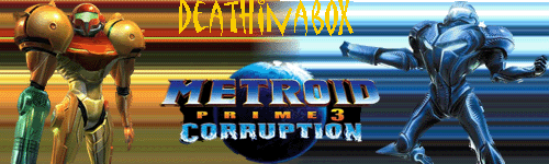
6.5/10
reason not 7 is because the meteroid render looks cool but would have been better if you had tried yourself. but i like how the yellow and blue backgrounds blend together but stil look seperate and as though they should be like that. the text isnt the best though, its placed a bit far up and the yellow colour blends a bit to much with the yellow side of the sig.
looking at a lot of your sigs you are using that same stretch effect of the render as the background, al though it may look good and have its uses try to move a way from it and try other styles of backgrounds so you have more variety in your work

 Reply With Quote
Similar Threads
-
[Showoff] Quick Signature I made. First one.
By vuth in forum Art & Graphic DesignReplies: 2Last Post: 09-28-2009, 05:34 PM -
[Signature] First one
By MuffinVendor in forum Art & Graphic DesignReplies: 2Last Post: 12-21-2008, 06:14 AM -
[Signature] My first one!
By dUcKyDrEaMeRx3 in forum Art & Graphic DesignReplies: 7Last Post: 12-20-2008, 05:14 PM -
[Show-Off]The first sig you ever made!
By Trucido in forum Art & Graphic DesignReplies: 21Last Post: 12-05-2007, 05:51 AM -
Old IF Video! My first one I made!
By ghost681 in forum World of Warcraft ExplorationReplies: 6Last Post: 11-11-2007, 02:47 PM
-
OwnedCore Forums
casino news World of Warcraft Pokemon GO MMO Overwatch RTS Casino reviews bc game bc game -
casino
Casino Gambling Online casinos Casino en ligne vercel livescore bc game lovable vercel bc game no deposit bonus codes stake Top 10 Casinos Casino reviews Bitcoin casino Lucky8 1xbit heycasino Need someone to [US] Wotlk giveaway 2 80s Any account Phisher, not blue but Help with an account! [US] Account Giveaway Steam Account Phisher ive scamed a lot, and im So I tried Phishing.... -
CoreCoins
CoreCoins CoreCoins FAQ Shout-Out Banner Ads -
My OwnedCore
My Profile Notifications Settings Buy CoreCoins About Us


Privacy Policy | Cookie Policy | Terms | Contact Us
Available Payment Methods:-
![[Signature]- First one I kinda made](https://www.ownedcore.com/images/paybutton/paypal.png)
![[Signature]- First one I kinda made](https://www.ownedcore.com/images/paybutton/skrill.png)
![[Signature]- First one I kinda made](https://www.ownedcore.com/images/paybutton/payop.png)
-
Casino
HashLucky Casino | stake | mystake | travel advantage | CryptoRoyal Casino | here | Aviator game casino | iLucki Casino | mwr life | Shuffle Casino | MRQ Casino | mwr | canada | Free casino games | Bitstarz Tournament | Mirax Casino | Blockchain gambling | X | freebet tanpa | Instant Payout Methods | stake | Top 5 canadian online casinos 2025