
Ah, thank's, good thing I have thatOriginally Posted by Remah
.


Shout-Out
User Tag List
Thread: Show-off thread
Results 586 to 600 of 709
-
11-23-2007 #586
 Contributor

- Reputation
- 218
- Join Date
- Sep 2007
- Posts
- 604
- Thanks G/R
- 0/0
- Trade Feedback
- 0 (0%)
- Mentioned
- 0 Post(s)
- Tagged
- 0 Thread(s)
Re: Show-off thread

-
11-23-2007 #587
Active Member

- Reputation
- 38
- Join Date
- Mar 2007
- Posts
- 190
- Thanks G/R
- 0/0
- Trade Feedback
- 0 (0%)
- Mentioned
- 0 Post(s)
- Tagged
- 0 Thread(s)
Re: Show-off thread
Or you could make ur own from stock photos, i think ima make a tut how to cut a render.

-
11-23-2007 #588
Member
- Reputation
- 20
- Join Date
- Aug 2007
- Posts
- 87
- Thanks G/R
- 0/0
- Trade Feedback
- 0 (0%)
- Mentioned
- 0 Post(s)
- Tagged
- 0 Thread(s)
Re: Show-off thread
My first try at a grunge sig :>
What do you think?

-
11-23-2007 #589
Member
- Reputation
- 6
- Join Date
- Jul 2007
- Posts
- 99
- Thanks G/R
- 0/0
- Trade Feedback
- 0 (0%)
- Mentioned
- 0 Post(s)
- Tagged
- 0 Thread(s)


Re: Show-off thread
Flow is off, lighting is bad, and I hate those dots and square things.Originally Posted by Xarv
Gfx

-
11-23-2007 #590
( ͡° ͜ʖ ͡°)

- Reputation
- 444
- Join Date
- Nov 2007
- Posts
- 1,591
- Thanks G/R
- 7/5
- Trade Feedback
- 0 (0%)
- Mentioned
- 0 Post(s)
- Tagged
- 0 Thread(s)

Re: Show-off thread
Nothing good to say? Oh well...Originally Posted by .pwn
-
11-23-2007 #591
Member
- Reputation
- 6
- Join Date
- Jul 2007
- Posts
- 99
- Thanks G/R
- 0/0
- Trade Feedback
- 0 (0%)
- Mentioned
- 0 Post(s)
- Tagged
- 0 Thread(s)
Re: Show-off thread
Well, you didnt even say anything about mine...Originally Posted by Bikeraman
Gfx
-
11-23-2007 #592
Member
- Reputation
- 20
- Join Date
- Aug 2007
- Posts
- 87
- Thanks G/R
- 0/0
- Trade Feedback
- 0 (0%)
- Mentioned
- 0 Post(s)
- Tagged
- 0 Thread(s)
Re: Show-off thread
Doesn't mean you can't say anything good about mine :P but thanks for the comment
Atleast I know what to work on :P
-
11-23-2007 #593
Contributor
- Reputation
- 196
- Join Date
- Mar 2007
- Posts
- 960
- Thanks G/R
- 0/0
- Trade Feedback
- 0 (0%)
- Mentioned
- 0 Post(s)
- Tagged
- 0 Thread(s)
Re: Show-off thread
Xarv i like it, but the text doesn't seem to fit in (that's just my opinion).
Anyways heres two of my sigs that i made the other day. (i didn't use any brushes on the green one )
)


Tried to make a sort of vector type thing. Turns out that i needed some of those 4k gradients Phase has

-
11-24-2007 #594
Member
- Reputation
- 93
- Join Date
- Apr 2007
- Posts
- 447
- Thanks G/R
- 0/0
- Trade Feedback
- 0 (0%)
- Mentioned
- 0 Post(s)
- Tagged
- 0 Thread(s)
Re: Show-off thread
they're pretty rad man, tell me what you think of my first matte painting
Before
 After
After
Last edited by Bob_Magic; 11-24-2007 at 06:04 AM.

-
11-24-2007 #595
Member
- Reputation
- 655
- Join Date
- Jul 2007
- Posts
- 700
- Thanks G/R
- 0/0
- Trade Feedback
- 0 (0%)
- Mentioned
- 0 Post(s)
- Tagged
- 0 Thread(s)
Re: Show-off thread
Good start Bob, but immediatly the temple sticks out, You need to change the hue and saturation of that definitely. The reflection is working well, but possibly a tad strong. Just adjust the opacity of that see if it improves. The fog is good around the mountain but not the temple, looks out of place around the temple.
Very good start mate but also think what your trying to achieve, think of the whole round mood, the atmosphere your going for.
Becuase then you need to think of changing the sky, filters etc..
But great start!
- Puff
-
11-24-2007 #596
Member
- Reputation
- 93
- Join Date
- Apr 2007
- Posts
- 447
- Thanks G/R
- 0/0
- Trade Feedback
- 0 (0%)
- Mentioned
- 0 Post(s)
- Tagged
- 0 Thread(s)
Re: Show-off thread
thanks man, i've never done it before, still a work in progress
-
11-24-2007 #597
Member
- Reputation
- 655
- Join Date
- Jul 2007
- Posts
- 700
- Thanks G/R
- 0/0
- Trade Feedback
- 0 (0%)
- Mentioned
- 0 Post(s)
- Tagged
- 0 Thread(s)
Re: Show-off thread
Oh lol sorry i didnt notice that all you've chaged is the temple, its quite an odd photo to minipulate really. But good start keep at it!
-
11-24-2007 #598
Member
- Reputation
- 93
- Join Date
- Apr 2007
- Posts
- 447
- Thanks G/R
- 0/0
- Trade Feedback
- 0 (0%)
- Mentioned
- 0 Post(s)
- Tagged
- 0 Thread(s)
Re: Show-off thread
yeah i thought i would challenge myself with a reflection render, here is another example give me some more criticisms
-
11-24-2007 #599
Member
- Reputation
- 93
- Join Date
- Apr 2007
- Posts
- 447
- Thanks G/R
- 0/0
- Trade Feedback
- 0 (0%)
- Mentioned
- 0 Post(s)
- Tagged
- 0 Thread(s)
Re: Show-off thread
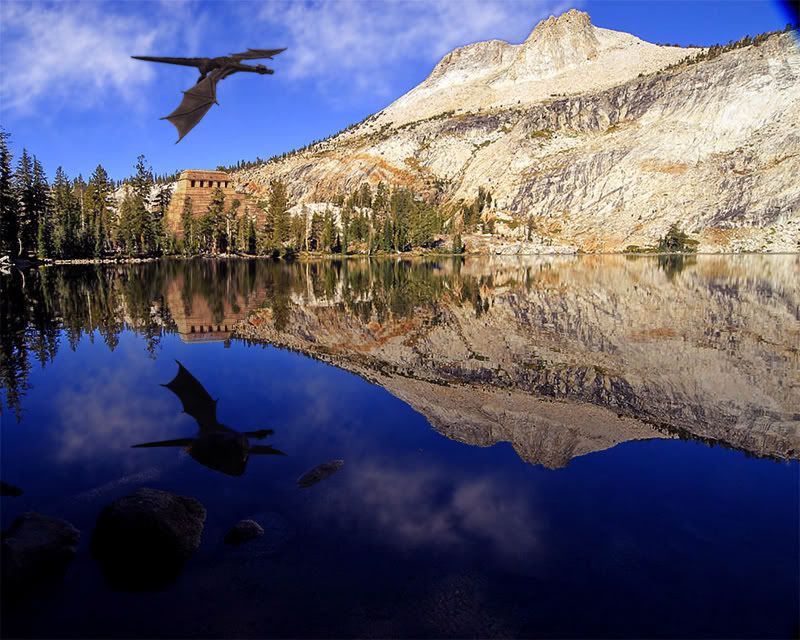
I thought that the 3d dragon may have been a bit much, he stands out a bit, but this time i tried alot harder to get the tempel to blend.
-
11-24-2007 #600
Member
- Reputation
- 655
- Join Date
- Jul 2007
- Posts
- 700
- Thanks G/R
- 0/0
- Trade Feedback
- 0 (0%)
- Mentioned
- 0 Post(s)
- Tagged
- 0 Thread(s)
Re: Show-off thread
Yeah no matter what the dragon will be a hard task to make it look liek its really 'there' but that will come with experience. The Temple looks ALOT better mate well done, you just need to tweak it as to me it looks abit to perfect, but it could be the look your going for.
Well done though, great to see people getting into It (Y)
- Puff

 Reply With Quote
Similar Threads
-
Show off Thread
By stoneharry in forum World of Warcraft Emulator ServersReplies: 3Last Post: 05-27-2013, 06:10 PM -
[Show Off] Snakehead's Modeling Thread
By Snakehead in forum World of Warcraft Model EditingReplies: 53Last Post: 01-11-2009, 07:06 AM -
Show off your avatar!
By Apocalyptic_Hunter in forum World of Warcraft GeneralReplies: 7Last Post: 12-07-2006, 01:32 PM -
Show Off Ur Sig Skills
By fasck in forum Community ChatReplies: 9Last Post: 08-09-2006, 04:23 PM
-
OwnedCore Forums
casino news World of Warcraft Pokemon GO MMO Overwatch RTS Casino reviews www.planet-casino.com sportbetworld no deposit codes bc game bc game -
casino
Casino Gambling Online casinos Casino en ligne bc game bc game bc game no deposit bonus codes roobet Top 10 Casinos Casino reviews Bitcoin casino Paypal Casino Lucky8 1xbit heycasino Glider help Free Season 3 shaman / Website scam Frozen account Need Help with an Pretty much blank Good spam service? Tube Increaser? Need help with scam. -
CoreCoins
CoreCoins CoreCoins FAQ Shout-Out Banner Ads -
My OwnedCore
My Profile Notifications Settings Buy CoreCoins About Us


Privacy Policy | Cookie Policy | Terms | Contact Us
Available Payment Methods:-


-
Casino
mwrlife | Aviator game casino | here | mwr life | Free casino games | travel advantage | Top 5 canadian online casinos 2025 | mystake | travel advantage | mwr life | mwr | Instant Payout Methods | iLucki Casino | here | mwr | mwr life | Mirax Casino | canada | travel advantage | MRQ Casino | Bitstarz Tournament | CryptoRoyal Casino | mwr life | mwr | freebet tanpa | mwr | travel advantage | mwr | Shuffle Casino | Blockchain gambling | HashLucky Casino | travel advantage