
I finally managed to make my Photoshop work so after a months break I made some new sigs
Ok, I don't really like the first one but it still looks decent imo.
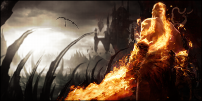
I tried to achieve nice lightning and depth in the second one. How should I change it to make it look more natural?
Constructive criticism would be really appreciated.


Shout-Out
User Tag List
Results 1 to 9 of 9
-
07-16-2011 #1
 Active Member

- Reputation
- 59
- Join Date
- Jul 2010
- Posts
- 189
- Thanks G/R
- 0/0
- Trade Feedback
- 0 (0%)
- Mentioned
- 0 Post(s)
- Tagged
- 0 Thread(s)

Crysis and Half Life 2 signatures
~OhMaiGawdGFX on deviantART

-
07-16-2011 #2
 Sergeant
- Reputation
- 22
- Join Date
- Jul 2011
- Posts
- 43
- Thanks G/R
- 0/0
- Trade Feedback
- 0 (0%)
- Mentioned
- 0 Post(s)
- Tagged
- 0 Thread(s)

The first one lacks a bit of the fundamental aspects of a signature, but you could easily correct that, if you still had the .psd.
In the second one you managed to get the lighting, focal and depth fairly good. Some reposition of the render and text would make it follow the rules of thirds better, but looking apart from that, I think it's fairly good.
One thing I just had to criticize though, is the use of topaz on the signature. Topaz can be good to some extent, but it's just so easy to overuse. So I would suggest removing the topaz completely or only have a minimum amount of it. I actually kinda like it on the background though, maybe a bit less there. But the render is just ruined by it, in my opinion.
Correct some minor things, and both signatures can turn out pretty good.
-
07-16-2011 #3
 Bawx Lurker


- Reputation
- 351
- Join Date
- Oct 2009
- Posts
- 769
- Thanks G/R
- 2/0
- Trade Feedback
- 1 (100%)
- Mentioned
- 0 Post(s)
- Tagged
- 0 Thread(s)
the crysis one is good but could use a few changes to the lighting otherwise good job.
keep up the work, good to see more activity in this section
Last edited by shadowsx; 07-16-2011 at 01:08 PM.

-
07-16-2011 #4
 Legendary

- Reputation
- 624
- Join Date
- Feb 2007
- Posts
- 1,760
- Thanks G/R
- 0/1
- Trade Feedback
- 0 (0%)
- Mentioned
- 0 Post(s)
- Tagged
- 0 Thread(s)
I think that the Crysis one will look better if you made the signature's hight a little smaller.
And the first one is a little emty imo, there's so much more that you can do with it to make it look better. But next to that I do like the text and I think that you're making some good progress

-------------------------------------------
Retired Model Editor - Graphic Designer - Cameraman - Video Editor
Flamewalker.deviantart.com / youtube.com/redmammothproduction
-
07-17-2011 #5
Active Member
- Reputation
- 59
- Join Date
- Jul 2010
- Posts
- 189
- Thanks G/R
- 0/0
- Trade Feedback
- 0 (0%)
- Mentioned
- 0 Post(s)
- Tagged
- 0 Thread(s)
Thanks for the comments
Ok I got rid of topaz on the render but kept it on the background. I also made some minor changes to lightning.
Villadsen where should I put the render to follow rule of thirds better? I tried to reposition it but I didn't find any spots where it looked better.
Gawdlaw I made some attempts to lower it atleast to 400x140 and I somehow always failed to recreate the background - it was all to "crowded".
Ok here is my second attempt:

Lol I had to upload this sig like 10 times - every time I uploaded it I found a minor mistake and had to correct it ^^
~OhMaiGawdGFX on deviantART
-
07-17-2011 #6
Sergeant
- Reputation
- 22
- Join Date
- Jul 2011
- Posts
- 43
- Thanks G/R
- 0/0
- Trade Feedback
- 0 (0%)
- Mentioned
- 0 Post(s)
- Tagged
- 0 Thread(s)
That looks much better in my opinion. Sadly, the background still would do better with a little less topaz, especially after you removed it from the render.
-
07-18-2011 #7
Legendary
- Reputation
- 624
- Join Date
- Feb 2007
- Posts
- 1,760
- Thanks G/R
- 0/1
- Trade Feedback
- 0 (0%)
- Mentioned
- 0 Post(s)
- Tagged
- 0 Thread(s)
Still looks better imo =)

-------------------------------------------
Retired Model Editor - Graphic Designer - Cameraman - Video Editor
Flamewalker.deviantart.com / youtube.com/redmammothproduction
-
07-18-2011 #8
Active Member
- Reputation
- 59
- Join Date
- Jul 2010
- Posts
- 189
- Thanks G/R
- 0/0
- Trade Feedback
- 0 (0%)
- Mentioned
- 0 Post(s)
- Tagged
- 0 Thread(s)
I can't believe how I always complicate things - I tried several different positions but I never just cut the highest part ^^Originally Posted by Gawdlaw
You were right, its better now

~OhMaiGawdGFX on deviantART
-
07-18-2011 #9
 Legendary
- Reputation
- 783
- Join Date
- Mar 2008
- Posts
- 3,377
- Thanks G/R
- 1/2
- Trade Feedback
- 0 (0%)
- Mentioned
- 0 Post(s)
- Tagged
- 0 Thread(s)
Definitely. Too much space above one's head is never good, whether it is in photography or digital art. It is better to trim of parts of the head than to leave too much space.Originally Posted by Gawdlaw
Freelance Digital Artist
https://reflectionartwork.deviantart.com
You did not desert me
My brothers in arms


 Reply With Quote
Similar Threads
-
[Selling] Steam account / half-life, Crysis, Burnout, GTA 4, Hitman, ... etc
By Ahim in forum General Trading Buy Sell TradeReplies: 2Last Post: 05-13-2012, 10:22 AM -
[Selling] Steam Account w/ Black Ops, CSS, and 3 game Half-Life package
By IceMake in forum General Trading Buy Sell TradeReplies: 8Last Post: 08-27-2011, 08:23 PM -
[WTS] Half Life 2 and Half Life 2 episode 1
By Viter in forum Members Only Accounts And CD Keys Buy SellReplies: 0Last Post: 04-25-2009, 12:58 PM -
Half Life 2 - Easter Eggs and Beyond
By Glynbeard in forum Gaming ChatReplies: 0Last Post: 11-04-2007, 09:51 AM -
from the makers of half life, check out this video
By coffee in forum Gaming ChatReplies: 2Last Post: 08-15-2006, 12:13 AM
-
OwnedCore Forums
casino news World of Warcraft Pokemon GO MMO Overwatch RTS Casino reviews www.planet-casino.com lucky 8 lucky8 no deposit codes bc game bc game lucky8 -
casino
Casino Gambling Online casinos Casino en ligne bc game bc game bc game no deposit bonus codes roobet Top 10 Casinos Casino reviews Bitcoin casino Paypal Casino Lucky8 1xbit heycasino Having some Problems How to get an account Is an account 100% safe help taking an inactive [US] Wotlk giveaway Giving away US Rogue U.S. Scamming account, 3 Accounts. (2 frozen) Seeing How Much Gold You -
CoreCoins
CoreCoins CoreCoins FAQ Shout-Out Banner Ads -
My OwnedCore
My Profile Notifications Settings Buy CoreCoins About Us


Privacy Policy | Cookie Policy | Terms | Contact Us
Available Payment Methods:-


