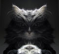
Redesigned the old one. Looked fine before I traced over it, but I had to make it darker because it is on the back of an english worksheet and it wouldn't scan properly. I don't have a steady hand so it looks ****ed now. Whomp.
Still planning on turning this into a vector/vexel art piece one day, I'm just not at the skill level to do so while making it look appealing.
*I know, the K looks very top-heavy, nothing I can do about it now. Also trying to think of something else I could do where the circles are, because it feels too left-sided without it, but they aren't the best.
Original Post.
-----------------------------------------------------------------------------------------------------------------------------
Just something I started doodling during my java class, decided to shade it in when i got home, and scan it up to the computer.
I plan on turning it into a vectorized typography when I get the chance, only traced the M and tail so far.
[spoiler][/spoiler]
The piranha plant from Mario got a little bit messed up cause of the dullness of my pencil's tip =/
Lemme know what you think.
Shout-Out
User Tag List
Thread: [Doodle] Typography Drawing
Results 1 to 7 of 7
-
10-10-2010 #1Contributor


- Reputation
- 121
- Join Date
- Aug 2008
- Posts
- 605
- Thanks G/R
- 0/0
- Trade Feedback
- 0 (0%)
- Mentioned
- 0 Post(s)
- Tagged
- 0 Thread(s)
[Doodle] Typography Drawing
Last edited by Sneakylemons; 05-29-2011 at 10:18 AM.
I WAS DRILL ROLLED BY GZ. AND I LOVED IT.

-
10-10-2010 #2
 Former Staff


- Reputation
- 705
- Join Date
- Dec 2007
- Posts
- 1,793
- Thanks G/R
- 7/8
- Trade Feedback
- 60 (100%)
- Mentioned
- 0 Post(s)
- Tagged
- 0 Thread(s)
I actually cant wait to see the vectorized version.
-
10-11-2010 #3Contributor


- Reputation
- 91
- Join Date
- Feb 2008
- Posts
- 1,103
- Thanks G/R
- 0/1
- Trade Feedback
- 0 (0%)
- Mentioned
- 0 Post(s)
- Tagged
- 0 Thread(s)
Looking good mate. Photoshop that up!

 Death to all but Metal.
-
10-11-2010 #4I AM 100$ SERIOUS


- Reputation
- 525
- Join Date
- Oct 2006
- Posts
- 1,122
- Thanks G/R
- 0/1
- Trade Feedback
- 1 (100%)
- Mentioned
- 0 Post(s)
- Tagged
- 0 Thread(s)
would you mind if i make it 3d for fun?

-
05-29-2011 #5Contributor


- Reputation
- 121
- Join Date
- Aug 2008
- Posts
- 605
- Thanks G/R
- 0/0
- Trade Feedback
- 0 (0%)
- Mentioned
- 0 Post(s)
- Tagged
- 0 Thread(s)
Sure, I guess. If you don't mind though, just give a link to the original drawing.
-----------------------------------------
Updated .I WAS DRILL ROLLED BY GZ. AND I LOVED IT.

-
05-29-2011 #6
 Bawx Lurker


- Reputation
- 351
- Join Date
- Oct 2009
- Posts
- 769
- Thanks G/R
- 2/0
- Trade Feedback
- 1 (100%)
- Mentioned
- 0 Post(s)
- Tagged
- 0 Thread(s)
i think the K looks good as is

-
05-29-2011 #7Contributor


- Reputation
- 121
- Join Date
- Aug 2008
- Posts
- 605
- Thanks G/R
- 0/0
- Trade Feedback
- 0 (0%)
- Mentioned
- 0 Post(s)
- Tagged
- 0 Thread(s)
I plan on making the bottom half of it come out more and moving the E over a bit so that it is semi-behind it, that way the K looks normal and still drips down onto the E.
Last edited by Sneakylemons; 05-29-2011 at 12:05 PM.
I WAS DRILL ROLLED BY GZ. AND I LOVED IT.

Similar Threads
-
I tried to draw a goat.
By Parog in forum Screenshot & Video ShowoffReplies: 11Last Post: 11-18-2007, 05:45 AM -
Zukassi Karlov's Drawing guide (Anime Style): Blood Elf Male
By karlov in forum Art & Graphic DesignReplies: 5Last Post: 11-11-2007, 05:54 PM -
Offensive Drawing!!! (extremely nice if you ask me!)
By latruwski in forum Screenshot & Video ShowoffReplies: 7Last Post: 11-07-2007, 09:07 PM -
PMap, draw your glider profiles!
By MLT in forum World of Warcraft Bots and ProgramsReplies: 10Last Post: 08-30-2007, 03:06 PM -
Increase 'draw' range? (graphic improvements)
By Toldorn in forum World of Warcraft GeneralReplies: 0Last Post: 01-11-2007, 08:07 PM
![[Doodle] Typography Drawing](https://www.ownedcore.com/forums/images/styles/OwnedCoreFX/addimg/menu4.svg)

![[Doodle] Typography Drawing](https://www.ownedcore.com/forums/./ocpbanners/1/2/9/8/0/2/2/01d9781faec8bfe3abf9095ac9e57d1e.jpg)
![TradeSafe Middleman [Doodle] Typography Drawing](https://www.ownedcore.com/assets/mm/images/wits.png)
![CoreCoins [Doodle] Typography Drawing](https://www.ownedcore.com/forums/images/styles/OwnedCoreFX/addimg/wicc.png)


 Reply With Quote
![[Doodle] Typography Drawing](https://www.ownedcore.com/images/ba/g/b2.gif)


![[Doodle] Typography Drawing](https://www.ownedcore.com/images/paybutton/paypal.png)
![[Doodle] Typography Drawing](https://www.ownedcore.com/images/paybutton/skrill.png)
![[Doodle] Typography Drawing](https://www.ownedcore.com/images/paybutton/payop.png)