![[Small gallery] Just some GFX I have done :)](https://www.ownedcore.com/forums/images/styles/OwnedCoreFX/addimg/menu4.svg)
Hey guys, i will be showing all of my work here. I will keep updating if i do something that is worth showing.
[Something i made for a Runescape private server]
[This is also something i made for a Runscape private server]


![[Small gallery] Just some GFX I have done :)](https://www.ownedcore.com/forums/./ocpbanners/1/2/9/8/0/2/2/01d9781faec8bfe3abf9095ac9e57d1e.jpg)
![[Small gallery] Just some GFX I have done :)](https://www.ownedcore.com/assets/mm/images/wits.png "TradeSafe Middleman")
![[Small gallery] Just some GFX I have done :)](https://www.ownedcore.com/forums/images/styles/OwnedCoreFX/addimg/wicc.png "CoreCoins")

Shout-Out
User Tag List
Results 1 to 15 of 55
-
09-29-2010 #1
 Sergeant
- Reputation
- 13
- Join Date
- Sep 2010
- Posts
- 62
- Thanks G/R
- 0/0
- Trade Feedback
- 0 (0%)
- Mentioned
- 0 Post(s)
- Tagged
- 0 Thread(s)

[Small gallery] Just some GFX I have done :)
Last edited by iFrosty; 10-07-2010 at 08:17 AM.
[RIGHT]
![[Small gallery] Just some GFX I have done :)](https://www.ownedcore.com/images/ba/g/b2.gif)
-
09-29-2010 #2
 Legendary

- Reputation
- 783
- Join Date
- Mar 2008
- Posts
- 3,377
- Thanks G/R
- 1/2
- Trade Feedback
- 0 (0%)
- Mentioned
- 0 Post(s)
- Tagged
- 0 Thread(s)
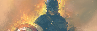
Love the first signature though I feel it's a bit pale. Some saturation would really make the orange pop in a fiery sort of way.
Second one is interesting as well. Topaz is overused and frankly not so nice looking in my opinion.
Third and fourth are both decent, the random light sources at the bottom really don't go along well with the rest. I prefer the purple version.
The fifth is interesting, but I can't really tell what it's supposed to be. The circles in the background could be a bit more blurred as it's further away but it really doesn't appear to be.
Number six: Again, those lines are overused as with the topaz and therefore not the best choice for a signature (or any other piece for that matter).
Number seven is a bit too chaotic for my taste, it would've worked very well with a simple depth of field or a peaceful type of signature.
I'm guessing the last three is relatively old as I'm not a fan of either of them. Too much negative space and the brown one is pretty much just a smudged mess.
Really like your style on the newest two (the one at top and the one in your current signature.. at least I'm guessing they're the newest ones).
Finally, welcome to the graphics forum and enjoy your stay (Hopefully I won't scare you away haha, I'm just pointing out what could be improved. No use in criticizing the good parts)
Keep it up! I really feel you're going somewhere with your latest signatures.
Freelance Digital Artist
https://reflectionartwork.deviantart.com
You did not desert me
My brothers in arms
-
09-29-2010 #3
Sergeant
- Reputation
- 13
- Join Date
- Sep 2010
- Posts
- 62
- Thanks G/R
- 0/0
- Trade Feedback
- 0 (0%)
- Mentioned
- 0 Post(s)
- Tagged
- 0 Thread(s)
Thanks m8, yeah I just stop and go with GFX so you can see improvements or unimprovements (if that's even a word lol) with my sigs easily.Originally Posted by Reflection
And thanks for the CnC +Rep
Cya round :wave:[RIGHT]
-
09-29-2010 #4
Banned
- Reputation
- 191
- Join Date
- Sep 2007
- Posts
- 584
- Thanks G/R
- 0/0
- Trade Feedback
- 0 (0%)
- Mentioned
- 0 Post(s)
- Tagged
- 0 Thread(s)
They look quite decent, i personally liked the "smudged mess." the most

And indeed, welcome to the Graphics forum.
-
09-30-2010 #5
Sergeant
- Reputation
- 13
- Join Date
- Sep 2010
- Posts
- 62
- Thanks G/R
- 0/0
- Trade Feedback
- 0 (0%)
- Mentioned
- 0 Post(s)
- Tagged
- 0 Thread(s)
Thank you m8Originally Posted by Grif
[RIGHT]
-
10-01-2010 #6
![[the Sills]'s Avatar](https://www.ownedcore.com/forums/customavatars/avatar423650_26.gif "[the Sills]'s Avatar") Contributor
Contributor

- Reputation
- 132
- Join Date
- Jan 2009
- Posts
- 681
- Thanks G/R
- 0/0
- Trade Feedback
- 0 (0%)
- Mentioned
- 0 Post(s)
- Tagged
- 0 Thread(s)
Impressive stuff
-
10-01-2010 #7
Sergeant
- Reputation
- 13
- Join Date
- Sep 2010
- Posts
- 62
- Thanks G/R
- 0/0
- Trade Feedback
- 0 (0%)
- Mentioned
- 0 Post(s)
- Tagged
- 0 Thread(s)
Why, thank youOriginally Posted by [the Sills]
Added a couple more sigs i found lieing around.[RIGHT]
-
10-01-2010 #8
 Established Member

- Reputation
- 72
- Join Date
- Aug 2009
- Posts
- 321
- Thanks G/R
- 0/0
- Trade Feedback
- 0 (0%)
- Mentioned
- 0 Post(s)
- Tagged
- 0 Thread(s)
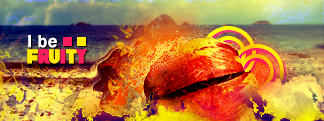
love the 4th from bottom, how much did you do to the render?
-
10-01-2010 #9
Sergeant
- Reputation
- 13
- Join Date
- Sep 2010
- Posts
- 62
- Thanks G/R
- 0/0
- Trade Feedback
- 0 (0%)
- Mentioned
- 0 Post(s)
- Tagged
- 0 Thread(s)
Tbh, I didn't do that much on the render, just a couple of adjustments. The part i concentrated most on was the background. I made t using the render.Originally Posted by Dobbs
[RIGHT]
-
10-01-2010 #10
Legendary
- Reputation
- 783
- Join Date
- Mar 2008
- Posts
- 3,377
- Thanks G/R
- 1/2
- Trade Feedback
- 0 (0%)
- Mentioned
- 0 Post(s)
- Tagged
- 0 Thread(s)
I like all the new ones.
Freelance Digital Artist
https://reflectionartwork.deviantart.com
You did not desert me
My brothers in arms
-
10-01-2010 #11
Banned
- Reputation
- 191
- Join Date
- Sep 2007
- Posts
- 584
- Thanks G/R
- 0/0
- Trade Feedback
- 0 (0%)
- Mentioned
- 0 Post(s)
- Tagged
- 0 Thread(s)
The 4th from the top looks amazing! Love the colors (personal taste) and the whole work on it ;p
-
10-01-2010 #12
Sergeant
- Reputation
- 13
- Join Date
- Sep 2010
- Posts
- 62
- Thanks G/R
- 0/0
- Trade Feedback
- 0 (0%)
- Mentioned
- 0 Post(s)
- Tagged
- 0 Thread(s)
Originally Posted by Reflection
Thanks guysOriginally Posted by Grif
[RIGHT]
-
10-02-2010 #13
Sergeant
- Reputation
- 13
- Join Date
- Sep 2010
- Posts
- 62
- Thanks G/R
- 0/0
- Trade Feedback
- 0 (0%)
- Mentioned
- 0 Post(s)
- Tagged
- 0 Thread(s)
Added 2 more, and fixed the text on the 4th from the bottom.
[RIGHT]
-
10-02-2010 #14
Banned
- Reputation
- 191
- Join Date
- Sep 2007
- Posts
- 584
- Thanks G/R
- 0/0
- Trade Feedback
- 0 (0%)
- Mentioned
- 0 Post(s)
- Tagged
- 0 Thread(s)
I don't know is it that good, but im in love with the 4th (now 6th) from the top, i just love the colors and the whole look of it.
Any chance whatsoever you could post a guide on how you made it? I personally would find it quite useful.
---------- Post added at 05:50 AM ---------- Previous post was at 05:49 AM ----------
P.S. Especially interested in the background, less interested about the Girl in the sig.! :P
-
10-02-2010 #15
Sergeant
- Reputation
- 13
- Join Date
- Sep 2010
- Posts
- 62
- Thanks G/R
- 0/0
- Trade Feedback
- 0 (0%)
- Mentioned
- 0 Post(s)
- Tagged
- 0 Thread(s)
Hehe, thanks m8.Originally Posted by Grif
Yeah sure, if i get round to it i'll definitely make a tut, but atm i am bust with school work and stuff so I probably won't be able to any time soon :/
[RIGHT]


 Reply With Quote
Similar Threads
-
[ShowOff] Just a few I have done this year...
By Fironus in forum Art & Graphic DesignReplies: 6Last Post: 01-04-2009, 01:56 PM -
[Show off] Some Sigs I Have Done
By Xtinction in forum Art & Graphic DesignReplies: 0Last Post: 08-02-2008, 12:58 PM -
Emotes :S just some i found
By Spooch in forum World of Warcraft GuidesReplies: 8Last Post: 11-17-2007, 07:48 PM -
worst thing you have done in the name of comedy?
By nerdywow in forum Community ChatReplies: 32Last Post: 10-03-2007, 08:20 AM -
Some tutorials I have written
By m0rbidang3l in forum Art & Graphic DesignReplies: 4Last Post: 08-12-2007, 07:43 PM
-
OwnedCore Forums
casino news World of Warcraft Pokemon GO MMO Overwatch RTS Casino reviews bc game bc game -
casino
Casino Gambling Online casinos Casino en ligne vercel livescore bc game lovable vercel bc game no deposit bonus codes stake Top 10 Casinos Casino reviews Bitcoin casino Lucky8 1xbit heycasino -
CoreCoins
CoreCoins CoreCoins FAQ Shout-Out Banner Ads -
My OwnedCore
My Profile Notifications Settings Buy CoreCoins About Us


Privacy Policy | Cookie Policy | Terms | Contact Us
Available Payment Methods:-
![[Small gallery] Just some GFX I have done :)](https://www.ownedcore.com/images/paybutton/paypal.png)
![[Small gallery] Just some GFX I have done :)](https://www.ownedcore.com/images/paybutton/skrill.png)
![[Small gallery] Just some GFX I have done :)](https://www.ownedcore.com/images/paybutton/payop.png)
-
Casino
stake | stake | stake | stake | stake | stake | stake | stake | stake | stake | stake | stake | stake | stake | stake | stake | stake | stake | stake | stake | stake | stake | stake | stake | stake | stake | stake | stake | stake | stake | stake | stake | stake | stake | stake | stake | stake | stake | stake | stake | stake | stake | stake | stake | stake | stake | stake | stake | stake | stake | stake | stake | stake | stake | stake | stake | stake | stake | stake | stake