
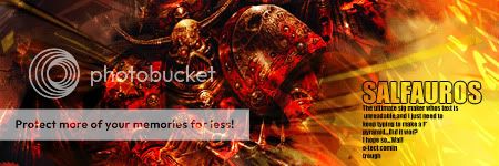
Well,I made another sig,experimented with colors and stuff...What do you think? Rate and CC please


Shout-Out
User Tag List
Results 1 to 13 of 13
-
06-28-2010 #1
 Banned
- Reputation
- 145
- Join Date
- Jan 2009
- Posts
- 745
- Thanks G/R
- 0/0
- Trade Feedback
- 0 (0%)
- Mentioned
- 0 Post(s)
- Tagged
- 0 Thread(s)
Showoff - Second sig in 6 months :)

-
06-28-2010 #2
Legendary

- Reputation
- 783
- Join Date
- Mar 2008
- Posts
- 3,377
- Thanks G/R
- 1/2
- Trade Feedback
- 0 (0%)
- Mentioned
- 0 Post(s)
- Tagged
- 0 Thread(s)
I've never really liked these types of signatures.. I prefer purely black & white or just color, these just disturb more than help.. sorry /:
Looks good otherwise though but could use a little more lightning imo.
Freelance Digital Artist
https://reflectionartwork.deviantart.com
You did not desert me
My brothers in arms
-
06-28-2010 #3
Banned


- Reputation
- 402
- Join Date
- Nov 2007
- Posts
- 1,697
- Thanks G/R
- 0/0
- Trade Feedback
- 0 (0%)
- Mentioned
- 0 Post(s)
- Tagged
- 0 Thread(s)
I'd go so far as to even state that it looks decent, the small text I can't read bugs me though
 MUST READ .. IT!!!!
moar lighting imo
-
06-28-2010 #4
Banned
- Reputation
- 622
- Join Date
- Nov 2008
- Posts
- 1,421
- Thanks G/R
- 0/0
- Trade Feedback
- 0 (0%)
- Mentioned
- 0 Post(s)
- Tagged
- 0 Thread(s)
I have to agree with Reflection, though it's very original.
-
06-28-2010 #5
Contributor

- Reputation
- 91
- Join Date
- Feb 2008
- Posts
- 1,103
- Thanks G/R
- 0/1
- Trade Feedback
- 0 (0%)
- Mentioned
- 0 Post(s)
- Tagged
- 0 Thread(s)
Can we see it without the black and white bits? :P
I do like it though. Death to all but Metal.
-
06-28-2010 #6
★ Elder ★


- Reputation
- 1179
- Join Date
- Jul 2008
- Posts
- 2,906
- Thanks G/R
- 94/51
- Trade Feedback
- 0 (0%)
- Mentioned
- 0 Post(s)
- Tagged
- 0 Thread(s)
"The Ultimate sig maker whose text is unreadable and I just..."
Does that sound familiar?
-
06-28-2010 #7
★ Elder ★
- Reputation
- 1170
- Join Date
- Apr 2007
- Posts
- 3,858
- Thanks G/R
- 0/0
- Trade Feedback
- 0 (0%)
- Mentioned
- 0 Post(s)
- Tagged
- 0 Thread(s)
I like it, black and white bits are a bit too large though, would look better if they were more like a border (half to a third their current size)
Look at your post, now back to mine; Now back to your post, now back to mine. Sadly, it isn't mine, but if you stopped trolling and started posting legitimate content, it could look like mine. Look down, backup, where are you? You're scrolling through threads, reading the post your post could look like. What did you post? Back at mine; It's a reply saying something you want to hear. Look again and the reply is now diamonds.
Anything is possible when you think before you post. The moon is shrinking.
-
06-28-2010 #8
Contributor
- Reputation
- 127
- Join Date
- Apr 2010
- Posts
- 527
- Thanks G/R
- 0/5
- Trade Feedback
- 0 (0%)
- Mentioned
- 0 Post(s)
- Tagged
- 0 Thread(s)
Sounds like a quote from Narudan's Text Tutorial...Originally Posted by Xel

-
06-28-2010 #9
Banned
- Reputation
- 145
- Join Date
- Jan 2009
- Posts
- 745
- Thanks G/R
- 0/0
- Trade Feedback
- 0 (0%)
- Mentioned
- 0 Post(s)
- Tagged
- 0 Thread(s)
While I was making it the subtext trick from narudans tut was around the edges of my mind,so I did it
But I just randomed text lawl...
And tommorow I'm gonna add full colored version,and with some smaller borders...
-
06-29-2010 #10
Sergeant
- Reputation
- 13
- Join Date
- Apr 2010
- Posts
- 53
- Thanks G/R
- 0/0
- Trade Feedback
- 0 (0%)
- Mentioned
- 0 Post(s)
- Tagged
- 0 Thread(s)
/agree Reflection sorry :/
-
06-29-2010 #11
Banned
- Reputation
- 145
- Join Date
- Jan 2009
- Posts
- 745
- Thanks G/R
- 0/0
- Trade Feedback
- 0 (0%)
- Mentioned
- 0 Post(s)
- Tagged
- 0 Thread(s)
By Dragonshadows request, smaller borders:

And by alj03's request - full colored -
Are these any better?
-
06-29-2010 #12
Legendary
- Reputation
- 783
- Join Date
- Mar 2008
- Posts
- 3,377
- Thanks G/R
- 1/2
- Trade Feedback
- 0 (0%)
- Mentioned
- 0 Post(s)
- Tagged
- 0 Thread(s)
I like the fully colored one.
Freelance Digital Artist
https://reflectionartwork.deviantart.com
You did not desert me
My brothers in arms
-
06-29-2010 #13
Banned
- Reputation
- 365
- Join Date
- Aug 2007
- Posts
- 1,725
- Thanks G/R
- 0/0
- Trade Feedback
- 0 (0%)
- Mentioned
- 0 Post(s)
- Tagged
- 0 Thread(s)
Indeed, fully colored is much better. But the color is too saturated and the text doesn't go with that look. It looked good in the first sig, but not in the last version.


 Reply With Quote
Similar Threads
-
[Showoff] First sig in months...
By AndreasG7 in forum Art & Graphic DesignReplies: 3Last Post: 08-14-2009, 07:37 PM -
[Showoff] Old Sigs I made A Bit Back
By Cigma in forum Art & Graphic DesignReplies: 5Last Post: 02-19-2008, 11:02 AM -
[Showoff] Some Sig's I like tut's from MMOwned
By sheepking in forum Art & Graphic DesignReplies: 4Last Post: 02-17-2008, 01:35 PM -
[Showoff] New Sigs/Website Stuff
By sublimepwns in forum Art & Graphic DesignReplies: 0Last Post: 01-07-2008, 12:47 AM -
[Showoff/advice?] Sig in the works
By tairen in forum Art & Graphic DesignReplies: 1Last Post: 12-22-2007, 10:45 AM
-
OwnedCore Forums
casino news World of Warcraft Pokemon GO MMO Overwatch RTS Casino reviews www.planet-casino.com sportbetworld no deposit codes bc game bc game -
casino
Casino Gambling Online casinos Casino en ligne bc game bc game bc game no deposit bonus codes roobet Top 10 Casinos Casino reviews Bitcoin casino Paypal Casino Lucky8 1xbit heycasino [EU] accont give away [EU] Confidence's [Giveway] Free US account US account (worthless Making a Knight Online need to be unbanned :) Have all info but Webhost with cURL? Question - Please Help. -
CoreCoins
CoreCoins CoreCoins FAQ Shout-Out Banner Ads -
My OwnedCore
My Profile Notifications Settings Buy CoreCoins About Us


Privacy Policy | Cookie Policy | Terms | Contact Us
Available Payment Methods:-


-
Casino
mwr | HashLucky Casino | mwrlife | canada | MRQ Casino | here | travel advantage | Free casino games | travel advantage | Instant Payout Methods | freebet tanpa | mwr life | mwr | travel advantage | Shuffle Casino | mwr life | mwr | Top 5 canadian online casinos 2025 | iLucki Casino | Blockchain gambling | here | mwr life | mwr | travel advantage | Aviator game casino | mwr life | CryptoRoyal Casino | Mirax Casino | mwr | mystake | travel advantage | Bitstarz Tournament