
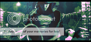
So, guys thanks to Reflection's Tutorial (Reflectionartwork's Gallery) I made this Sig:
And this Avatar:


User Tag List
Thread: New Style!
Results 1 to 15 of 50
-
05-25-2010 #1
 Established Member

- Reputation
- 72
- Join Date
- Aug 2009
- Posts
- 321
- Thanks G/R
- 0/0
- Trade Feedback
- 0 (0%)
- Mentioned
- 0 Post(s)
- Tagged
- 0 Thread(s)
New Style!

-
05-25-2010 #2
 ★ Elder ★

- Reputation
- 1132
- Join Date
- Aug 2008
- Posts
- 3,503
- Thanks G/R
- 0/0
- Trade Feedback
- 0 (0%)
- Mentioned
- 0 Post(s)
- Tagged
- 0 Thread(s)
Looks good.

-
05-25-2010 #3
 Contributor

- Reputation
- 127
- Join Date
- Jun 2008
- Posts
- 1,326
- Thanks G/R
- 0/0
- Trade Feedback
- 0 (0%)
- Mentioned
- 0 Post(s)
- Tagged
- 0 Thread(s)

Awesome work o.o

----------------------------------------------------------------

-
05-25-2010 #4
Banned
- Reputation
- 229
- Join Date
- Jun 2008
- Posts
- 990
- Thanks G/R
- 0/0
- Trade Feedback
- 0 (0%)
- Mentioned
- 0 Post(s)
- Tagged
- 0 Thread(s)

Looks better than the other signautres you have made. But it is too plain. Add some C4Ds or clippng mask.
-
05-25-2010 #5
Established Member
- Reputation
- 72
- Join Date
- Aug 2009
- Posts
- 321
- Thanks G/R
- 0/0
- Trade Feedback
- 0 (0%)
- Mentioned
- 0 Post(s)
- Tagged
- 0 Thread(s)
I used some C4D's around the fist and the render, however my collection isn't very good are they are all mainly .tif instead of .png Do you know were i can get some good onesOriginally Posted by SheEpYW0lf
-
05-25-2010 #6
Legendary

- Reputation
- 783
- Join Date
- Mar 2008
- Posts
- 3,377
- Thanks G/R
- 1/2
- Trade Feedback
- 0 (0%)
- Mentioned
- 0 Post(s)
- Tagged
- 0 Thread(s)
Looks good for a start! But as sheepy said, it's too plain. I'm glad someone still finds some use for my tutorial, even though it's old
Freelance Digital Artist
https://reflectionartwork.deviantart.com
You did not desert me
My brothers in arms
-
05-25-2010 #7
Banned
- Reputation
- 229
- Join Date
- Jun 2008
- Posts
- 990
- Thanks G/R
- 0/0
- Trade Feedback
- 0 (0%)
- Mentioned
- 0 Post(s)
- Tagged
- 0 Thread(s)
Deviant art has a lot of packs or single C4Ds.Originally Posted by Dobbs
Another idea to change it a bit, could be a variation in color, in the smudged background. It basicly only consists of 2 colors - making it boring to look at.
-
05-25-2010 #8
Established Member
- Reputation
- 72
- Join Date
- Aug 2009
- Posts
- 321
- Thanks G/R
- 0/0
- Trade Feedback
- 0 (0%)
- Mentioned
- 0 Post(s)
- Tagged
- 0 Thread(s)
Ok, so i added some C4D's. Also one C4D had a 'Ball' on it. So I set it to Luminosity and played around with it and come up with this:

-
05-25-2010 #9
Legendary
- Reputation
- 783
- Join Date
- Mar 2008
- Posts
- 3,377
- Thanks G/R
- 1/2
- Trade Feedback
- 0 (0%)
- Mentioned
- 0 Post(s)
- Tagged
- 0 Thread(s)
Better, but still a little bland. Try to add some c4d with strong colors, maybe some purple as the render has a little bit of it?
I'd like to see some lightning as well as it'll help a ton with the depth: from where does the light come? Apply light on the right correction. Do NOT just brush with white, play with overlay/soft light, opacity, duplicates, different sizes, smudge, etc.
Freelance Digital Artist
https://reflectionartwork.deviantart.com
You did not desert me
My brothers in arms
-
05-25-2010 #10
Banned
- Reputation
- 229
- Join Date
- Jun 2008
- Posts
- 990
- Thanks G/R
- 0/0
- Trade Feedback
- 0 (0%)
- Mentioned
- 0 Post(s)
- Tagged
- 0 Thread(s)
Another thing.. Play a bit with layer adjustments.
-
05-25-2010 #11
Established Member
- Reputation
- 72
- Join Date
- Aug 2009
- Posts
- 321
- Thanks G/R
- 0/0
- Trade Feedback
- 0 (0%)
- Mentioned
- 0 Post(s)
- Tagged
- 0 Thread(s)
Ok, so I played with the lighting and Added Some C4D's here's what i got
V1:
V2:
-
05-25-2010 #12
Active Member
- Reputation
- 40
- Join Date
- Nov 2008
- Posts
- 186
- Thanks G/R
- 0/0
- Trade Feedback
- 0 (0%)
- Mentioned
- 0 Post(s)
- Tagged
- 0 Thread(s)
Definitely your best work yet, only thing that isn't to great imo is the text, otherwise keep up the good work.
-
05-25-2010 #13
Established Member
- Reputation
- 72
- Join Date
- Aug 2009
- Posts
- 321
- Thanks G/R
- 0/0
- Trade Feedback
- 0 (0%)
- Mentioned
- 0 Post(s)
- Tagged
- 0 Thread(s)
Thanks, means loads. However can someone tell me a good place to get fonts. Also how to make them work with the Sig. I.E Blending Option and Layer Style.Originally Posted by DSJ
-
05-25-2010 #14
Banned
- Reputation
- 229
- Join Date
- Jun 2008
- Posts
- 990
- Thanks G/R
- 0/0
- Trade Feedback
- 0 (0%)
- Mentioned
- 0 Post(s)
- Tagged
- 0 Thread(s)
Dafont.com
On V1 you should try add a black/white gradient map, 100% opacity, luminosity. Would make it looks a lot better.
-
05-25-2010 #15
Established Member
- Reputation
- 72
- Join Date
- Aug 2009
- Posts
- 321
- Thanks G/R
- 0/0
- Trade Feedback
- 0 (0%)
- Mentioned
- 0 Post(s)
- Tagged
- 0 Thread(s)
I did this, also best font i could find to suit they style.Originally Posted by SheEpYW0lf

Last edited by Dobbs; 05-25-2010 at 12:27 PM.


 Reply With Quote
Similar Threads
-
[ShowOff]Been using a new style
By Hartstock in forum Art & Graphic DesignReplies: 9Last Post: 03-26-2008, 06:16 PM -
[Rate] A new style of Signature.
By Shinyshoes in forum Art & Graphic DesignReplies: 3Last Post: 02-24-2008, 12:29 PM -
New style for mages merciless gladiator's shoulders
By kirillkolombet in forum World of Warcraft Model EditingReplies: 7Last Post: 09-04-2007, 11:36 AM -
anathema - new style possible ?
By defel in forum WoW ME Questions and RequestsReplies: 4Last Post: 09-01-2007, 03:41 PM
-
OwnedCore Forums
casino news World of Warcraft Pokemon GO MMO Overwatch RTS Casino reviews www.planet-casino.com lucky 8 lucky8 no deposit codes bc game bc game lucky8 -
casino
Casino Gambling Online casinos Casino en ligne bc game bc game bc game no deposit bonus codes roobet Top 10 Casinos Casino reviews Bitcoin casino Paypal Casino Lucky8 1xbit heycasino Site [Underground Gamer] 10 Need help for setting up [Questions] E-mails Scared Recall my account get The method to verify the Banned or Perma Banned PayPal...moar trouble -
CoreCoins
CoreCoins CoreCoins FAQ Shout-Out Banner Ads -
My OwnedCore
My Profile Notifications Settings Buy CoreCoins About Us


Privacy Policy | Cookie Policy | Terms | Contact Us
Available Payment Methods:-


