![[Criticise] What I've been up to!](https://www.ownedcore.com/forums/images/styles/OwnedCoreFX/addimg/menu4.svg)
These were all requests from people I play with.

![[Criticise] What I've been up to!](https://www.ownedcore.com/forums/./ocpbanners/1/2/9/8/0/2/2/01d9781faec8bfe3abf9095ac9e57d1e.jpg)
![[Criticise] What I've been up to!](https://www.ownedcore.com/assets/mm/images/wits.png "TradeSafe Middleman")
![[Criticise] What I've been up to!](https://www.ownedcore.com/forums/images/styles/OwnedCoreFX/addimg/wicc.png "CoreCoins")

Shout-Out
User Tag List
Results 1 to 6 of 6
-
09-16-2009 #1
 Banned
- Reputation
- 141
- Join Date
- Sep 2008
- Posts
- 368
- Thanks G/R
- 14/53
- Trade Feedback
- 1 (100%)
- Mentioned
- 0 Post(s)
- Tagged
- 0 Thread(s)
[Criticise] What I've been up to!
Last edited by Ciris; 09-16-2009 at 02:25 PM.
![[Criticise] What I've been up to!](https://www.ownedcore.com/images/ba/g/b2.gif)
-
09-16-2009 #2
 Fedora Potato Johnson V

- Reputation
- 1113
- Join Date
- Jan 2008
- Posts
- 3,129
- Thanks G/R
- 12/89
- Trade Feedback
- 0 (0%)
- Mentioned
- 0 Post(s)
- Tagged
- 0 Thread(s)

I like them but the first one is basically a lot of weird background effects + a render with outer glow O_o


-
09-16-2009 #3
Banned
- Reputation
- 141
- Join Date
- Sep 2008
- Posts
- 368
- Thanks G/R
- 14/53
- Trade Feedback
- 1 (100%)
- Mentioned
- 0 Post(s)
- Tagged
- 0 Thread(s)
That's what he asked for lmao.Originally Posted by -JD-
-
09-17-2009 #4
Member
- Reputation
- 10
- Join Date
- Jan 2007
- Posts
- 68
- Thanks G/R
- 0/0
- Trade Feedback
- 0 (0%)
- Mentioned
- 0 Post(s)
- Tagged
- 0 Thread(s)
They all look pretty nice, maybe I should get myself a sig too lol

-
09-17-2009 #5
 Member
- Reputation
- 9
- Join Date
- Jan 2008
- Posts
- 71
- Thanks G/R
- 0/0
- Trade Feedback
- 0 (0%)
- Mentioned
- 0 Post(s)
- Tagged
- 0 Thread(s)
Some strange stuff there XD.
-
09-17-2009 #6
 Active Member

- Reputation
- 27
- Join Date
- Jul 2008
- Posts
- 311
- Thanks G/R
- 0/0
- Trade Feedback
- 0 (0%)
- Mentioned
- 0 Post(s)
- Tagged
- 0 Thread(s)
You all are horrible at criticism.
Personally, I think there's more to it than just C4Ds and overlays.
Use more filter effects, use the pentool, use everything in your power to be godly.
I honestly can't say I'm a fan of any of these, the Vincent one is just awful. No blending in it at all.
The bear one, definitely a failed attempt at c4d placement. The center of a C4D is meant for the edges, then the things around it that flow outward are used to create a sort of flow.
The text is definitely not blended, ruins the entire focus of the signature.
Rahh, thank you for reading.
You should also balance out your colors in some of these via. gradient maps. =_=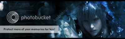
Editable signature, at last!


 Reply With Quote
Similar Threads
-
"What We've Been Training For" Pet-Quest bug/exploit
By Sealice in forum World of Warcraft ExploitsReplies: 11Last Post: 06-06-2013, 04:43 AM -
Been playing WoW too much - Should probably stop playing - What to do?
By abcghi4433op in forum World of Warcraft GeneralReplies: 12Last Post: 12-27-2011, 08:43 PM -
Aphel's Update: "What we've been cookin'!"
By Jeremiah in forum Articles and InterviewsReplies: 4Last Post: 04-17-2011, 01:40 PM -
What should I do if I have been reported for botting?
By kev1br4 in forum World of Warcraft GeneralReplies: 7Last Post: 02-20-2011, 09:51 AM
-
OwnedCore Forums
casino news World of Warcraft Pokemon GO MMO Overwatch RTS Casino reviews www.planet-casino.com lucky 8 lucky8 no deposit codes bc game bc game lucky8 -
casino
Casino Gambling Online casinos Casino en ligne bc game bc game bc game no deposit bonus codes roobet Top 10 Casinos Casino reviews Bitcoin casino Paypal Casino Lucky8 1xbit heycasino Hacked account, need need help with getting problem with email Account Help fast! Please how to Do i need the first name Giveaway - t5/t6 70 New idea (need Mea Culpa Scamming -
CoreCoins
CoreCoins CoreCoins FAQ Shout-Out Banner Ads -
My OwnedCore
My Profile Notifications Settings Buy CoreCoins About Us


Privacy Policy | Cookie Policy | Terms | Contact Us
Available Payment Methods:-
![[Criticise] What I've been up to!](https://www.ownedcore.com/images/paybutton/paypal.png)
![[Criticise] What I've been up to!](https://www.ownedcore.com/images/paybutton/skrill.png)
![[Criticise] What I've been up to!](https://www.ownedcore.com/images/paybutton/payop.png)