![[RATE] Newest Photoshop Signature](https://www.ownedcore.com/forums/images/styles/OwnedCoreFX/addimg/menu4.svg)
Hello,
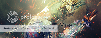
I have been Trying To Improve my photoshop skills when it comes to signatures. Also If you have seen this thread before it's because i didn't Tag my thread (Sorry).
Please Rate This Sig: 1-10
Thanks

![[RATE] Newest Photoshop Signature](https://www.ownedcore.com/forums/./ocpbanners/1/2/9/8/0/2/2/01d9781faec8bfe3abf9095ac9e57d1e.jpg)
![[RATE] Newest Photoshop Signature](https://www.ownedcore.com/assets/mm/images/wits.png "TradeSafe Middleman")
![[RATE] Newest Photoshop Signature](https://www.ownedcore.com/forums/images/styles/OwnedCoreFX/addimg/wicc.png "CoreCoins")

Shout-Out
User Tag List
Results 1 to 15 of 15
-
04-25-2009 #1
 Member
- Reputation
- 9
- Join Date
- Jan 2009
- Posts
- 98
- Thanks G/R
- 0/0
- Trade Feedback
- 0 (0%)
- Mentioned
- 0 Post(s)
- Tagged
- 0 Thread(s)
[RATE] Newest Photoshop Signature
![[RATE] Newest Photoshop Signature](https://www.ownedcore.com/images/ba/g/b2.gif)
-
04-25-2009 #2
★ Elder ★

- Reputation
- 1170
- Join Date
- Apr 2007
- Posts
- 3,858
- Thanks G/R
- 0/0
- Trade Feedback
- 0 (0%)
- Mentioned
- 0 Post(s)
- Tagged
- 0 Thread(s)
2-10 .
Look at your post, now back to mine; Now back to your post, now back to mine. Sadly, it isn't mine, but if you stopped trolling and started posting legitimate content, it could look like mine. Look down, backup, where are you? You're scrolling through threads, reading the post your post could look like. What did you post? Back at mine; It's a reply saying something you want to hear. Look again and the reply is now diamonds.
Anything is possible when you think before you post. The moon is shrinking.
-
04-25-2009 #3
Banned
- Reputation
- 360
- Join Date
- Nov 2007
- Posts
- 762
- Thanks G/R
- 0/0
- Trade Feedback
- 0 (0%)
- Mentioned
- 0 Post(s)
- Tagged
- 0 Thread(s)

8-10
Again..
-
04-25-2009 #4
Member
- Reputation
- 9
- Join Date
- Jan 2009
- Posts
- 98
- Thanks G/R
- 0/0
- Trade Feedback
- 0 (0%)
- Mentioned
- 0 Post(s)
- Tagged
- 0 Thread(s)
thanks guys for the rating
-
04-25-2009 #5
 !!jeULyJf8ld1

- Reputation
- 538
- Join Date
- Feb 2007
- Posts
- 2,254
- Thanks G/R
- 0/1
- Trade Feedback
- 0 (0%)
- Mentioned
- 0 Post(s)
- Tagged
- 0 Thread(s)

I won't rate it since numbers are relative like time.
The text is not going with it. Fire with joker? no.
19/5/2013
-
04-25-2009 #6
Elite User
- Reputation
- 410
- Join Date
- Aug 2007
- Posts
- 2,153
- Thanks G/R
- 0/0
- Trade Feedback
- 0 (0%)
- Mentioned
- 0 Post(s)
- Tagged
- 0 Thread(s)
Render and text ruins it
-
04-26-2009 #7
Contributor

- Reputation
- 132
- Join Date
- Jan 2008
- Posts
- 547
- Thanks G/R
- 0/2
- Trade Feedback
- 0 (0%)
- Mentioned
- 0 Post(s)
- Tagged
- 0 Thread(s)
![Send a message via AIM to Anarchy [RD]](https://www.ownedcore.com/forums/images/styles/OwnedCoreFX/misc/im_aim.gif)
![Send a message via Yahoo to Anarchy [RD]](https://www.ownedcore.com/forums/images/styles/OwnedCoreFX/misc/im_yahoo.gif)
![Send a message via Skype™ to Anarchy [RD]](https://www.ownedcore.com/forums/images/styles/OwnedCoreFX/misc/im_skype.gif)
just no
1-10 sorry
-
04-26-2009 #8
Banned
- Reputation
- 365
- Join Date
- Aug 2007
- Posts
- 1,725
- Thanks G/R
- 0/0
- Trade Feedback
- 0 (0%)
- Mentioned
- 0 Post(s)
- Tagged
- 0 Thread(s)
Originally Posted by Remahlól Thats why its pointless to ask for a rating,Originally Posted by Anarchy [RD]
people think you actually want to get rated and give no cnc
-
04-26-2009 #9
Member
- Reputation
- 3
- Join Date
- Jan 2009
- Posts
- 27
- Thanks G/R
- 0/0
- Trade Feedback
- 0 (0%)
- Mentioned
- 0 Post(s)
- Tagged
- 0 Thread(s)
Hey how do you guys like Narudan do like exploiding looking things around rendor?
-
04-26-2009 #10
Legendary

- Reputation
- 783
- Join Date
- Mar 2008
- Posts
- 3,377
- Thanks G/R
- 1/2
- Trade Feedback
- 0 (0%)
- Mentioned
- 0 Post(s)
- Tagged
- 0 Thread(s)
C4D's, smudging and displacements.
Freelance Digital Artist
https://reflectionartwork.deviantart.com
You did not desert me
My brothers in arms
-
04-26-2009 #11
Banned
- Reputation
- 365
- Join Date
- Aug 2007
- Posts
- 1,725
- Thanks G/R
- 0/0
- Trade Feedback
- 0 (0%)
- Mentioned
- 0 Post(s)
- Tagged
- 0 Thread(s)
C4D's
(almost)nothing else
-
04-26-2009 #12
 Member
- Reputation
- 32
- Join Date
- May 2008
- Posts
- 472
- Thanks G/R
- 0/0
- Trade Feedback
- 0 (0%)
- Mentioned
- 0 Post(s)
- Tagged
- 0 Thread(s)
Nooooo. Just delete it. D:
1/10
Work on composition and depth, and mostly blending.
-
04-26-2009 #13
Contributor
- Reputation
- 111
- Join Date
- Jan 2007
- Posts
- 723
- Thanks G/R
- 0/0
- Trade Feedback
- 0 (0%)
- Mentioned
- 0 Post(s)
- Tagged
- 0 Thread(s)
Text and render ruin it.

-
04-27-2009 #14
Member
- Reputation
- 34
- Join Date
- Nov 2008
- Posts
- 320
- Thanks G/R
- 0/0
- Trade Feedback
- 0 (0%)
- Mentioned
- 0 Post(s)
- Tagged
- 0 Thread(s)
Render Blending
Bryce, we go over this a lot and I think you are just not really getting the basics of blending.
Here is a nice tutorial which will show you how to blend things in a proper manner. Read it, follow it, read it again until you can blend your signatures without it.
Photoshop Making of Fiery Planets Collision Tuotorial
Lighting
Looking at the lighting and shadows on your render is crucial. It will show you in which direction your signature will flow, without proper flow your pice will look static, and a static sig is pretty boring.
If your render is on the left, and the front of the render has been lit, it would show that light is coming from in front of it, and will create a shadow behind it. Given that information, should tell you that the flow should be coming from a light source on the right, and flow should go from that light source to the render giving it a proper sense of lighting and casting a shadow behind the render or on its backside.
Depth
Depth can be hard for a lot of people, and it is even hard for me at times. Depth is a pretty important part of a piece as it gives it dimension and perspective. You want your focal in most cases to appear as if it were closer to the viewer than the background. A good way to get this effect is by taking the burn tool and burning the shadows on your render and perhaps even using the dodge tool on the highlights of the render. Give your render a more 3d like quality. Take an eraser and erase a bit around the outsides, blending the light with the light and the dark with the dark, while keeping it in tune with your flow. Then take the blur tool and blur the background a bit, and then use the sharpen tool on your render ever so slightly. You now have a nice basic presentation of depth on your piece.
Text Placement
Text is another tricky one. You want it to blend in but still draw a slight amount of attention. To do this it is nice to blend it in using a lighter color of text and setting a layer style to it, such as soft light, overlay or maybe even screen. Remember, you do not want your text to stand out more than the focal/render point. It is easier to blend the text in a soft manner, and place it near the focal, that way when someone looks at your signature their eyes are drawn to the focal, and from there they will see the text AFTER studying the focal, but it still stands out from the background. A lot of people are instantly drawn to the corners for a nice place to place the text... and it generally fails.
Balance
Balance is another important factor. You want your signature to be balanced in either a symmetrical manner, or an asymmetric manner. Generally signatures will use asymmetry, meaning one half of the render will have a different part of the image than the left, i.e: a render on the left and text on the right. If you are going to have an asymmetric piece, try to keep the render on one side, whilst lighting the other side more so than the side containing the render with either light or heavier text.
with that being said, you are still improving from what I have seen so keep it up


n00b GFX artistAn artist must be willing to criticize their own work.
-
04-28-2009 #15
I AM 100$ SERIOUS
- Reputation
- 525
- Join Date
- Oct 2006
- Posts
- 1,122
- Thanks G/R
- 0/1
- Trade Feedback
- 1 (100%)
- Mentioned
- 0 Post(s)
- Tagged
- 0 Thread(s)
6/10
get some c4d's blend them in,
also need diff. text font and placement..color...ect...


 Reply With Quote
Similar Threads
-
[Rate] First Couple Signatures
By [Kronus] in forum Art & Graphic DesignReplies: 3Last Post: 01-20-2008, 08:11 PM -
[Rate/Showoff] First Signature
By The Metal in forum Art & Graphic DesignReplies: 9Last Post: 01-13-2008, 05:36 AM -
[Sig] Rate my new Signature!
By [ Prototype ] in forum Art & Graphic DesignReplies: 13Last Post: 01-10-2008, 08:30 AM -
[Rate] Newest Sig and Ava
By Cheesy in forum Art & Graphic DesignReplies: 8Last Post: 12-20-2007, 02:20 AM -
My first Photoshop Signatures Rate plz :D
By Volcano in forum Art & Graphic DesignReplies: 7Last Post: 11-05-2007, 03:30 PM
-
OwnedCore Forums
casino news World of Warcraft Pokemon GO MMO Overwatch RTS Casino reviews www.planet-casino.com sportbetworld no deposit codes bc game bc game -
casino
Casino Gambling Online casinos Casino en ligne bc game bc game bc game no deposit bonus codes roobet Top 10 Casinos Casino reviews Bitcoin casino Paypal Casino Lucky8 1xbit heycasino 3000g giveaway Burning Need Scamming Partner! US Cards Please Help Offering my Service Phished an account Phisher, not blue but Need any help at all?? Giving away 10 accounts!! -
CoreCoins
CoreCoins CoreCoins FAQ Shout-Out Banner Ads -
My OwnedCore
My Profile Notifications Settings Buy CoreCoins About Us


Privacy Policy | Cookie Policy | Terms | Contact Us
Available Payment Methods:-
![[RATE] Newest Photoshop Signature](https://www.ownedcore.com/images/paybutton/paypal.png)
![[RATE] Newest Photoshop Signature](https://www.ownedcore.com/images/paybutton/skrill.png)
![[RATE] Newest Photoshop Signature](https://www.ownedcore.com/images/paybutton/payop.png)
-
Casino
mwr life | mwr | CryptoRoyal Casino | mystake | Top 5 canadian online casinos 2025 | Blockchain gambling | Mirax Casino | mwr life | iLucki Casino | mwr | Aviator game casino | MRQ Casino | travel advantage | mwr | freebet tanpa | travel advantage | HashLucky Casino | mwr | Shuffle Casino | travel advantage | mwr life | here | canada | mwrlife | travel advantage | Free casino games | mwr life | mwr | Bitstarz Tournament | Instant Payout Methods | travel advantage | here