![[Show off] New Avy and Sig for SoTW](https://www.ownedcore.com/forums/images/styles/OwnedCoreFX/addimg/menu4.svg)
well at another site im part of called Warez Forum we have a SoTW (Signature of The Week) battle and this was my entry for SoTW #4 for music....
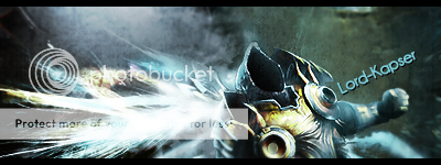
Signature:
Avy i made to go with it:
this sig was very experimental for me, because i about never use stuff like that on a sig, that and if you look at the image at tinypic where its hosted by clicking "view image" and it goes the the white bg it looks like somethings missingits something a did being random

![[Show off] New Avy and Sig for SoTW](https://www.ownedcore.com/forums/./ocpbanners/1/2/9/8/0/2/2/01d9781faec8bfe3abf9095ac9e57d1e.jpg)
![[Show off] New Avy and Sig for SoTW](https://www.ownedcore.com/assets/mm/images/wits.png "TradeSafe Middleman")
![[Show off] New Avy and Sig for SoTW](https://www.ownedcore.com/forums/images/styles/OwnedCoreFX/addimg/wicc.png "CoreCoins")

Shout-Out
User Tag List
Results 1 to 5 of 5
-
01-08-2009 #1
 Member
- Reputation
- 5
- Join Date
- Apr 2008
- Posts
- 63
- Thanks G/R
- 0/0
- Trade Feedback
- 0 (0%)
- Mentioned
- 0 Post(s)
- Tagged
- 0 Thread(s)
[Show off] New Avy and Sig for SoTW

![[Show off] New Avy and Sig for SoTW](https://www.ownedcore.com/images/ba/g/b2.gif)
-
01-08-2009 #2
Contributor

- Reputation
- 259
- Join Date
- Nov 2006
- Posts
- 2,602
- Thanks G/R
- 0/0
- Trade Feedback
- 2 (100%)
- Mentioned
- 0 Post(s)
- Tagged
- 0 Thread(s)

3-4/10
I don't know whats wrong with maybe it's too bland on the right side and the render is showing too little? I'm not sure...THIS SIGNATURE IS IN VIALOATION OF SITE RULES, PLEASE FIX ME!
-Fault
-
01-09-2009 #3
Member
- Reputation
- 5
- Join Date
- Apr 2008
- Posts
- 63
- Thanks G/R
- 0/0
- Trade Feedback
- 0 (0%)
- Mentioned
- 0 Post(s)
- Tagged
- 0 Thread(s)
well thats all i could work with....his head in the the top left on the picture so i cant get the full head :/Originally Posted by Mirror
-
01-09-2009 #4
Active Member

- Reputation
- 21
- Join Date
- Jan 2007
- Posts
- 233
- Thanks G/R
- 0/0
- Trade Feedback
- 0 (0%)
- Mentioned
- 0 Post(s)
- Tagged
- 0 Thread(s)
Hmm imo it needs a border other than that i dont think the render is flowing with the red and black squares. Also the text aint very well blended and it stands out a little too much :P
The colours looks great together keep it up!
-Lord-kapser
-
01-14-2009 #5
Contributor
- Reputation
- 98
- Join Date
- Aug 2008
- Posts
- 394
- Thanks G/R
- 0/0
- Trade Feedback
- 0 (0%)
- Mentioned
- 0 Post(s)
- Tagged
- 0 Thread(s)
Brighten the right side, and it'll look really nice.


 Reply With Quote
Similar Threads
-
[Show Off] New signature and avatar what do you think?
By Adosi in forum Art & Graphic DesignReplies: 2Last Post: 04-04-2009, 05:54 AM -
[Show off] new sig and avatar
By Syplex23 in forum Art & Graphic DesignReplies: 10Last Post: 03-30-2008, 05:06 AM -
[Show off] New Illidan sig
By Bob_Magic in forum Art & Graphic DesignReplies: 6Last Post: 03-01-2008, 08:28 AM -
[Show-off] New sig, av and random wallpaper
By Piersd in forum Art & Graphic DesignReplies: 1Last Post: 02-26-2008, 07:13 PM -
Looking for new Avatar and Sig
By Nilrac in forum Art & Graphic DesignReplies: 6Last Post: 02-16-2008, 05:26 AM
-
OwnedCore Forums
casino news World of Warcraft Pokemon GO MMO Overwatch RTS Casino reviews bc game bc game -
casino
Casino Gambling Online casinos Casino en ligne vercel livescore bc game lovable vercel bc game no deposit bonus codes stake Top 10 Casinos Casino reviews Bitcoin casino Lucky8 1xbit heycasino -
CoreCoins
CoreCoins CoreCoins FAQ Shout-Out Banner Ads -
My OwnedCore
My Profile Notifications Settings Buy CoreCoins About Us


Privacy Policy | Cookie Policy | Terms | Contact Us
Available Payment Methods:-
![[Show off] New Avy and Sig for SoTW](https://www.ownedcore.com/images/paybutton/paypal.png)
![[Show off] New Avy and Sig for SoTW](https://www.ownedcore.com/images/paybutton/skrill.png)
![[Show off] New Avy and Sig for SoTW](https://www.ownedcore.com/images/paybutton/payop.png)
-
Casino
stake | stake | stake | stake | stake | stake | stake | stake | stake | stake | stake | stake | stake | stake | stake | stake | stake | stake | stake | stake | stake | stake | stake | stake | stake | stake | stake | stake | stake | stake | stake | stake | stake | stake | stake | stake | stake | stake | stake | stake | stake | stake | stake | stake | stake | stake | stake | stake | stake | stake | stake | stake | stake | stake | stake | stake | stake | stake | stake | stake