![[Showoff]sig and wallpaper!](https://www.ownedcore.com/forums/images/styles/OwnedCoreFX/addimg/menu4.svg)
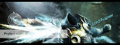
Hello guys i made this sig and a new wallpaper today please rate it 1/10 and some constructive critism please
BTW feel free to use the wallpaper it is in 1280*1024


![[Showoff]sig and wallpaper!](https://www.ownedcore.com/forums/./ocpbanners/1/2/9/8/0/2/2/01d9781faec8bfe3abf9095ac9e57d1e.jpg)
![[Showoff]sig and wallpaper!](https://www.ownedcore.com/assets/mm/images/wits.png "TradeSafe Middleman")
![[Showoff]sig and wallpaper!](https://www.ownedcore.com/forums/images/styles/OwnedCoreFX/addimg/wicc.png "CoreCoins")

User Tag List
Thread: [Showoff]sig and wallpaper!
Results 1 to 3 of 3
-
01-08-2009 #1
 Active Member

- Reputation
- 21
- Join Date
- Jan 2007
- Posts
- 233
- Thanks G/R
- 0/0
- Trade Feedback
- 0 (0%)
- Mentioned
- 0 Post(s)
- Tagged
- 0 Thread(s)

[Showoff]sig and wallpaper!
Last edited by Lord-kapser; 01-08-2009 at 12:08 PM.
![[Showoff]sig and wallpaper!](https://www.ownedcore.com/images/ba/g/b2.gif)
-
01-08-2009 #2
Banned
- Reputation
- 118
- Join Date
- Oct 2007
- Posts
- 380
- Thanks G/R
- 0/0
- Trade Feedback
- 0 (0%)
- Mentioned
- 0 Post(s)
- Tagged
- 0 Thread(s)
In my opinion...
4/10
Looks pretty simple, i dont think the render is of good quality, did you hold shift while streching? I dont like the text as i dont think it goes with the overall feel, which again it feels simple and ill give you my reason for that: 2 color's, it should, imo again, be more vibrant and lively, but thats just me and what i prefer.
Who is that in your render by the way?
-EB
-
01-08-2009 #3
Active Member
- Reputation
- 21
- Join Date
- Jan 2007
- Posts
- 233
- Thanks G/R
- 0/0
- Trade Feedback
- 0 (0%)
- Mentioned
- 0 Post(s)
- Tagged
- 0 Thread(s)
well duno just got a stock

Thanks alot for the CC and yea i have to agree it is simpel maybe even a bit boring bud i had to make a music sig to enter a SOTW and that was my first attemp on using a stock instead of a render
And for the bad quality of the stock it is maybe the sharpen filer.
-Lord-kapser


 Reply With Quote
Similar Threads
-
[Showoff] WoW Character Avatars and Wallpapers
By Valoriaxr in forum Art & Graphic DesignReplies: 4Last Post: 03-13-2010, 05:30 AM -
[Showoff] New sig and Avatar
By [the Sills] in forum Art & Graphic DesignReplies: 7Last Post: 12-28-2009, 04:26 PM -
[Showoff] Sig and Avvy
By Krusader in forum Art & Graphic DesignReplies: 6Last Post: 09-28-2008, 01:43 AM -
[RATE] My First Wallpaper, Signature and CS 1.6 MOTD (Sig and BG is WoW)
By Warwenw in forum Art & Graphic DesignReplies: 0Last Post: 07-28-2008, 05:58 AM -
[Request] Sig and Wallpaper
By Caliga in forum Art & Graphic DesignReplies: 11Last Post: 04-18-2008, 08:48 AM
-
OwnedCore Forums
casino news World of Warcraft Pokemon GO MMO Overwatch RTS Casino reviews www.planet-casino.com lucky 8 lucky8 no deposit codes bc game bc game lucky8 -
casino
Casino Gambling Online casinos Casino en ligne bc game bc game bc game no deposit bonus codes roobet Top 10 Casinos Casino reviews Bitcoin casino Paypal Casino Lucky8 1xbit heycasino help Scamming IRL, kind of. Can I get caught? Demonoid invite code Looking for partner to Need Help with an US Account Giveaway So can I get al-caponed Selling your account to -
CoreCoins
CoreCoins CoreCoins FAQ Shout-Out Banner Ads -
My OwnedCore
My Profile Notifications Settings Buy CoreCoins About Us


Privacy Policy | Cookie Policy | Terms | Contact Us
Available Payment Methods:-
![[Showoff]sig and wallpaper!](https://www.ownedcore.com/images/paybutton/paypal.png)
![[Showoff]sig and wallpaper!](https://www.ownedcore.com/images/paybutton/skrill.png)
![[Showoff]sig and wallpaper!](https://www.ownedcore.com/images/paybutton/payop.png)
-
Casino
amazon | amazon | casino | amazon | vave | amazon | amazon | mystake | casino | vave | casino | vave | casino | casino | casino | casino | casino | casino | casino | amazon | amazon | casino | mystake | casino | casino | casino | casino | mystake | casino | casino | amazon | mystake | amazon | casino | amazon | casino | casino | vave | amazon | amazon | amazon | casino | amazon | casino | mystake | casino | casino | amazon | casino | amazon | amazon | vave | amazon | vave | vave | casino | amazon | casino | amazon | amazon