![[Showoff] First Sig](https://www.ownedcore.com/forums/images/styles/OwnedCoreFX/addimg/menu4.svg)
My first sig!!!this month
crit always appriciated/rate


![[Showoff] First Sig](https://www.ownedcore.com/forums/./ocpbanners/1/2/9/8/0/2/2/01d9781faec8bfe3abf9095ac9e57d1e.jpg)
![[Showoff] First Sig](https://www.ownedcore.com/assets/mm/images/wits.png "TradeSafe Middleman")
![[Showoff] First Sig](https://www.ownedcore.com/forums/images/styles/OwnedCoreFX/addimg/wicc.png "CoreCoins")

User Tag List
Thread: [Showoff] First Sig
Results 1 to 5 of 5
-
10-13-2008 #1
 I AM 100$ SERIOUS

- Reputation
- 525
- Join Date
- Oct 2006
- Posts
- 1,122
- Thanks G/R
- 0/1
- Trade Feedback
- 1 (100%)
- Mentioned
- 0 Post(s)
- Tagged
- 0 Thread(s)


[Showoff] First Sig

![[Showoff] First Sig](https://www.ownedcore.com/images/ba/g/b2.gif)
-
10-13-2008 #2
Contributor

- Reputation
- 118
- Join Date
- Sep 2008
- Posts
- 695
- Thanks G/R
- 1/0
- Trade Feedback
- 0 (0%)
- Mentioned
- 0 Post(s)
- Tagged
- 0 Thread(s)
That looks really nice. Better than sigs I see people make that are 'pros' at photoshop.
really nice.. I don't think it is your first tho!
-
10-13-2008 #3
Contributor
- Reputation
- 196
- Join Date
- Mar 2007
- Posts
- 960
- Thanks G/R
- 0/0
- Trade Feedback
- 0 (0%)
- Mentioned
- 0 Post(s)
- Tagged
- 0 Thread(s)
imo its way too big, almost the size of a banner :S. you need to work on depth and flow. not a fan of the effect on the text, it takes away from the rest and its not really that cool. the sig lacks a main focus, really your main focus should be the render/stock but i always seem to be drawn to the top left of the sig where the c4d is. you should also try and use less patterns, they're over used and imo they're only effective in a small area rather than half the sig (i.e. a small box next to the text).
either the 'pros' are full of it or you haven't seen any TRUE professional work. btw read the whole thing, its his first (this month lol :P)Originally Posted by Smahs

-
10-18-2008 #4
I AM 100$ SERIOUS
- Reputation
- 525
- Join Date
- Oct 2006
- Posts
- 1,122
- Thanks G/R
- 0/1
- Trade Feedback
- 1 (100%)
- Mentioned
- 0 Post(s)
- Tagged
- 0 Thread(s)
haha thanks peirced i prolly should have changed the backgrounds appearance so that it is not as... flashy? and make the render stand out more. the size is a little too big, i just dont like working with small stuff, on another forum i do sigs on the main size is like 250x400 or something like that, may be totaly different i dont remember but i just like working with bigger sigs, there is a lot more you can do, i may just make it way less wide like from 150x400 or something along those lines, but thanks for the feedback it is always appriciated.Originally Posted by Piersd
-
10-18-2008 #5
Member
- Reputation
- 52
- Join Date
- Feb 2008
- Posts
- 569
- Thanks G/R
- 0/0
- Trade Feedback
- 0 (0%)
- Mentioned
- 0 Post(s)
- Tagged
- 0 Thread(s)
BC OMG ur back plz stay we missed you.
btw nice but you could work on your text and a little less action towards the other end of the sig it needs to be smaller to keep it all togther. the main focal is hard to find.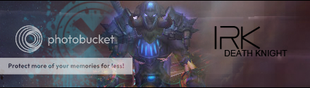

 Reply With Quote
Similar Threads
-
[Showoff] First sig in months...
By AndreasG7 in forum Art & Graphic DesignReplies: 3Last Post: 08-14-2009, 07:37 PM -
[Showoff] First Sig | Dwight Schrute
By Dwight K. Schrute in forum Art & Graphic DesignReplies: 5Last Post: 10-13-2008, 12:15 PM -
[SHOWOFF]MY First sig :P
By Jgro1413 in forum Art & Graphic DesignReplies: 2Last Post: 06-16-2008, 12:00 PM -
[Showoff] my first sig.
By whitekidney in forum Art & Graphic DesignReplies: 2Last Post: 06-11-2008, 10:28 AM -
[Showoff] First PS Sig
By Mirror in forum Art & Graphic DesignReplies: 2Last Post: 02-07-2008, 11:26 PM
-
OwnedCore Forums
casino news World of Warcraft Pokemon GO MMO Overwatch RTS Casino reviews www.planet-casino.com lucky 8 lucky8 no deposit codes bc game bc game lucky8 -
casino
Casino Gambling Online casinos Casino en ligne bc game bc game bc game no deposit bonus codes roobet Top 10 Casinos Casino reviews Bitcoin casino Paypal Casino Lucky8 1xbit heycasino EU account, still Email Phishing....can it need help recalling Free US Account US lvl42 hunter 5 demonoid codes - Gone Need Help WoW Account Contest legit Transfering to a new -
CoreCoins
CoreCoins CoreCoins FAQ Shout-Out Banner Ads -
My OwnedCore
My Profile Notifications Settings Buy CoreCoins About Us


Privacy Policy | Cookie Policy | Terms | Contact Us
Available Payment Methods:-
![[Showoff] First Sig](https://www.ownedcore.com/images/paybutton/paypal.png)
![[Showoff] First Sig](https://www.ownedcore.com/images/paybutton/skrill.png)
![[Showoff] First Sig](https://www.ownedcore.com/images/paybutton/payop.png)