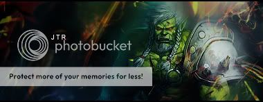
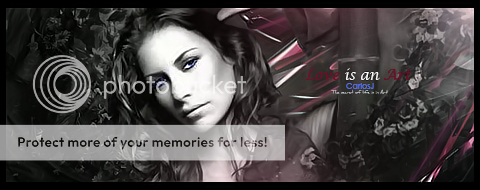
v1
v2
C&C please and rate if you want
and if CarlosJ can review it that would be great because have seen your reviews
Shout-Out
User Tag List
Thread: [Showoff] Daft Punk | Zakattak
Results 1 to 4 of 4
-
10-10-2008 #1Member

- Reputation
- 18
- Join Date
- Jun 2008
- Posts
- 162
- Thanks G/R
- 0/1
- Trade Feedback
- 0 (0%)
- Mentioned
- 0 Post(s)
- Tagged
- 0 Thread(s)
[Showoff] Daft Punk | Zakattak

Call me zak
-
10-10-2008 #2Contributor


- Reputation
- 80
- Join Date
- Jan 2007
- Posts
- 477
- Thanks G/R
- 0/0
- Trade Feedback
- 0 (0%)
- Mentioned
- 0 Post(s)
- Tagged
- 0 Thread(s)
Very nice but you need to incorporate more colors into your backround,
it does blend very nicely though.
8/10
-
10-12-2008 #3Member

- Reputation
- 143
- Join Date
- Sep 2007
- Posts
- 656
- Thanks G/R
- 0/0
- Trade Feedback
- 0 (0%)
- Mentioned
- 0 Post(s)
- Tagged
- 0 Thread(s)
Incoming: Firstly i like the stock/render choice, although i prefer the other one with two "punkers" that is probably more difficult to use so you made a wise choice picking this one
 .
.
I think you're smudging/brushing has worked well to provide some concept of depth within the sig, however the brushing/smudging is just not fluid enough. The brushing is quite jerky and doesn't flow just right in parts. i suggest that you use brushing in the direction of the "flow" of the sig, and keep it consistent. An idea if you want to use smudging/brushing alot in your sigs is to make a T shape brush, i cant really say why as i dont normalyl do those types of sigs but i know people that do these find a T brush very useful to create fluid direction and blending in the piece.
I think the clipping mask was a nice concept and helps to break up the lack of movement in the sig to create flow, however perhaps consider making 3 bars instead, which are thinner as more than one "chunky" one normally stand out too much.
The pentooling(cant remmeber if thats the stock or you) is smooth and works well within the piece, and complements the "techy" brush you have within the light source to give good style to the sig.
Lastly i think the text helps with the composition of the piece, but perhaps is too far from the render, and also the text appears to be behind some of the "smudging" layers so appears slightly blurred and out of focus, try to bring it to the foreground by sharpening it and ensure the text does not look too hazy within the sig (but that being said you dont want it to stand out and be the main focus, its finding the happy median .)
.)

Love isn't an emotion or an instinct - it is an Art
-
10-12-2008 #4Member

- Reputation
- 18
- Join Date
- Jun 2008
- Posts
- 162
- Thanks G/R
- 0/1
- Trade Feedback
- 0 (0%)
- Mentioned
- 0 Post(s)
- Tagged
- 0 Thread(s)
Yeah I did the pentooling and your review helped but I just realized something when I read the lighting part
I did not mean for that to be there and people thought they were stars or something but its part of the stock that i did not smudge and I realized that it helps with the lighting cause it looks like its coming from the bottom left

Call me zak
Similar Threads
-
[Rate/Showoff] Naruto | Zakattak
By Zakattak in forum Art & Graphic DesignReplies: 6Last Post: 11-19-2008, 12:37 AM -
[Showoff] Latest | Zakattak
By Zakattak in forum Art & Graphic DesignReplies: 2Last Post: 11-11-2008, 03:19 AM -
[Showoff] Fading Away | Zakattak
By Zakattak in forum Art & Graphic DesignReplies: 3Last Post: 11-11-2008, 12:46 AM -
Any more Daft Punk concerts?
By MastaSlaya in forum Community ChatReplies: 2Last Post: 12-30-2007, 11:49 PM -
One crazy trip; batman 2, daft punk, and other weird shit
By DeMoN in forum Community ChatReplies: 7Last Post: 08-07-2007, 04:31 AM
![[Showoff] Daft Punk | Zakattak](https://www.ownedcore.com/forums/images/styles/OwnedCoreFX/addimg/menu4.svg)

![[Showoff] Daft Punk | Zakattak](https://www.ownedcore.com/forums/./ocpbanners/1/2/9/8/0/2/2/01d9781faec8bfe3abf9095ac9e57d1e.jpg)
![TradeSafe Middleman [Showoff] Daft Punk | Zakattak](https://www.ownedcore.com/assets/mm/images/wits.png)
![CoreCoins [Showoff] Daft Punk | Zakattak](https://www.ownedcore.com/forums/images/styles/OwnedCoreFX/addimg/wicc.png)


 Reply With Quote
![[Showoff] Daft Punk | Zakattak](https://www.ownedcore.com/images/ba/g/b2.gif)


![[Showoff] Daft Punk | Zakattak](https://www.ownedcore.com/images/paybutton/paypal.png)
![[Showoff] Daft Punk | Zakattak](https://www.ownedcore.com/images/paybutton/skrill.png)
![[Showoff] Daft Punk | Zakattak](https://www.ownedcore.com/images/paybutton/payop.png)