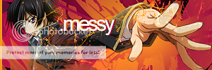
...any advice on what to add?
wtb carlosj response :P
Shout-Out
User Tag List
Thread: [Show off] What to add? :S
Results 1 to 4 of 4
-
10-10-2008 #1Contributor


- Reputation
- 196
- Join Date
- Mar 2007
- Posts
- 960
- Thanks G/R
- 0/0
- Trade Feedback
- 0 (0%)
- Mentioned
- 0 Post(s)
- Tagged
- 0 Thread(s)
[Show off] What to add? :S
Last edited by Piersd; 10-10-2008 at 09:28 AM.

-
10-10-2008 #2
 King - AMG

- Reputation
- 415
- Join Date
- Aug 2008
- Posts
- 812
- Thanks G/R
- 1/2
- Trade Feedback
- 0 (0%)
- Mentioned
- 0 Post(s)
- Tagged
- 0 Thread(s)
Nudez? Mebe

-
10-10-2008 #3Contributor


- Reputation
- 196
- Join Date
- Mar 2007
- Posts
- 960
- Thanks G/R
- 0/0
- Trade Feedback
- 0 (0%)
- Mentioned
- 0 Post(s)
- Tagged
- 0 Thread(s)
-
10-10-2008 #4Member

- Reputation
- 143
- Join Date
- Sep 2007
- Posts
- 656
- Thanks G/R
- 0/0
- Trade Feedback
- 0 (0%)
- Mentioned
- 0 Post(s)
- Tagged
- 0 Thread(s)
lol WTS response then
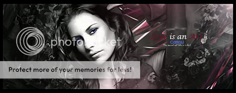
 : well i sort of feel unhelpful when i say this and in other ways i feel not so unhelpful as its the truth; i can't see any suggestion for improvemnt. its really beautiful and i just love the colours. you got them spot on this time, althought they are soft colours they are vibrant enough to stand out and provide some real freshness to the piece, they contrast against each other to add depth in a clever way.
The vector shapes are so random but work perfectly with each other to give flow the sig between components. so yeah there really is nothing in my personal opinion that i think should be altered. once again perhaps some simple text on the right just to stop rippers (and/or to add some other detail to the empty part in the right of the sig), but i do fear it could ruin the simplicity of the sig if you add text, so thats sort of a problem:confused: and guessing by the result you dont think the text contributed to the piece well.
New vector styles working well and producing some nice results.
p.s. random model for the stock or you know her name? 90% of my female stocks suck because they are celebrities just posing so theres nothing artistic in the stock to use, but good choice with this, i need more like it.
Last edited by CarlosJ; 10-10-2008 at 12:21 PM.

Love isn't an emotion or an instinct - it is an Art
Similar Threads
-
[Show Off] New signature and avatar what do you think?
By Adosi in forum Art & Graphic DesignReplies: 2Last Post: 04-04-2009, 05:54 AM -
Show off your avatar!
By Apocalyptic_Hunter in forum World of Warcraft GeneralReplies: 7Last Post: 12-07-2006, 01:32 PM -
Show Off Ur Sig Skills
By fasck in forum Community ChatReplies: 9Last Post: 08-09-2006, 04:23 PM -
I need something that will show me what items mobs have can u do that?
By case in forum World of Warcraft GeneralReplies: 1Last Post: 03-20-2006, 12:16 AM
![[Show off] What to add? :S](https://www.ownedcore.com/forums/images/styles/OwnedCoreFX/addimg/menu4.svg)

![[Show off] What to add? :S](https://www.ownedcore.com/forums/./ocpbanners/1/0/6/3/8/1/6/1e102dbc1865060efdd7bf3ae1edf5cc.jpg)
![TradeSafe Middleman [Show off] What to add? :S](https://www.ownedcore.com/assets/mm/images/wits.png)
![CoreCoins [Show off] What to add? :S](https://www.ownedcore.com/forums/images/styles/OwnedCoreFX/addimg/wicc.png)


 Reply With Quote
![[Show off] What to add? :S](https://www.ownedcore.com/images/ba/g/b2.gif)


![[Show off] What to add? :S](https://www.ownedcore.com/images/paybutton/paypal.png)
![[Show off] What to add? :S](https://www.ownedcore.com/images/paybutton/skrill.png)
![[Show off] What to add? :S](https://www.ownedcore.com/images/paybutton/payop.png)