![[Cheese Warning!] New Sig](https://www.ownedcore.com/forums/images/styles/OwnedCoreFX/addimg/menu4.svg)
Just wanted to have some opinions on it

![[Cheese Warning!] New Sig](https://www.ownedcore.com/forums/./ocpbanners/1/3/9/6/9/4/8/08b6377e7ee13e5b1d2306cbeed08f8c.png)
![[Cheese Warning!] New Sig](https://www.ownedcore.com/assets/mm/images/wits.png "TradeSafe Middleman")
![[Cheese Warning!] New Sig](https://www.ownedcore.com/forums/images/styles/OwnedCoreFX/addimg/wicc.png "CoreCoins")

Shout-Out
User Tag List
Thread: [Cheese Warning!] New Sig
Results 1 to 5 of 5
-
09-24-2008 #1
 Contributor

- Reputation
- 214
- Join Date
- Sep 2007
- Posts
- 434
- Thanks G/R
- 0/0
- Trade Feedback
- 0 (0%)
- Mentioned
- 0 Post(s)
- Tagged
- 0 Thread(s)
[Cheese Warning!] New Sig
![[Cheese Warning!] New Sig](https://www.ownedcore.com/images/ba/g/b2.gif)
-
09-24-2008 #2
Contributor
- Reputation
- 96
- Join Date
- Mar 2008
- Posts
- 667
- Thanks G/R
- 0/0
- Trade Feedback
- 0 (0%)
- Mentioned
- 0 Post(s)
- Tagged
- 0 Thread(s)

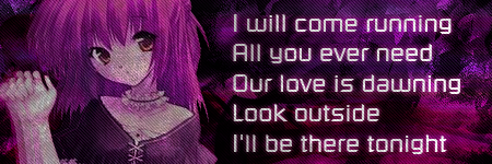
Looks nice Xayo, but I think that the text stands out a bit too much, the render should be the focal, otherwise good.
7/10
-
09-24-2008 #3
Member
- Reputation
- 410
- Join Date
- Jan 2008
- Posts
- 204
- Thanks G/R
- 0/0
- Trade Feedback
- 0 (0%)
- Mentioned
- 0 Post(s)
- Tagged
- 0 Thread(s)
first of all .. i had no idea we had a graphics discussion thread xD.
And as for the sig i don't know ... even tough i understand you want to create something that looks like one thing, the purple colors are to close to each other. You should use some variations. I also think you could be a little more original on placing the text and graphic. Try making a signature that blends the texts with the flow of a graphic. The fade out of the graphic is also to strong. it makes the arm and hand of the girl look weird.
anyways hoops this helps you on your way xD
DA: http:thedarkhell.deviantart.com
-
09-24-2008 #4
Active Member

- Reputation
- 30
- Join Date
- Mar 2007
- Posts
- 323
- Thanks G/R
- 0/0
- Trade Feedback
- 1 (100%)
- Mentioned
- 0 Post(s)
- Tagged
- 0 Thread(s)

6/10... the text was the first thing i saw and i think the render is a bit too transpartent? also, it's prolly just me, but i think there's too much text, but if that's what you want it to say then by all means
-
09-25-2008 #5
Contributor
- Reputation
- 214
- Join Date
- Sep 2007
- Posts
- 434
- Thanks G/R
- 0/0
- Trade Feedback
- 0 (0%)
- Mentioned
- 0 Post(s)
- Tagged
- 0 Thread(s)
thanks for the constructive critique, i will take it *bow down to his master*Originally Posted by Goshujinsama

 Reply With Quote
Similar Threads
-
Testing new sig
By Turrash in forum Art & Graphic DesignReplies: 1Last Post: 04-11-2007, 10:02 PM -
New sig...need feedback
By lohkies in forum Art & Graphic DesignReplies: 5Last Post: 03-12-2007, 05:46 PM -
Another new sig....PLEASE PUT FEEDBACK
By lohkies in forum Art & Graphic DesignReplies: 4Last Post: 03-11-2007, 04:53 AM -
New Sig!
By StopTheOncoming in forum Art & Graphic DesignReplies: 5Last Post: 02-21-2007, 09:54 PM -
new sig
By Airisus in forum Art & Graphic DesignReplies: 0Last Post: 02-04-2007, 08:32 AM
-
OwnedCore Forums
casino news World of Warcraft Pokemon GO MMO Overwatch RTS Casino reviews bc game bc game bc game bc game bc game bc game bc game bc game bc game bc game bc game bc game bc game bc game bc game bc game bc game bc game bc game bc game bc game bc game bc game bc game bc game bc game bc game bc game bc game bc game bc game bc game bc game bc game bc game bc game bc game bc game bc game bc game bc game bc game bc game bc game bc game bc game bc game bc game bc game bc game bc game -
casino
Casino Gambling Online casinos Casino en ligne bc game bc game bc game bc game bc game bc game bc game bc game bc game bc game bc game no deposit bonus codes roobet Top 10 Casinos Casino reviews Bitcoin casino Paypal Casino Lucky8 1xbit heycasino ✅Lucky8 Casino Bonus - ⭐ Stake Casino - ✅N1 Casino Review - Empire.io Casino - Best ⭐ Top Live Casino ⭐ Bitkingz Casino - ⭐ ThorCasino - 100% Up Découvrir l'élégance Casobet Casino - 120% -
CoreCoins
CoreCoins CoreCoins FAQ Shout-Out Banner Ads -
My OwnedCore
My Profile Notifications Settings Buy CoreCoins About Us


Privacy Policy | Cookie Policy | Terms | Contact Us
Available Payment Methods:-
![[Cheese Warning!] New Sig](https://www.ownedcore.com/images/paybutton/paypal.png)
![[Cheese Warning!] New Sig](https://www.ownedcore.com/images/paybutton/skrill.png)
![[Cheese Warning!] New Sig](https://www.ownedcore.com/images/paybutton/payop.png)
-
Casino
Bitstarz | Bonus code | Millionz | Stake Casino | Cresus Casino | PalmSlots Casino | Drake Casino | Casobet | Betflip Casino | Casino | Bc Game | Slot machines | BitCasino | No deposit bonus | Rollino Casino | Lucky8 | USA CASINO | How to Play BlackJack Online | Dublinbet | Crypto Casino | BuzzLuck | Mystake Casino | Lucky Dreams Casino | Lucky31 | Casino deposit offers | MrGreen | Oshi Casino | Welcome Bonuses | Jackpotcity