![[Showoff] New sig >_>](https://www.ownedcore.com/forums/images/styles/OwnedCoreFX/addimg/menu4.svg)
I like Avril
7,8921 minutes sig:
I gave up on the text here :/
Edit:

![[Showoff] New sig >_>](https://www.ownedcore.com/forums/./ocpbanners/1/2/9/8/0/2/2/01d9781faec8bfe3abf9095ac9e57d1e.jpg)
![[Showoff] New sig >_>](https://www.ownedcore.com/assets/mm/images/wits.png "TradeSafe Middleman")
![[Showoff] New sig >_>](https://www.ownedcore.com/forums/images/styles/OwnedCoreFX/addimg/wicc.png "CoreCoins")

Shout-Out
User Tag List
Thread: [Showoff] New sig >_>
Results 1 to 9 of 9
-
09-22-2008 #1
 Banned
- Reputation
- 365
- Join Date
- Aug 2007
- Posts
- 1,725
- Thanks G/R
- 0/0
- Trade Feedback
- 0 (0%)
- Mentioned
- 0 Post(s)
- Tagged
- 0 Thread(s)
[Showoff] New sig >_>
Last edited by Narudan; 09-23-2008 at 07:30 AM.
![[Showoff] New sig >_>](https://www.ownedcore.com/images/ba/g/b2.gif)
-
09-22-2008 #2
Legendary

- Reputation
- 783
- Join Date
- Mar 2008
- Posts
- 3,377
- Thanks G/R
- 1/2
- Trade Feedback
- 0 (0%)
- Mentioned
- 0 Post(s)
- Tagged
- 0 Thread(s)
Not really a fan of the first one, but I gotta say the second one is perfect.
Text fits good, the part on the right is so damn nice.
The reason I didn't quite like the first one is because it's too messy for my taste, too many c4d's while the second one had just enough.
Freelance Digital Artist
https://reflectionartwork.deviantart.com
You did not desert me
My brothers in arms
-
09-22-2008 #3
Banned
- Reputation
- 365
- Join Date
- Aug 2007
- Posts
- 1,725
- Thanks G/R
- 0/0
- Trade Feedback
- 0 (0%)
- Mentioned
- 0 Post(s)
- Tagged
- 0 Thread(s)
Yes, don't take the first one too serious, its just a c4d, a render and several other c4d's
Suggestions for the second?
-
09-22-2008 #4
Legendary
- Reputation
- 783
- Join Date
- Mar 2008
- Posts
- 3,377
- Thanks G/R
- 1/2
- Trade Feedback
- 0 (0%)
- Mentioned
- 0 Post(s)
- Tagged
- 0 Thread(s)
To be honest, I got no suggestions, it's perfect as it is in my opinion.
Freelance Digital Artist
https://reflectionartwork.deviantart.com
You did not desert me
My brothers in arms
-
09-22-2008 #5
Member
- Reputation
- 13
- Join Date
- Jun 2008
- Posts
- 220
- Thanks G/R
- 0/0
- Trade Feedback
- 0 (0%)
- Mentioned
- 0 Post(s)
- Tagged
- 0 Thread(s)
wish i was as good as that. very good
[L]eighto[X]
-
09-22-2008 #6
Banned
- Reputation
- 179
- Join Date
- Jan 2008
- Posts
- 1,396
- Thanks G/R
- 0/0
- Trade Feedback
- 0 (0%)
- Mentioned
- 0 Post(s)
- Tagged
- 0 Thread(s)
#2nd - Best. I think you need to blend it a bit more and work on the text

-
09-22-2008 #7
Contributor

- Reputation
- 96
- Join Date
- Mar 2008
- Posts
- 667
- Thanks G/R
- 0/0
- Trade Feedback
- 0 (0%)
- Mentioned
- 0 Post(s)
- Tagged
- 0 Thread(s)

I think the 2nd one is best too, does also like the c4d / whatever it is on the right side and text doesn't look too bad either. But the render looks a bit poor cut tho >_<

-
09-22-2008 #8
Member
- Reputation
- 52
- Join Date
- Feb 2008
- Posts
- 569
- Thanks G/R
- 0/0
- Trade Feedback
- 0 (0%)
- Mentioned
- 0 Post(s)
- Tagged
- 0 Thread(s)
You used mah rendar site

The second is the best it flows right with the c4d and the text is very good even tho you gave up :P
the 1st as you mentioned is alot of c4ds and a gradient map?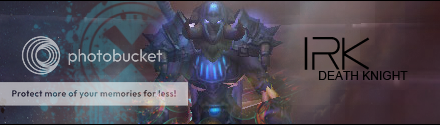
-
09-23-2008 #9
Banned
- Reputation
- 365
- Join Date
- Aug 2007
- Posts
- 1,725
- Thanks G/R
- 0/0
- Trade Feedback
- 0 (0%)
- Mentioned
- 0 Post(s)
- Tagged
- 0 Thread(s)
Yes, the hair-cut doesn't look too natural^^
Ease, your site is nice, thanks
When i worked on the second sig i added the main c4d you see in the background of the first and it looked good, but didn't fit the second, so i decided to make another one^^


 Reply With Quote
Similar Threads
-
[SHOWOFF] New Sig, Simply But Elegant
By evann in forum Art & Graphic DesignReplies: 1Last Post: 06-07-2008, 04:58 PM -
[Showoff] new sig
By Waspp in forum Art & Graphic DesignReplies: 1Last Post: 05-17-2008, 05:11 AM -
[Showoff] New Sig
By cgrock in forum Art & Graphic DesignReplies: 0Last Post: 03-29-2008, 11:15 AM -
[Showoff] ~New Sig~
By SpookyMan92 in forum Art & Graphic DesignReplies: 5Last Post: 02-26-2008, 10:31 PM -
[Showoff] New Sigs/Website Stuff
By sublimepwns in forum Art & Graphic DesignReplies: 0Last Post: 01-07-2008, 12:47 AM
-
OwnedCore Forums
casino news World of Warcraft Pokemon GO MMO Overwatch RTS Casino reviews www.planet-casino.com lucky 8 lucky8 no deposit codes bc game bc game lucky8 -
casino
Casino Gambling Online casinos Casino en ligne bc game bc game bc game no deposit bonus codes roobet Top 10 Casinos Casino reviews Bitcoin casino Paypal Casino Lucky8 1xbit heycasino Looking for somone to Fresh Phish! Free glider keys Give Giving away 20 account temporarly Urgent Regarding Free Accounts! when I scam should I use [Help] Scamming Phisher -
CoreCoins
CoreCoins CoreCoins FAQ Shout-Out Banner Ads -
My OwnedCore
My Profile Notifications Settings Buy CoreCoins About Us


Privacy Policy | Cookie Policy | Terms | Contact Us
Available Payment Methods:-
![[Showoff] New sig >_>](https://www.ownedcore.com/images/paybutton/paypal.png)
![[Showoff] New sig >_>](https://www.ownedcore.com/images/paybutton/skrill.png)
![[Showoff] New sig >_>](https://www.ownedcore.com/images/paybutton/payop.png)