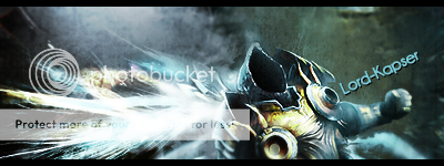
Alright i tried these one of my old styles and a newer 1. Which one do you think looks better
1.
2.

User Tag List
Thread: [Rate] Signature
Results 1 to 11 of 11
-
07-22-2008 #1Member

- Reputation
- 24
- Join Date
- Dec 2007
- Posts
- 524
- Thanks G/R
- 0/0
- Trade Feedback
- 0 (0%)
- Mentioned
- 0 Post(s)
- Tagged
- 0 Thread(s)
[Rate] Signature

-
07-22-2008 #2Member

- Reputation
- 143
- Join Date
- Sep 2007
- Posts
- 656
- Thanks G/R
- 0/0
- Trade Feedback
- 0 (0%)
- Mentioned
- 0 Post(s)
- Tagged
- 0 Thread(s)
personally style 1 i prefer. i prefer it because of the better colouring mainly. the contrast of two just looks really wrong, and also because all the colours are similar the depth is ruined slightly. however i do prefer the blending of the render in number 2, i think thats something you need to work on with number one a bit more, also try add a light source, it will help with the depth and prevent your sigs from looking flat.

Love isn't an emotion or an instinct - it is an Art
-
07-22-2008 #3Member

- Reputation
- 24
- Join Date
- Dec 2007
- Posts
- 524
- Thanks G/R
- 0/0
- Trade Feedback
- 0 (0%)
- Mentioned
- 0 Post(s)
- Tagged
- 0 Thread(s)
Kk i also tried useing both styles in 1 and i got this

its a bit dark but i like it
-
07-22-2008 #4Contributor


- Reputation
- 96
- Join Date
- Mar 2008
- Posts
- 667
- Thanks G/R
- 0/0
- Trade Feedback
- 0 (0%)
- Mentioned
- 0 Post(s)
- Tagged
- 0 Thread(s)
-
07-22-2008 #5Member

- Reputation
- 24
- Join Date
- Dec 2007
- Posts
- 524
- Thanks G/R
- 0/0
- Trade Feedback
- 0 (0%)
- Mentioned
- 0 Post(s)
- Tagged
- 0 Thread(s)
Thanks i really like it also

-
07-22-2008 #6Active Member


- Reputation
- 21
- Join Date
- Jan 2007
- Posts
- 233
- Thanks G/R
- 0/0
- Trade Feedback
- 0 (0%)
- Mentioned
- 0 Post(s)
- Tagged
- 0 Thread(s)
I like the first one the colours are nicer to my eyes
 keep it up:biggthumpup:

-
07-22-2008 #7Member

- Reputation
- 24
- Join Date
- Dec 2007
- Posts
- 524
- Thanks G/R
- 0/0
- Trade Feedback
- 0 (0%)
- Mentioned
- 0 Post(s)
- Tagged
- 0 Thread(s)
Thanks

My full gallery ( well just about everything i made ) is at
GFX Amped
a great forum and render gallery that is going to get better

-
07-24-2008 #8Member

- Reputation
- 145
- Join Date
- Apr 2007
- Posts
- 948
- Thanks G/R
- 0/0
- Trade Feedback
- 0 (0%)
- Mentioned
- 0 Post(s)
- Tagged
- 0 Thread(s)
You should make your sig's a bit bigger. They are quite small.


-
07-25-2008 #9Contributor


- Reputation
- 196
- Join Date
- Mar 2007
- Posts
- 960
- Thanks G/R
- 0/0
- Trade Feedback
- 0 (0%)
- Mentioned
- 0 Post(s)
- Tagged
- 0 Thread(s)
-
07-25-2008 #10Contributor


- Reputation
- 115
- Join Date
- Apr 2007
- Posts
- 1,045
- Thanks G/R
- 0/0
- Trade Feedback
- 0 (0%)
- Mentioned
- 0 Post(s)
- Tagged
- 0 Thread(s)
lol above filler

-
07-25-2008 #11Member

- Reputation
- 145
- Join Date
- Apr 2007
- Posts
- 948
- Thanks G/R
- 0/0
- Trade Feedback
- 0 (0%)
- Mentioned
- 0 Post(s)
- Tagged
- 0 Thread(s)
Similar Threads
-
[Rate] Signature, Position of Power
By BrightChild in forum Art & Graphic DesignReplies: 2Last Post: 11-30-2010, 10:10 PM -
[Rate] Signature
By nickeg in forum Art & Graphic DesignReplies: 3Last Post: 07-04-2008, 09:13 PM -
[Rate] Signature I've made for a friend
By Reflection in forum Art & Graphic DesignReplies: 6Last Post: 03-20-2008, 03:01 PM -
First made signature and avatar. please rate
By Volcano in forum Art & Graphic DesignReplies: 16Last Post: 09-29-2007, 12:43 AM -
My new signature rate it please :)
By Muatmessmoko in forum Art & Graphic DesignReplies: 7Last Post: 07-03-2007, 08:46 PM
![[Rate] Signature](https://www.ownedcore.com/forums/images/styles/OwnedCoreFX/addimg/menu4.svg)

![[Rate] Signature](https://www.ownedcore.com/forums/./ocpbanners/1/0/6/3/8/1/6/1e102dbc1865060efdd7bf3ae1edf5cc.jpg)
![TradeSafe Middleman [Rate] Signature](https://www.ownedcore.com/assets/mm/images/wits.png)
![CoreCoins [Rate] Signature](https://www.ownedcore.com/forums/images/styles/OwnedCoreFX/addimg/wicc.png)


 Reply With Quote
![[Rate] Signature](https://www.ownedcore.com/images/ba/g/b2.gif)


![[Rate] Signature](https://www.ownedcore.com/images/paybutton/paypal.png)
![[Rate] Signature](https://www.ownedcore.com/images/paybutton/skrill.png)
![[Rate] Signature](https://www.ownedcore.com/images/paybutton/payop.png)