![[rate] Catalyst's new signatures](https://www.ownedcore.com/forums/images/styles/OwnedCoreFX/addimg/menu4.svg)
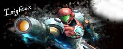
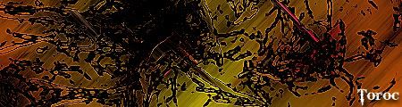
Heres Some of my latest work, its like 3 days old now.
1.
2.
3.
4.
5.
6.
7.
8.
9.
10.
So there it is . Rate it on a 10 scale.
Post suggestions also, i like feedback

![[rate] Catalyst's new signatures](https://www.ownedcore.com/forums/./ocpbanners/1/0/6/3/8/1/6/1e102dbc1865060efdd7bf3ae1edf5cc.jpg)
![[rate] Catalyst's new signatures](https://www.ownedcore.com/assets/mm/images/wits.png "TradeSafe Middleman")
![[rate] Catalyst's new signatures](https://www.ownedcore.com/forums/images/styles/OwnedCoreFX/addimg/wicc.png "CoreCoins")

User Tag List
Thread: [rate] Catalyst's new signatures
Results 1 to 4 of 4
-
06-29-2008 #1
 Banned

- Reputation
- 136
- Join Date
- Jul 2007
- Posts
- 833
- Thanks G/R
- 0/0
- Trade Feedback
- 0 (0%)
- Mentioned
- 0 Post(s)
- Tagged
- 0 Thread(s)


[rate] Catalyst's new signatures
![[rate] Catalyst's new signatures](https://www.ownedcore.com/images/ba/g/b2.gif)
-
06-29-2008 #2
Member
- Reputation
- 15
- Join Date
- Jan 2008
- Posts
- 105
- Thanks G/R
- 0/0
- Trade Feedback
- 0 (0%)
- Mentioned
- 0 Post(s)
- Tagged
- 0 Thread(s)
I think the 2nd one is your best one and the rest are to messy for my taste. And on the second one try to put the text more in the middle like have it, left from here shoulder .. and then take the text... click text colour and point at a good spot in your signature to get a colour from your signature.... that will make so the text fits the signature more.

-
06-30-2008 #3
Member
- Reputation
- 13
- Join Date
- Jun 2008
- Posts
- 220
- Thanks G/R
- 0/0
- Trade Feedback
- 0 (0%)
- Mentioned
- 0 Post(s)
- Tagged
- 0 Thread(s)
nice simple but the only 1 i liked was the secand one all the rest have to much lines and all over the place make them more simple with brushes and u might want to try smudgeing
-
06-30-2008 #4
Contributor

- Reputation
- 196
- Join Date
- Mar 2007
- Posts
- 960
- Thanks G/R
- 0/0
- Trade Feedback
- 0 (0%)
- Mentioned
- 0 Post(s)
- Tagged
- 0 Thread(s)
the second one has a nice subtle feel, all the others have too many filters and effects. and maybe you should choose a different font. it might look cool on its own or be your favourite font, but it doesn't fit in so well with most of these sigs.


 Reply With Quote
Similar Threads
-
[Rate & Comment] My New Signatures =D
By Zore in forum Art & Graphic DesignReplies: 68Last Post: 07-03-2009, 01:07 PM -
[Rate] [Comment] A new signature I put together!
By Zeluous in forum Art & Graphic DesignReplies: 4Last Post: 05-27-2009, 12:20 PM -
[Yet another Rate & CC] - My new Signature -
By wow4Supplier in forum Art & Graphic DesignReplies: 2Last Post: 05-13-2009, 09:45 AM -
[Sig] Rate my new Signature!
By [ Prototype ] in forum Art & Graphic DesignReplies: 13Last Post: 01-10-2008, 08:30 AM -
My new signature rate it please :)
By Muatmessmoko in forum Art & Graphic DesignReplies: 7Last Post: 07-03-2007, 08:46 PM
-
OwnedCore Forums
casino news World of Warcraft Pokemon GO MMO Overwatch RTS Casino reviews www.planet-casino.com lucky 8 lucky8 no deposit codes bc game bc game lucky8 -
casino
Casino Gambling Online casinos Casino en ligne bc game bc game bc game no deposit bonus codes roobet Top 10 Casinos Casino reviews Bitcoin casino Paypal Casino Lucky8 1xbit heycasino Retail Authentication Key [REQUEST] WoTLK Phisher Is this a ban? Glider Elite giveaway Recall account finding out wow Level 80 Palidin Giveaway paypal scam [Question] Can VCC's -
CoreCoins
CoreCoins CoreCoins FAQ Shout-Out Banner Ads -
My OwnedCore
My Profile Notifications Settings Buy CoreCoins About Us


Privacy Policy | Cookie Policy | Terms | Contact Us
Available Payment Methods:-
![[rate] Catalyst's new signatures](https://www.ownedcore.com/images/paybutton/paypal.png)
![[rate] Catalyst's new signatures](https://www.ownedcore.com/images/paybutton/skrill.png)
![[rate] Catalyst's new signatures](https://www.ownedcore.com/images/paybutton/payop.png)