![[Rate] My first sig](https://www.ownedcore.com/forums/images/styles/OwnedCoreFX/addimg/menu4.svg)
Hey all.
It's my first sig ever, so be gentle
Please tell me what I can do better for next time, but don't say it's boring or something, cuz I know that, I didn't spend that much time on it :P

![[Rate] My first sig](https://www.ownedcore.com/forums/./ocpbanners/1/2/9/8/0/2/2/01d9781faec8bfe3abf9095ac9e57d1e.jpg)
![[Rate] My first sig](https://www.ownedcore.com/assets/mm/images/wits.png "TradeSafe Middleman")
![[Rate] My first sig](https://www.ownedcore.com/forums/images/styles/OwnedCoreFX/addimg/wicc.png "CoreCoins")

User Tag List
Thread: [Rate] My first sig
Results 1 to 8 of 8
-
06-24-2008 #1
 Contributor

- Reputation
- 96
- Join Date
- Mar 2008
- Posts
- 667
- Thanks G/R
- 0/0
- Trade Feedback
- 0 (0%)
- Mentioned
- 0 Post(s)
- Tagged
- 0 Thread(s)

[Rate] My first sig

![[Rate] My first sig](https://www.ownedcore.com/images/ba/g/b2.gif)
-
06-24-2008 #2
Member
- Reputation
- 52
- Join Date
- Feb 2008
- Posts
- 569
- Thanks G/R
- 0/0
- Trade Feedback
- 0 (0%)
- Mentioned
- 0 Post(s)
- Tagged
- 0 Thread(s)
A Few words:
Pro's
Blends
Cons
Text doesn't do the job
Very plain.
If your using photoshop try to brush, get some brushes from Photoshop Brushes - Free Photoshop Brushes at Brusheezy!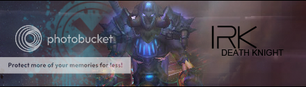
-
06-24-2008 #3
Contributor
- Reputation
- 111
- Join Date
- Jun 2007
- Posts
- 905
- Thanks G/R
- 0/0
- Trade Feedback
- 0 (0%)
- Mentioned
- 0 Post(s)
- Tagged
- 0 Thread(s)
It isn't that bad :P I couldn't do it ... But some more effects on it won't hurt


-
06-24-2008 #4
Contributor
- Reputation
- 96
- Join Date
- Mar 2008
- Posts
- 667
- Thanks G/R
- 0/0
- Trade Feedback
- 0 (0%)
- Mentioned
- 0 Post(s)
- Tagged
- 0 Thread(s)
Thanks for the critismOriginally Posted by Ease

Hehe thanks, i'm glad someone atleast doesn't think it's that bad.Originally Posted by GwarrLast edited by Randie; 06-24-2008 at 10:38 AM.
-
06-24-2008 #5
Active Member

- Reputation
- 21
- Join Date
- Jan 2007
- Posts
- 233
- Thanks G/R
- 0/0
- Trade Feedback
- 0 (0%)
- Mentioned
- 0 Post(s)
- Tagged
- 0 Thread(s)
As Ease said you should use some brushes to remove the plainness ;D and add some depht to it. And you should try to make it all blend together, but for a first sig i think it is okay ;D keep trying!
Lord-kapser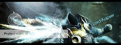
-
06-27-2008 #6
Member
- Reputation
- 1
- Join Date
- Jun 2008
- Posts
- 6
- Thanks G/R
- 0/0
- Trade Feedback
- 0 (0%)
- Mentioned
- 0 Post(s)
- Tagged
- 0 Thread(s)
In my opinion the sig doesn't really have much flow in it, but then again, neither did mine my first few attempts!
Like previously said, the text is just kind of blah, just there. Maybe add a little opacity and effects to it.
-
06-27-2008 #7
Member
- Reputation
- 36
- Join Date
- Jun 2008
- Posts
- 175
- Thanks G/R
- 0/0
- Trade Feedback
- 0 (0%)
- Mentioned
- 0 Post(s)
- Tagged
- 0 Thread(s)

Not bad for a first sig but to me it just looks like a render on a red background with words. Add in some C4D's and play around with the effects

-
06-27-2008 #8
Contributor
- Reputation
- 196
- Join Date
- Mar 2007
- Posts
- 960
- Thanks G/R
- 0/0
- Trade Feedback
- 0 (0%)
- Mentioned
- 0 Post(s)
- Tagged
- 0 Thread(s)
i wouldn't suggest using C4D's if your new to photoshop, a lot of people don't know how to use them properly.Originally Posted by CodeDemon


 Reply With Quote
Similar Threads
-
[Rate] My first sig. Ever!
By Rawlsku- in forum Art & Graphic DesignReplies: 0Last Post: 07-03-2008, 03:44 PM -
[Rate]My first sig
By CodeDemon in forum Art & Graphic DesignReplies: 4Last Post: 06-07-2008, 08:23 PM -
[Rate] My first sig
By tumadre in forum Art & Graphic DesignReplies: 2Last Post: 05-31-2008, 01:24 PM -
[Rate] My First Sig + Avatar
By Submit in forum Art & Graphic DesignReplies: 3Last Post: 01-20-2008, 10:08 AM -
Rate my first sig plz
By freezer1012 in forum Art & Graphic DesignReplies: 4Last Post: 11-07-2007, 05:12 AM
-
OwnedCore Forums
casino news World of Warcraft Pokemon GO MMO Overwatch RTS Casino reviews bc game bc game -
casino
Casino Gambling Online casinos Casino en ligne vercel livescore bc game lovable vercel bc game no deposit bonus codes stake Top 10 Casinos Casino reviews Bitcoin casino Lucky8 1xbit heycasino Gamecard Reloaded Full info priest giveaway PLZ Almost got my first 23 Gnome Mage Good GOLD SCAMMING Some1 transferred my How much for account? 000webhost? I'm Lost. Help please how do i -
CoreCoins
CoreCoins CoreCoins FAQ Shout-Out Banner Ads -
My OwnedCore
My Profile Notifications Settings Buy CoreCoins About Us


Privacy Policy | Cookie Policy | Terms | Contact Us
Available Payment Methods:-
![[Rate] My first sig](https://www.ownedcore.com/images/paybutton/paypal.png)
![[Rate] My first sig](https://www.ownedcore.com/images/paybutton/skrill.png)
![[Rate] My first sig](https://www.ownedcore.com/images/paybutton/payop.png)
-
Casino
Blockchain gambling | Shuffle Casino | travel advantage | mwr life | mwr life | mwr life | Aviator game casino | mwr life | here | mwr life | freebet tanpa | stake | mwr life | iLucki Casino | mwr | mwr life | Top 5 canadian online casinos 2025 | CryptoRoyal Casino | mwr life | mwr life | Instant Payout Methods | mwr life | HashLucky Casino | MRQ Casino | X | Free casino games | mystake | mwr life | mwr life | canada | Mirax Casino | Bitstarz Tournament