![[SHOWOFF]Fiddyx[Cyong] Assassins Creed](https://www.ownedcore.com/forums/images/styles/OwnedCoreFX/addimg/menu4.svg)
Well, as you guys prolly have or havent noticed, i havent been on in a while, i've been busy with school and finals, UGHHHHHHHHHHHH lol well anyways, here is something i made for fun. CC pl0x

![[SHOWOFF]Fiddyx[Cyong] Assassins Creed](https://www.ownedcore.com/forums/./ocpbanners/1/4/7/9/2/7/3/954ecbc55ddc50a3099da3e6d85bbf82.gif)
![[SHOWOFF]Fiddyx[Cyong] Assassins Creed](https://www.ownedcore.com/assets/mm/images/wits.png "TradeSafe Middleman")
![[SHOWOFF]Fiddyx[Cyong] Assassins Creed](https://www.ownedcore.com/forums/images/styles/OwnedCoreFX/addimg/wicc.png "CoreCoins")

Shout-Out
User Tag List
Results 1 to 5 of 5
-
06-16-2008 #1
 Active Member

- Reputation
- 32
- Join Date
- Aug 2007
- Posts
- 244
- Thanks G/R
- 0/0
- Trade Feedback
- 0 (0%)
- Mentioned
- 0 Post(s)
- Tagged
- 0 Thread(s)


[SHOWOFF]Fiddyx[Cyong] Assassins Creed


![[SHOWOFF]Fiddyx[Cyong] Assassins Creed](https://www.ownedcore.com/images/ba/g/b2.gif)
-
06-17-2008 #2
Member
- Reputation
- 143
- Join Date
- Sep 2007
- Posts
- 656
- Thanks G/R
- 0/0
- Trade Feedback
- 0 (0%)
- Mentioned
- 0 Post(s)
- Tagged
- 0 Thread(s)
i reckon its one of your best yet (i cant remember all of yours but definately compared to your current at some of your others its a big improvement)
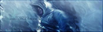
i think what this sig has that your old sigs didn't is depth. its very subtle here but it works just well enough. i like the brush work and the sort of smoke/water like effects. the colours all match well with the render to give good flow. however it would be nice if you added a prominent light source on the left (or wherever you want to put it) just to make the shadows and lighting youve sort of brushed in more realistic, because at the moment it sort of looks like a liquified background with dark brush work that need some blending into each other. the triple repeated render works well to add a bit more depth to the background while still being subtle
lastly the text fits nicely in the sig, the brushing on the right shoulder could perhaps have been smudged a little more into the rest of the background but overall i think its an improving piece

Love isn't an emotion or an instinct - it is an Art
-
06-17-2008 #3
Member
- Reputation
- 5
- Join Date
- Jun 2008
- Posts
- 74
- Thanks G/R
- 0/0
- Trade Feedback
- 0 (0%)
- Mentioned
- 0 Post(s)
- Tagged
- 0 Thread(s)
the pink one > assasins :P
-
06-18-2008 #4
Member
- Reputation
- 2
- Join Date
- May 2008
- Posts
- 8
- Thanks G/R
- 0/0
- Trade Feedback
- 0 (0%)
- Mentioned
- 0 Post(s)
- Tagged
- 0 Thread(s)
Yah I don't particularly like the Assassin's Creed signature, the whole wave / ripple / ocean ripple technique just doesn't work real well in this...
But maybe 6/10 just because it's Assassin's Creed
I prefer your current pink signature. It's bad ass >_< Kirby ftw
-
07-02-2008 #5
Active Member
- Reputation
- 32
- Join Date
- Aug 2007
- Posts
- 244
- Thanks G/R
- 0/0
- Trade Feedback
- 0 (0%)
- Mentioned
- 0 Post(s)
- Tagged
- 0 Thread(s)
lol ty guys and ty carlosj =D

 Reply With Quote
Similar Threads
-
Assassins creed 2
By Drunksqirrel in forum Gaming ChatReplies: 10Last Post: 11-24-2009, 05:26 AM -
Assassins creed 2
By darthwispy in forum Gaming ChatReplies: 4Last Post: 04-22-2009, 07:27 AM -
Assassins creed 2 =D
By numbchuckz in forum Community ChatReplies: 2Last Post: 04-13-2009, 04:34 PM -
[Show Off/CC] Assassins Creed O.o
By .Cyong in forum Art & Graphic DesignReplies: 1Last Post: 08-28-2008, 08:33 AM -
Assassins Creed iphone/itouch theme
By eti-enne02 in forum Gaming ChatReplies: 2Last Post: 07-03-2008, 01:49 PM
-
OwnedCore Forums
casino news World of Warcraft Pokemon GO MMO Overwatch RTS Casino reviews bc game bc game bc game bc game bc game bc game bc game bc game bc game bc game bc game bc game bc game bc game bc game bc game bc game bc game bc game bc game bc game bc game bc game bc game bc game bc game bc game bc game bc game bc game bc game bc game bc game bc game bc game bc game bc game bc game bc game bc game bc game bc game bc game bc game bc game bc game bc game bc game bc game bc game -
casino
Casino Gambling Online casinos Casino en ligne bc game bc game bc game bc game bc game bc game bc game bc game bc game bc game bc game no deposit bonus codes roobet Top 10 Casinos Casino reviews Bitcoin casino Paypal Casino Lucky8 1xbit heycasino Roulette Casino - Best ✅Leonbet Casino - Stake No deposit Bonus ✅Oshi Casino - 100% ✅Millionz Casino - ✅Casinos en ligne - ⭐ Bitstarz Casino - CashLib dans les casinos Casinos en ligne avec -
CoreCoins
CoreCoins CoreCoins FAQ Shout-Out Banner Ads -
My OwnedCore
My Profile Notifications Settings Buy CoreCoins About Us


Privacy Policy | Cookie Policy | Terms | Contact Us
Available Payment Methods:-
![[SHOWOFF]Fiddyx[Cyong] Assassins Creed](https://www.ownedcore.com/images/paybutton/paypal.png)
![[SHOWOFF]Fiddyx[Cyong] Assassins Creed](https://www.ownedcore.com/images/paybutton/skrill.png)
![[SHOWOFF]Fiddyx[Cyong] Assassins Creed](https://www.ownedcore.com/images/paybutton/payop.png)
-
Casino
Crypto Casino | Drake Casino | Rollino Casino | Jackpotcity | Millionz | Lucky Dreams Casino | Bitstarz | MrGreen | Cresus Casino | Bonus code | Casino Reviews | Mystake Casino | Casino Bonus | No deposit bonus | Casino deposit offers | BuzzLuck | PalmSlots Casino | ZenCasino | Sportsbook | Bc Game | InstantPay | Bovada casino | Lucky31 | Dublinbet | Slot machines | BitCasino | Betflip Casino | Oshi Casino | Welcome Bonuses