![[Rate]My first sig](https://www.ownedcore.com/forums/images/styles/OwnedCoreFX/addimg/menu4.svg)
This is the first sig I ever made what do you guys think?


![[Rate]My first sig](https://www.ownedcore.com/forums/./ocpbanners/1/2/9/8/0/2/2/01d9781faec8bfe3abf9095ac9e57d1e.jpg)
![[Rate]My first sig](https://www.ownedcore.com/assets/mm/images/wits.png "TradeSafe Middleman")
![[Rate]My first sig](https://www.ownedcore.com/forums/images/styles/OwnedCoreFX/addimg/wicc.png "CoreCoins")

Shout-Out
User Tag List
Thread: [Rate]My first sig
Results 1 to 5 of 5
-
06-07-2008 #1
 Member
- Reputation
- 36
- Join Date
- Jun 2008
- Posts
- 175
- Thanks G/R
- 0/0
- Trade Feedback
- 0 (0%)
- Mentioned
- 0 Post(s)
- Tagged
- 0 Thread(s)


[Rate]My first sig
![[Rate]My first sig](https://www.ownedcore.com/images/ba/g/b2.gif)
-
06-07-2008 #2
Banned
- Reputation
- 192
- Join Date
- Jan 2008
- Posts
- 1,244
- Thanks G/R
- 0/0
- Trade Feedback
- 0 (0%)
- Mentioned
- 0 Post(s)
- Tagged
- 0 Thread(s)

My Rate: 7/10
-
06-07-2008 #3
Member
- Reputation
- 11
- Join Date
- May 2008
- Posts
- 201
- Thanks G/R
- 0/0
- Trade Feedback
- 0 (0%)
- Mentioned
- 0 Post(s)
- Tagged
- 0 Thread(s)
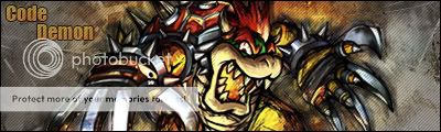
6/10
The figure in it still has an outline that looks like he wasn't cut out all the way, I'd choose a better font maybe, and borders on sigs is a must imo.
but for a first sig its definitely better than mine was lawl
-
06-07-2008 #4
Member
- Reputation
- 36
- Join Date
- Jun 2008
- Posts
- 175
- Thanks G/R
- 0/0
- Trade Feedback
- 0 (0%)
- Mentioned
- 0 Post(s)
- Tagged
- 0 Thread(s)
yea true lol thanks for the comments

-
06-07-2008 #5
Banned
- Reputation
- 179
- Join Date
- Jan 2008
- Posts
- 1,396
- Thanks G/R
- 0/0
- Trade Feedback
- 0 (0%)
- Mentioned
- 0 Post(s)
- Tagged
- 0 Thread(s)
3/10.
The render looks squashed.
It needs to blend more.
The text doesn't fit and the glow isn't needed.
It needs a border (My opinion, it would look way better if it did)
The sig is sort of basic...try using some more C4D's and effects.
Just my criticism. =)

 Reply With Quote
Similar Threads
-
[Rate] My first sig. Ever!
By Rawlsku- in forum Art & Graphic DesignReplies: 0Last Post: 07-03-2008, 03:44 PM -
[Rate] My first sig
By Randie in forum Art & Graphic DesignReplies: 7Last Post: 06-27-2008, 09:59 PM -
[Rate] My first sig
By tumadre in forum Art & Graphic DesignReplies: 2Last Post: 05-31-2008, 01:24 PM -
[Rate] My First Sig + Avatar
By Submit in forum Art & Graphic DesignReplies: 3Last Post: 01-20-2008, 10:08 AM -
Rate my first sig plz
By freezer1012 in forum Art & Graphic DesignReplies: 4Last Post: 11-07-2007, 05:12 AM
-
OwnedCore Forums
casino news World of Warcraft Pokemon GO MMO Overwatch RTS Casino reviews www.planet-casino.com lucky 8 lucky8 no deposit codes bc game bc game lucky8 -
casino
Casino Gambling Online casinos Casino en ligne bc game bc game bc game no deposit bonus codes roobet Top 10 Casinos Casino reviews Bitcoin casino Paypal Casino Lucky8 1xbit heycasino Need to sell account [Giveaway] Rapidshare FREE US account. Help Please This Is I have all the account [HELP] With a full info Help Khaz'Goroth Trade??? Blank account -
CoreCoins
CoreCoins CoreCoins FAQ Shout-Out Banner Ads -
My OwnedCore
My Profile Notifications Settings Buy CoreCoins About Us


Privacy Policy | Cookie Policy | Terms | Contact Us
Available Payment Methods:-
![[Rate]My first sig](https://www.ownedcore.com/images/paybutton/paypal.png)
![[Rate]My first sig](https://www.ownedcore.com/images/paybutton/skrill.png)
![[Rate]My first sig](https://www.ownedcore.com/images/paybutton/payop.png)
-
Casino
mystake | mystake | amazon | casino | casino | amazon | amazon | casino | amazon | amazon | amazon | vave | vave | vave | casino | amazon | amazon | amazon | casino | amazon | casino | casino | casino | amazon | casino | casino | amazon | casino | amazon | casino | casino | amazon | casino | casino | casino | Free casino games | amazon | vave | casino | casino | vave | amazon | casino | amazon | casino | mystake | amazon | amazon | amazon | amazon | casino | amazon | amazon | casino | amazon | casino | vave | amazon | casino | amazon