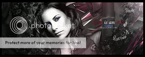
Rate/CC on my new signature, I tried to go for a new style, Personally I like it. Also I couldn't resist trying the way Piersd does his text.
I know, I need a border, I'm not sure how to make those. ;S
Shout-Out
User Tag List
Thread: [Rate/CC] Signature, New style.
Results 1 to 5 of 5
-
06-02-2008 #1Member

- Reputation
- 52
- Join Date
- Feb 2008
- Posts
- 569
- Thanks G/R
- 0/0
- Trade Feedback
- 0 (0%)
- Mentioned
- 0 Post(s)
- Tagged
- 0 Thread(s)
[Rate/CC] Signature, New style.

-
06-02-2008 #2Active Member


- Reputation
- 34
- Join Date
- Dec 2006
- Posts
- 298
- Thanks G/R
- 0/0
- Trade Feedback
- 0 (0%)
- Mentioned
- 0 Post(s)
- Tagged
- 0 Thread(s)
To make a border, this is how I do it.. I make a new layer, then press ctrl + a, then I got to Edit<Stroke, then pick your size, and what ever, then press okay. You are now done, then press ctrl + d to deselect it

DA Gift From Mr. Blain
-
06-03-2008 #3Member

- Reputation
- 52
- Join Date
- Feb 2008
- Posts
- 569
- Thanks G/R
- 0/0
- Trade Feedback
- 0 (0%)
- Mentioned
- 0 Post(s)
- Tagged
- 0 Thread(s)
Thanks, Any rating out of 10 or CC?

-
06-03-2008 #4Banned

- Reputation
- 365
- Join Date
- Aug 2007
- Posts
- 1,725
- Thanks G/R
- 0/0
- Trade Feedback
- 0 (0%)
- Mentioned
- 0 Post(s)
- Tagged
- 0 Thread(s)
The main critic point there is the render, its not blended in enough, a brightness contrast layer, a lightsource and deleting some parts would probably help.
And for my taste its too colorful ( Well not colorful, but the colors don't match^^)
It kinda looks like you tried some aspects of Piersds work, but don't. Its really hard OoLast edited by Narudan; 06-03-2008 at 09:35 AM.
-
06-03-2008 #5Member

- Reputation
- 143
- Join Date
- Sep 2007
- Posts
- 656
- Thanks G/R
- 0/0
- Trade Feedback
- 0 (0%)
- Mentioned
- 0 Post(s)
- Tagged
- 0 Thread(s)
personally its not my preferred kind of style so not to keen on it.
mainly because the render is so obvious (the colours just dont match) against the background and i prefer more blending between them both
also the contrast between the render and the background not to keen on as they dont really match. but i do like the depth of the background, would be nicer to have a light source though to help with the depth and blending the render with the background. also im really unsure about the arrow head thing on the left, it looks really strange and doesnt fit the style of the sig.
i think your work with the c4ds is nice and they blend preety well you just need to work on blending the foreground and background together, make one side of the render darker than another (using burn tool, dark brush etc), so the side of the render the light source isnt facing is darker and reflects the depth of the rest of the sig.
the texts not to bad either but try not to place it over a c4d with contrasting colours such as the red as it makes it stand out to much against the subtle blue colour.
overall i personally don't feel this is your best piece(sorry but i feel not telling the truth would be patronising and not help you), but nonetheless not a bad piece, theres just a few areas that could be edited/blended slightly imo to help improve the depth and in turn improve the realism. just keep practicisng by placing the render on the sig first and working around it, this will help to improve your blending and your depth work as you will be working around a main focus that fits with the rest of the sig
edit: arghh i wrote this ages ago and it didnt post so sorry for delay
Last edited by CarlosJ; 06-03-2008 at 02:54 PM.

Love isn't an emotion or an instinct - it is an Art
Similar Threads
-
[Yet another Rate & CC] - My new Signature -
By wow4Supplier in forum Art & Graphic DesignReplies: 2Last Post: 05-13-2009, 09:45 AM -
[Rate]New Style Sig
By CodeDemon in forum Art & Graphic DesignReplies: 1Last Post: 07-03-2008, 09:12 AM -
[rate] Catalyst's new signatures
By XC4T4LY5TX in forum Art & Graphic DesignReplies: 3Last Post: 06-30-2008, 05:00 AM -
[Showoff] New Style Signature
By PrimoPie in forum Art & Graphic DesignReplies: 2Last Post: 06-02-2008, 03:01 AM -
[Rate] A new style of Signature.
By Shinyshoes in forum Art & Graphic DesignReplies: 3Last Post: 02-24-2008, 12:29 PM
![[Rate/CC] Signature, New style.](https://www.ownedcore.com/forums/images/styles/OwnedCoreFX/addimg/menu4.svg)

![[Rate/CC] Signature, New style.](https://www.ownedcore.com/forums/./ocpbanners/1/0/6/3/8/1/6/1e102dbc1865060efdd7bf3ae1edf5cc.jpg)
![TradeSafe Middleman [Rate/CC] Signature, New style.](https://www.ownedcore.com/assets/mm/images/wits.png)
![CoreCoins [Rate/CC] Signature, New style.](https://www.ownedcore.com/forums/images/styles/OwnedCoreFX/addimg/wicc.png)


 Reply With Quote
![[Rate/CC] Signature, New style.](https://www.ownedcore.com/images/ba/g/b2.gif)


![[Rate/CC] Signature, New style.](https://www.ownedcore.com/images/paybutton/paypal.png)
![[Rate/CC] Signature, New style.](https://www.ownedcore.com/images/paybutton/skrill.png)
![[Rate/CC] Signature, New style.](https://www.ownedcore.com/images/paybutton/payop.png)