![[Rate] Sig](https://www.ownedcore.com/forums/images/styles/OwnedCoreFX/addimg/menu4.svg)
Hey im really new to this so i would like to know what i could change
to make my sig look better.
Thanks for every comment
(Also if anybody likes this i would give it away and change the name for you)

![[Rate] Sig](https://www.ownedcore.com/forums/./ocpbanners/1/2/9/8/0/2/2/01d9781faec8bfe3abf9095ac9e57d1e.jpg)
![[Rate] Sig](https://www.ownedcore.com/assets/mm/images/wits.png "TradeSafe Middleman")
![[Rate] Sig](https://www.ownedcore.com/forums/images/styles/OwnedCoreFX/addimg/wicc.png "CoreCoins")

Shout-Out
User Tag List
Thread: [Rate] Sig
Results 1 to 15 of 15
-
05-23-2008 #1
 Active Member

- Reputation
- 18
- Join Date
- Mar 2007
- Posts
- 144
- Thanks G/R
- 0/1
- Trade Feedback
- 0 (0%)
- Mentioned
- 0 Post(s)
- Tagged
- 0 Thread(s)

[Rate] Sig
![[Rate] Sig](https://www.ownedcore.com/images/ba/g/b2.gif)
-
05-23-2008 #2
 Member
- Reputation
- 11
- Join Date
- Jul 2007
- Posts
- 85
- Thanks G/R
- 0/0
- Trade Feedback
- 0 (0%)
- Mentioned
- 0 Post(s)
- Tagged
- 0 Thread(s)
Hmm, I'm not sure what it is about it... but I like it.. nice job man :Sylvia:
~Cgrock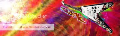
-
05-23-2008 #3
Contributor

- Reputation
- 196
- Join Date
- Mar 2007
- Posts
- 960
- Thanks G/R
- 0/0
- Trade Feedback
- 0 (0%)
- Mentioned
- 0 Post(s)
- Tagged
- 0 Thread(s)
uhh, i dunno what to say :S... maybe because i just woke up >.<
but overall, i really like it

-
05-23-2008 #4
Member
- Reputation
- 143
- Join Date
- Sep 2007
- Posts
- 656
- Thanks G/R
- 0/0
- Trade Feedback
- 0 (0%)
- Mentioned
- 0 Post(s)
- Tagged
- 0 Thread(s)
Regarding what to change, to perhaps improve it; i feel the text lets the sig down alot for me. curently it looks like a real nice sig (il get onto that later:P) but just looks as though you've just found it and plonked your name on it (i'm sure thats not what you have done but i'm trying to emphasise the point about the text looking out of place)
i would advise you to put the text on "overlay" or some other blending option so that it fits with the sig a bit more, also as a general rule outer glow is unecessary unless extreemley subtle because otherwise it makes the text stand out and detract from the focus which is the sig.
i really like the blending of the background with the brush work and the subtle colours that match each other giving nice flow. i also feel the render is nicely blended, nothing overthe top but simply done so it fits with the background to continue the depth. however i feel on the left (above the shoulder) you should change the light and dark around, only so it gives more a feel of depth, and so that the render is on a different focal layer to that of the light. or instead darkening the left side of the render which would provide a similar effect, so that it reflects the light source illuminanting from the right. i would have perhaps also have liked to have seen a bit more emphasis on a light source just so theres a bit of contrast in the sig as the colours are kind of dull (not a bad things thats just how it is ) overall i think its quite a nice sig just a few areas that could perhaps be altered slightly to give a bit more of an "edge" to it

Love isn't an emotion or an instinct - it is an Art
-
05-24-2008 #5
 Contributor

- Reputation
- 83
- Join Date
- Jul 2007
- Posts
- 410
- Thanks G/R
- 0/0
- Trade Feedback
- 0 (0%)
- Mentioned
- 0 Post(s)
- Tagged
- 0 Thread(s)
I like it, FMA ftw, my only issue with it is text and contrast, this is a idea of what I would have done with it:Originally Posted by Rake

Last edited by PrimoPie; 05-24-2008 at 04:15 AM.
-
05-24-2008 #6
Banned
- Reputation
- 365
- Join Date
- Aug 2007
- Posts
- 1,725
- Thanks G/R
- 0/0
- Trade Feedback
- 0 (0%)
- Mentioned
- 0 Post(s)
- Tagged
- 0 Thread(s)
The contrast is better, but you should add a light source if you make it like that, the text was fine.
-
05-24-2008 #7
Contributor
- Reputation
- 83
- Join Date
- Jul 2007
- Posts
- 410
- Thanks G/R
- 0/0
- Trade Feedback
- 0 (0%)
- Mentioned
- 0 Post(s)
- Tagged
- 0 Thread(s)
Yea, I'll agree after looking at it again text was decent, as far as light source, i hate flares, no?
-
05-24-2008 #8
Active Member
- Reputation
- 18
- Join Date
- Mar 2007
- Posts
- 144
- Thanks G/R
- 0/1
- Trade Feedback
- 0 (0%)
- Mentioned
- 0 Post(s)
- Tagged
- 0 Thread(s)
Thanks for all the comments ill have a look into it later
-
05-24-2008 #9
Active Member
- Reputation
- 32
- Join Date
- Nov 2007
- Posts
- 567
- Thanks G/R
- 0/0
- Trade Feedback
- 0 (0%)
- Mentioned
- 0 Post(s)
- Tagged
- 0 Thread(s)
not bad :P looks relay nice

-
05-24-2008 #10
Member
- Reputation
- 10
- Join Date
- May 2008
- Posts
- 134
- Thanks G/R
- 0/0
- Trade Feedback
- 0 (0%)
- Mentioned
- 0 Post(s)
- Tagged
- 0 Thread(s)
8/10, the other 2/10 is because I think Anime is stupid.
Overall, well done
-
05-24-2008 #11
Member
- Reputation
- 4
- Join Date
- Apr 2008
- Posts
- 24
- Thanks G/R
- 0/0
- Trade Feedback
- 0 (0%)
- Mentioned
- 0 Post(s)
- Tagged
- 0 Thread(s)
light source does not = flareOriginally Posted by jwicky
brushing/gradient/lighting effects, etc.
-
05-24-2008 #12
Member
- Reputation
- 143
- Join Date
- Sep 2007
- Posts
- 656
- Thanks G/R
- 0/0
- Trade Feedback
- 0 (0%)
- Mentioned
- 0 Post(s)
- Tagged
- 0 Thread(s)
sorry if that came across wrong, i don't think the text itself is bad i just don't think it matches the rest of the sig (hence why i said it just looks plonked on) because the text has alot brighter contrast and more vivid colours to the rest of the sig i feel it stands out too much. i think jwicky has got the contrast correct in his attempt and adding the text to that will fit nicely compared to beforehand. sorry if i gave the impression the text itself was no goodOriginally Posted by Narudan

Love isn't an emotion or an instinct - it is an Art
-
05-24-2008 #13
Member
- Reputation
- 1
- Join Date
- Jan 2008
- Posts
- 35
- Thanks G/R
- 0/0
- Trade Feedback
- 0 (0%)
- Mentioned
- 0 Post(s)
- Tagged
- 0 Thread(s)
Anime adds for some of the best signitures imo, the original is too dull, jwickys revision is very nice, the test doesnt quite fit it, the original text should be a tad bit bigger, by maybe 2px or so. other then that 6/10 atm FMA ftw
-
05-25-2008 #14
Banned
- Reputation
- 365
- Join Date
- Aug 2007
- Posts
- 1,725
- Thanks G/R
- 0/0
- Trade Feedback
- 0 (0%)
- Mentioned
- 0 Post(s)
- Tagged
- 0 Thread(s)
No i was referring to jwicky, meant the text looked better before ^^Originally Posted by carlosj
-
05-25-2008 #15
Active Member
- Reputation
- 30
- Join Date
- Oct 2007
- Posts
- 252
- Thanks G/R
- 0/0
- Trade Feedback
- 0 (0%)
- Mentioned
- 0 Post(s)
- Tagged
- 0 Thread(s)
I really like it, imo the colours in the bg goes well with the render's, and theres a nice flow.
8/10 from me :>


 Reply With Quote
Similar Threads
-
[showoff/rate] Sig, Stock photoshop smudge/c4d
By novaprosp3kt in forum Art & Graphic DesignReplies: 3Last Post: 08-22-2008, 11:33 PM -
[Rate] Sig and Render
By Phoenix WoW in forum Art & Graphic DesignReplies: 7Last Post: 07-08-2008, 05:57 AM -
[Rate] Sigs templates ive made
By Knomez in forum Art & Graphic DesignReplies: 3Last Post: 06-07-2008, 11:29 AM -
[Show Off/Rate] Sig :D
By timmeg in forum Art & Graphic DesignReplies: 6Last Post: 04-18-2008, 10:10 PM -
rate sig
By cirko in forum Art & Graphic DesignReplies: 7Last Post: 08-22-2007, 02:26 PM
-
OwnedCore Forums
casino news World of Warcraft Pokemon GO MMO Overwatch RTS Casino reviews www.planet-casino.com lucky 8 lucky8 no deposit codes bc game bc game lucky8 -
casino
Casino Gambling Online casinos Casino en ligne bc game bc game bc game no deposit bonus codes roobet Top 10 Casinos Casino reviews Bitcoin casino Paypal Casino Lucky8 1xbit heycasino Apocs Auth need help with getting (US) blank account Need Help please LF Fake Canandian ID Help with Paypal. Need 2 wotlk cd keys IGE Coupon Code how to get the blizz pic -
CoreCoins
CoreCoins CoreCoins FAQ Shout-Out Banner Ads -
My OwnedCore
My Profile Notifications Settings Buy CoreCoins About Us


Privacy Policy | Cookie Policy | Terms | Contact Us
Available Payment Methods:-
![[Rate] Sig](https://www.ownedcore.com/images/paybutton/paypal.png)
![[Rate] Sig](https://www.ownedcore.com/images/paybutton/skrill.png)
![[Rate] Sig](https://www.ownedcore.com/images/paybutton/payop.png)
-
Casino
vave | casino | casino | casino | casino | iLucki Casino | vave | vave | casino | casino | casino | casino | casino | vave | amazon | amazon | casino | amazon | casino | amazon | vave | amazon | amazon | casino | casino | amazon | casino | vave | casino | casino | casino | amazon | casino | amazon | amazon | amazon | casino | casino | casino | casino | amazon | amazon | casino | amazon | mystake | amazon | casino | casino | mystake | amazon | amazon | amazon | amazon | amazon | casino | casino | amazon | casino | casino | mystake