![[Rate] Newest Sig](https://www.ownedcore.com/forums/images/styles/OwnedCoreFX/addimg/menu4.svg)
Rate 1/10
Suggest improvements aswell!

![[Rate] Newest Sig](https://www.ownedcore.com/forums/./ocpbanners/1/2/9/8/0/2/2/01d9781faec8bfe3abf9095ac9e57d1e.jpg)
![[Rate] Newest Sig](https://www.ownedcore.com/assets/mm/images/wits.png "TradeSafe Middleman")
![[Rate] Newest Sig](https://www.ownedcore.com/forums/images/styles/OwnedCoreFX/addimg/wicc.png "CoreCoins")

Shout-Out
User Tag List
Thread: [Rate] Newest Sig
Results 1 to 4 of 4
-
04-20-2008 #1
![[Kronus]'s Avatar](https://www.ownedcore.com/forums/images/styles/OwnedCoreFX/addimg/noavatar.svg "[Kronus]'s Avatar") Contributor
Contributor![[Kronus] is offline](https://www.ownedcore.com/forums/images/styles/OwnedCoreFX/statusicon/user-offline.png)

- Reputation
- 184
- Join Date
- Sep 2006
- Posts
- 459
- Thanks G/R
- 0/0
- Trade Feedback
- 0 (0%)
- Mentioned
- 0 Post(s)
- Tagged
- 0 Thread(s)
[Rate] Newest Sig
![[Rate] Newest Sig](https://www.ownedcore.com/images/ba/g/b2.gif)
-
04-20-2008 #2
Member
- Reputation
- 57
- Join Date
- Apr 2008
- Posts
- 344
- Thanks G/R
- 0/0
- Trade Feedback
- 0 (0%)
- Mentioned
- 0 Post(s)
- Tagged
- 0 Thread(s)
I like i Give a 8/10
:Swift Leveling: <Cheap Swift Power Leveling>
https://swiftleveling.webs.com/
-
04-21-2008 #3
Member
- Reputation
- 143
- Join Date
- Sep 2007
- Posts
- 656
- Thanks G/R
- 0/0
- Trade Feedback
- 0 (0%)
- Mentioned
- 0 Post(s)
- Tagged
- 0 Thread(s)
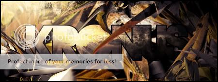
foremost for me its the text that stands out, but sadly not as a good thing. it just looks out of place and doesnt fit with the style of the sig, be it the colour or font choice.
but regarding the main sig i think it is very nice, the lighting in it provides great depth and the warmth is emphasised through the colour choices. perhaps on the left it would have been nicer if this shadows were gradual rather than a solid black "splodge" just to give a greater feel of depth.
overall i think the sig is a great example of successful lighting and complementing colours (both to complement the render and the other colours in the sig)
edit: ahh i've just seen piersd do the same request as well and judging by his sig its the render that contains most of the lighting effects, but still i think you helped complement the renders original lighting well with colour choices/effects and there is nice flow
Last edited by CarlosJ; 04-21-2008 at 03:18 AM.

Love isn't an emotion or an instinct - it is an Art
-
04-23-2008 #4
 Contributor
- Reputation
- 154
- Join Date
- Apr 2007
- Posts
- 1,479
- Thanks G/R
- 2/2
- Trade Feedback
- 1 (100%)
- Mentioned
- 0 Post(s)
- Tagged
- 0 Thread(s)
8.5/10, the putside edge were he is facing is a little dull


 Reply With Quote
Similar Threads
-
[Rate] Newest Sig
By mkultra. in forum Art & Graphic DesignReplies: 6Last Post: 12-07-2008, 03:04 PM -
[Rate]Newest Sig
By Krunkage in forum Art & Graphic DesignReplies: 3Last Post: 07-02-2008, 10:22 PM -
[Rate] My newest Sig!
By Shinyshoes in forum Art & Graphic DesignReplies: 23Last Post: 02-13-2008, 02:02 AM -
[Rate] Newest Sig and Ava
By Cheesy in forum Art & Graphic DesignReplies: 8Last Post: 12-20-2007, 02:20 AM -
Newest Sig (please rate it)
By cgrock in forum Art & Graphic DesignReplies: 3Last Post: 10-02-2007, 05:05 PM
-
OwnedCore Forums
casino news World of Warcraft Pokemon GO MMO Overwatch RTS Casino reviews bc game bc game -
casino
Casino Gambling Online casinos Casino en ligne vercel livescore bc game lovable vercel bc game no deposit bonus codes stake Top 10 Casinos Casino reviews Bitcoin casino Lucky8 1xbit heycasino -
CoreCoins
CoreCoins CoreCoins FAQ Shout-Out Banner Ads -
My OwnedCore
My Profile Notifications Settings Buy CoreCoins About Us


Privacy Policy | Cookie Policy | Terms | Contact Us
Available Payment Methods:-
![[Rate] Newest Sig](https://www.ownedcore.com/images/paybutton/paypal.png)
![[Rate] Newest Sig](https://www.ownedcore.com/images/paybutton/skrill.png)
![[Rate] Newest Sig](https://www.ownedcore.com/images/paybutton/payop.png)
-
Casino
stake | stake | stake | stake | stake | stake | stake | stake | stake | stake | stake | stake | stake | stake | stake | stake | stake | stake | stake | stake | stake | stake | stake | stake | stake | stake | stake | stake | stake | stake | stake | stake | stake | stake | stake | stake | stake | stake | stake | stake | stake | stake | stake | stake | stake | stake | stake | stake | stake | stake | stake | stake | stake | stake | stake | stake | stake | stake | stake | stake