![[Rate/Comment/Tips]Soul Caliber](https://www.ownedcore.com/forums/images/styles/OwnedCoreFX/addimg/menu4.svg)
Rate me on this, give me some tips, comment on it, please dont flame lol

![[Rate/Comment/Tips]Soul Caliber](https://www.ownedcore.com/forums/./ocpbanners/1/2/9/8/0/2/2/01d9781faec8bfe3abf9095ac9e57d1e.jpg)
![[Rate/Comment/Tips]Soul Caliber](https://www.ownedcore.com/assets/mm/images/wits.png "TradeSafe Middleman")
![[Rate/Comment/Tips]Soul Caliber](https://www.ownedcore.com/forums/images/styles/OwnedCoreFX/addimg/wicc.png "CoreCoins")

User Tag List
Thread: [Rate/Comment/Tips]Soul Caliber
Results 1 to 3 of 3
-
04-09-2008 #1
 Active Member

- Reputation
- 32
- Join Date
- Aug 2007
- Posts
- 244
- Thanks G/R
- 0/0
- Trade Feedback
- 0 (0%)
- Mentioned
- 0 Post(s)
- Tagged
- 0 Thread(s)


[Rate/Comment/Tips]Soul Caliber
Last edited by .Cyong; 04-09-2008 at 05:30 PM.


![[Rate/Comment/Tips]Soul Caliber](https://www.ownedcore.com/images/ba/g/b2.gif)
-
04-09-2008 #2
Member
- Reputation
- 97
- Join Date
- Aug 2007
- Posts
- 636
- Thanks G/R
- 0/0
- Trade Feedback
- 0 (0%)
- Mentioned
- 0 Post(s)
- Tagged
- 0 Thread(s)
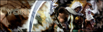
The main thing I see wrong in this sig is that there is no focus. It's a great concept, but you need to make sure the viewer knows who they are looking at. Try adding a new layer, then taking a 100-200px white brush and giving it some light at the top. Also the text placing is cool, but it's very hidden, try doing the same effect in a different place. I think it's just all over the place a bit, but overall pretty awesome. Edit: try to add more depth also.
-shiny

Visit my Sig/Av Shop! (Shinyshoes=Male)
-
04-09-2008 #3
Active Member
- Reputation
- 32
- Join Date
- Aug 2007
- Posts
- 244
- Thanks G/R
- 0/0
- Trade Feedback
- 0 (0%)
- Mentioned
- 0 Post(s)
- Tagged
- 0 Thread(s)
thnx shiny


 Reply With Quote
Similar Threads
-
[RATE/CC/COMMENT/TIPS] for my new sigand avatar ! :D
By Anarchy [RD] in forum Art & Graphic DesignReplies: 4Last Post: 07-08-2008, 12:27 PM -
[Show-off/Rate/Comment/Criticize] my newest background
By Anarchy [RD] in forum Art & Graphic DesignReplies: 4Last Post: 04-10-2008, 01:21 PM -
[Rate/Comment/Tips]Gears of War
By .Cyong in forum Art & Graphic DesignReplies: 0Last Post: 04-09-2008, 09:56 PM -
[Rate/Comment] My latest animated sig
By Anarchy [RD] in forum Art & Graphic DesignReplies: 6Last Post: 04-08-2008, 02:14 PM -
Soul Caliber 4(Now with More Vader!)
By Haq in forum Screenshot & Video ShowoffReplies: 4Last Post: 01-18-2008, 01:16 AM
-
OwnedCore Forums
casino news World of Warcraft Pokemon GO MMO Overwatch RTS Casino reviews www.planet-casino.com lucky 8 lucky8 no deposit codes bc game bc game lucky8 -
casino
Casino Gambling Online casinos Casino en ligne bc game bc game bc game no deposit bonus codes roobet Top 10 Casinos Casino reviews Bitcoin casino Paypal Casino Lucky8 1xbit heycasino help on closing paypal Need help with WoW Blizzard Store Pets, Extracting Emails From wow cd key selling site Severity of phishing need help Soom emailer [24/7] LIVE Scammer -
CoreCoins
CoreCoins CoreCoins FAQ Shout-Out Banner Ads -
My OwnedCore
My Profile Notifications Settings Buy CoreCoins About Us


Privacy Policy | Cookie Policy | Terms | Contact Us
Available Payment Methods:-
![[Rate/Comment/Tips]Soul Caliber](https://www.ownedcore.com/images/paybutton/paypal.png)
![[Rate/Comment/Tips]Soul Caliber](https://www.ownedcore.com/images/paybutton/skrill.png)
![[Rate/Comment/Tips]Soul Caliber](https://www.ownedcore.com/images/paybutton/payop.png)
-
Casino
amazon | amazon | amazon | amazon | amazon | amazon | amazon | amazon | amazon | amazon | amazon | amazon | amazon | amazon | amazon | amazon | amazon | amazon | amazon | amazon | amazon | amazon | amazon | amazon | amazon | amazon | amazon | amazon | amazon | amazon | amazon | amazon | amazon | amazon | amazon | amazon | amazon | amazon | amazon | amazon | amazon | amazon | amazon | iLucki Casino | amazon | amazon | amazon | amazon | amazon | amazon | amazon | amazon | amazon | amazon | amazon | amazon | amazon | amazon | amazon | amazon