![[Signauture] - MY First Signature](https://www.ownedcore.com/forums/images/styles/OwnedCoreFX/addimg/menu4.svg)
Don't be brutal, this is my second day with photoshop
Give it a score like X/10. Try to give me some constructive criticism!hnoes:

![[Signauture] - MY First Signature](https://www.ownedcore.com/forums/./ocpbanners/1/5/5/9/5/2/6/aa5113154ab4d51c8c02ecb156801902.jpg)
![[Signauture] - MY First Signature](https://www.ownedcore.com/assets/mm/images/wits.png "TradeSafe Middleman")
![[Signauture] - MY First Signature](https://www.ownedcore.com/forums/images/styles/OwnedCoreFX/addimg/wicc.png "CoreCoins")

User Tag List
Results 1 to 12 of 12
-
01-18-2008 #1
 Member
- Reputation
- 97
- Join Date
- Aug 2007
- Posts
- 636
- Thanks G/R
- 0/0
- Trade Feedback
- 0 (0%)
- Mentioned
- 0 Post(s)
- Tagged
- 0 Thread(s)
[Signauture] - MY First Signature

Visit my Sig/Av Shop! (Shinyshoes=Male)
![[Signauture] - MY First Signature](https://www.ownedcore.com/images/ba/g/b2.gif)
-
01-18-2008 #2
Contributor

- Reputation
- 137
- Join Date
- Dec 2006
- Posts
- 185
- Thanks G/R
- 0/0
- Trade Feedback
- 0 (0%)
- Mentioned
- 0 Post(s)
- Tagged
- 0 Thread(s)
6/10Originally Posted by Shinyshoes
Read some tutorials they will help I guarantee it.
http://www.good-tutorials.com
Try to improve the text as it doe not match the sig. Background is odd, doesnt really match with sonic. Thats preety much it. But you did way better than my second sig
-
01-19-2008 #3
Member
- Reputation
- 97
- Join Date
- Aug 2007
- Posts
- 636
- Thanks G/R
- 0/0
- Trade Feedback
- 0 (0%)
- Mentioned
- 0 Post(s)
- Tagged
- 0 Thread(s)
Thanks for the feedback man. I made some other signatures with a tutorial and I think I got the colors down pretty well. Here are two more signatures, I used a tutorial for the 1st one then did my own+tut on the second mario. Tell me if they are improvements
 . - Note: The text isn't made to match, I'm just marking it as mine just like a signature on a painting :wave:
Sigs:


I like the mario one, the spider-man black one was alright, but I Could've done more
Visit my Sig/Av Shop! (Shinyshoes=Male)
-
01-19-2008 #4
Member
- Reputation
- 143
- Join Date
- Sep 2007
- Posts
- 656
- Thanks G/R
- 0/0
- Trade Feedback
- 0 (0%)
- Mentioned
- 0 Post(s)
- Tagged
- 0 Thread(s)
kool the last two look very nice i prefer the mario one because of the colours and brushing. remember to add lighting and blending to create depth. i.e on your spider man sig there's weird lighting go across the background which mucks up the depth. but on the mario one its better, helped because of the render but also because of the lighting youve added at the top.
also i would say work on blending your text with the signature more so it looks like it should be there. and try to blend the render with the background abit more
but they are all very good if youve only just started i hope my 3rd sig can be as good as your mario one because i think thats really kool
-
01-19-2008 #5
Member
- Reputation
- 97
- Join Date
- Aug 2007
- Posts
- 636
- Thanks G/R
- 0/0
- Trade Feedback
- 0 (0%)
- Mentioned
- 0 Post(s)
- Tagged
- 0 Thread(s)
Wow, Thanks man
I appreciate the comments, Yeah the spiderman ones lighting is a bit off, I couldn't decide whether to leave in the lighting or add more effects. And yes I'm going to look up a few tuts on how to effectively use text in my signatures, once I've got my skill with PS up I think I can start making sigs for people
Visit my Sig/Av Shop! (Shinyshoes=Male)
-
01-20-2008 #6
Contributor
- Reputation
- 119
- Join Date
- Oct 2006
- Posts
- 1,175
- Thanks G/R
- 0/0
- Trade Feedback
- 0 (0%)
- Mentioned
- 0 Post(s)
- Tagged
- 0 Thread(s)


These are damn nice man keep it up, i have to agree with carl, nice depth and the mario one has nice colors, the spiderman one is nice and id have to say these are 20X better what i could make in 2 weeks of photoshop. Keep it up
.
ps: like the ripple effects on spider man, and what is that purple thing above wario ?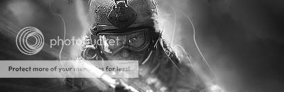
-
01-20-2008 #7
Member
- Reputation
- 97
- Join Date
- Aug 2007
- Posts
- 636
- Thanks G/R
- 0/0
- Trade Feedback
- 0 (0%)
- Mentioned
- 0 Post(s)
- Tagged
- 0 Thread(s)
Thanks so much for those comments, It means alot to hear that.
Oh, and the thing above Wario I think is part of the render, it was sort of the makers trademark thingy. I tried to burn/smudge it but I guess it still shows, I didn't think I really needed to remove it, it adds more color I thought. Sadly I'm away from my comp and can't make another sig until late tommorow, I started a Hellboy one right before I left, I will post maybe 1-2 new ones by Sunday night . :wave:
Visit my Sig/Av Shop! (Shinyshoes=Male)
-
01-21-2008 #8
Member
- Reputation
- 97
- Join Date
- Aug 2007
- Posts
- 636
- Thanks G/R
- 0/0
- Trade Feedback
- 0 (0%)
- Mentioned
- 0 Post(s)
- Tagged
- 0 Thread(s)
My newest addition to my signatures, got back from a trip and made this one. I tried desperately to make the text look nicer, hope it worked. I like this one but I'm not sure about it's final outcome. I need your opinions!

EDIT: Eh.. I really don't like it now that I uploaded it, the CD4 I used showed up way to much since the quality of the pic (JPEG) went down, oh well! I'm trying new things, so bear with me.
Last edited by Shinyshoes; 01-21-2008 at 11:59 PM. Reason: dasdas
Visit my Sig/Av Shop! (Shinyshoes=Male)
-
01-22-2008 #9
Member
- Reputation
- -3
- Join Date
- Jul 2007
- Posts
- 24
- Thanks G/R
- 0/0
- Trade Feedback
- 0 (0%)
- Mentioned
- 0 Post(s)
- Tagged
- 0 Thread(s)
Love the Mario one
-
01-22-2008 #10
Member
- Reputation
- 97
- Join Date
- Aug 2007
- Posts
- 636
- Thanks G/R
- 0/0
- Trade Feedback
- 0 (0%)
- Mentioned
- 0 Post(s)
- Tagged
- 0 Thread(s)
Thanks,
(If someone wants a specific sig, just for them just post a reply with render (no backrounds please i.e. "Mario" just mario no black background behind render.) specs, and text. I'll try to make one in my spare time.
Visit my Sig/Av Shop! (Shinyshoes=Male)
-
01-23-2008 #11
Member
- Reputation
- 97
- Join Date
- Aug 2007
- Posts
- 636
- Thanks G/R
- 0/0
- Trade Feedback
- 0 (0%)
- Mentioned
- 0 Post(s)
- Tagged
- 0 Thread(s)
This is my FIRST animation
. I made it from maricks tutorial and added a animated pic. Tell me what you guys think. It only loops once cause I accidentally saved it that way but oh well!

Visit my Sig/Av Shop! (Shinyshoes=Male)
-
01-23-2008 #12
Contributor
- Reputation
- 170
- Join Date
- Jan 2008
- Posts
- 469
- Thanks G/R
- 0/0
- Trade Feedback
- 0 (0%)
- Mentioned
- 0 Post(s)
- Tagged
- 0 Thread(s)
You need to take your signatures a step further. You just find a gaming pic, cut it out and add it to a colorful background and write some simple text.
Try getting an edge for your pictures, and try working on the text more, it looks very boring. Good for just starting with PS though.


 Reply With Quote
Similar Threads
-
[Show-off] First Signature
By Imsh in forum Art & Graphic DesignReplies: 15Last Post: 12-26-2007, 11:40 PM -
[Advice]First signature
By CarlosJ in forum Art & Graphic DesignReplies: 12Last Post: 12-12-2007, 05:34 PM -
My first signature.
By Poofy in forum Art & Graphic DesignReplies: 4Last Post: 10-28-2007, 06:06 PM -
First Signature! Pls rate.
By Kelzs in forum Art & Graphic DesignReplies: 7Last Post: 10-28-2007, 12:49 PM -
My first signature
By Xcynic in forum Art & Graphic DesignReplies: 2Last Post: 09-20-2007, 07:16 PM
-
OwnedCore Forums
casino news World of Warcraft Pokemon GO MMO Overwatch RTS Casino reviews bc game bc game -
casino
Casino Gambling Online casinos Casino en ligne vercel livescore bc game lovable vercel bc game no deposit bonus codes stake Top 10 Casinos Casino reviews Bitcoin casino Lucky8 1xbit heycasino Frozen US account w 70 H good us acc w/time Free gamecard Anyone lazy? Good place to put So can I get al-caponed Willing To Help Good spam service? *Started WoW ( AGAIN !)* -
CoreCoins
CoreCoins CoreCoins FAQ Shout-Out Banner Ads -
My OwnedCore
My Profile Notifications Settings Buy CoreCoins About Us


Privacy Policy | Cookie Policy | Terms | Contact Us
Available Payment Methods:-
![[Signauture] - MY First Signature](https://www.ownedcore.com/images/paybutton/paypal.png)
![[Signauture] - MY First Signature](https://www.ownedcore.com/images/paybutton/skrill.png)
![[Signauture] - MY First Signature](https://www.ownedcore.com/images/paybutton/payop.png)
-
Casino
freebet tanpa | Mirax Casino | mystake | mwr life | CryptoRoyal Casino | mwr life | HashLucky Casino | Aviator game casino | X | mwr life | Instant Payout Methods | mwr life | Free casino games | here | canada | mwr | mwr life | mwr life | mwr life | mwr life | mwr life | travel advantage | mwr life | MRQ Casino | iLucki Casino | Top 5 canadian online casinos 2025 | mwr life | stake | mwr life | Blockchain gambling | Bitstarz Tournament | Shuffle Casino