![[Showoff] New Myth Sig (Has a Naga Pally in it :D)](https://www.ownedcore.com/forums/images/styles/OwnedCoreFX/addimg/menu4.svg)
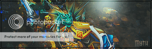
Here's my newest sig I tried, I don't think it looks great but I think it looks pretty good. Please rate it from 1-10 and say what you think is good about it and what is bad about it!Here it is:

![[Showoff] New Myth Sig (Has a Naga Pally in it :D)](https://www.ownedcore.com/forums/./ocpbanners/1/2/9/8/0/2/2/01d9781faec8bfe3abf9095ac9e57d1e.jpg)
![[Showoff] New Myth Sig (Has a Naga Pally in it :D)](https://www.ownedcore.com/assets/mm/images/wits.png "TradeSafe Middleman")
![[Showoff] New Myth Sig (Has a Naga Pally in it :D)](https://www.ownedcore.com/forums/images/styles/OwnedCoreFX/addimg/wicc.png "CoreCoins")

Shout-Out
User Tag List
Results 1 to 5 of 5
-
02-04-2008 #1
 Member
- Reputation
- 6
- Join Date
- Dec 2006
- Posts
- 87
- Thanks G/R
- 0/0
- Trade Feedback
- 0 (0%)
- Mentioned
- 0 Post(s)
- Tagged
- 0 Thread(s)

[Showoff] New Myth Sig (Has a Naga Pally in it :D)
Last edited by Myth.; 02-05-2008 at 05:49 PM.

![[Showoff] New Myth Sig (Has a Naga Pally in it :D)](https://www.ownedcore.com/images/ba/g/b2.gif)
-
02-04-2008 #2
Member
- Reputation
- 118
- Join Date
- Aug 2007
- Posts
- 139
- Thanks G/R
- 0/0
- Trade Feedback
- 0 (0%)
- Mentioned
- 0 Post(s)
- Tagged
- 0 Thread(s)
It looks cool 7.789/10 there is to much gray around naga add more color ..
Last edited by Vatralaus; 02-04-2008 at 04:26 PM.


-
02-04-2008 #3
Member
- Reputation
- 6
- Join Date
- Dec 2006
- Posts
- 87
- Thanks G/R
- 0/0
- Trade Feedback
- 0 (0%)
- Mentioned
- 0 Post(s)
- Tagged
- 0 Thread(s)
Thanks for the feedbackOriginally Posted by Vatralaus
 Can't add random colors or it's not going to flow correctly though, plus I was trying to give it a certain overall feel to it. I really appreciate the feedback though.
Last edited by Myth.; 02-05-2008 at 05:51 PM.
-
02-05-2008 #4
Member
- Reputation
- 6
- Join Date
- Dec 2006
- Posts
- 87
- Thanks G/R
- 0/0
- Trade Feedback
- 0 (0%)
- Mentioned
- 0 Post(s)
- Tagged
- 0 Thread(s)
I hate to bump, but BUMP. I want somebody well known for their sigs to maybe leave me a comment on it.
-
02-05-2008 #5
Active Member

- Reputation
- 164
- Join Date
- Sep 2006
- Posts
- 597
- Thanks G/R
- 0/0
- Trade Feedback
- 0 (0%)
- Mentioned
- 0 Post(s)
- Tagged
- 0 Thread(s)

Aaaw, there's no shame in bumping...
Anyways, I think it's a little bit grainy/sharp, and the bottom part of the border is waaaai to sharp. Consider changing blending mode there.
Other than that... It is actually possible to add a bit of contrasting colours to the sig without ruining it. Infact, sometimes that's all a sig needs to seem more lively.
If I'd rate it compared to mine (I'll give my own a ten, since I'm incredibly egocentric(spelling?)) I'd give yours a 7. But I hate giving rating, so scratch that.
Hope that's the feedback you needed!
Cheers.
Say NO to hemo


 Reply With Quote
Similar Threads
-
[Showoff]New (Improved) Sig
By C-Death in forum Art & Graphic DesignReplies: 8Last Post: 08-01-2008, 10:08 PM -
[Rate/showoff] new random sigs ive made :D
By Anarchy [RD] in forum Art & Graphic DesignReplies: 14Last Post: 03-29-2008, 02:18 PM -
[Showoff] New Sig
By cgrock in forum Art & Graphic DesignReplies: 0Last Post: 03-29-2008, 11:15 AM -
[Showoff] ~New Sig~
By SpookyMan92 in forum Art & Graphic DesignReplies: 5Last Post: 02-26-2008, 10:31 PM -
[Showoff] New Sigs/Website Stuff
By sublimepwns in forum Art & Graphic DesignReplies: 0Last Post: 01-07-2008, 12:47 AM
-
OwnedCore Forums
casino news World of Warcraft Pokemon GO MMO Overwatch RTS Casino reviews www.planet-casino.com lucky 8 lucky8 no deposit codes bc game bc game lucky8 -
casino
Casino Gambling Online casinos Casino en ligne bc game bc game bc game no deposit bonus codes roobet Top 10 Casinos Casino reviews Bitcoin casino Paypal Casino Lucky8 1xbit heycasino Need help Recalling FREE SCAMED ACCOUNT (No Best scam for a noob? [Giveaway] JACT Account good us acc w/time LF Phishing Partner 1 EU Account - Info [FULL INFO] Several Need help!! How do I -
CoreCoins
CoreCoins CoreCoins FAQ Shout-Out Banner Ads -
My OwnedCore
My Profile Notifications Settings Buy CoreCoins About Us


Privacy Policy | Cookie Policy | Terms | Contact Us
Available Payment Methods:-
![[Showoff] New Myth Sig (Has a Naga Pally in it :D)](https://www.ownedcore.com/images/paybutton/paypal.png)
![[Showoff] New Myth Sig (Has a Naga Pally in it :D)](https://www.ownedcore.com/images/paybutton/skrill.png)
![[Showoff] New Myth Sig (Has a Naga Pally in it :D)](https://www.ownedcore.com/images/paybutton/payop.png)
-
Casino
amazon | casino | amazon | casino | vave | casino | mystake | amazon | vave | amazon | amazon | vave | casino | casino | casino | vave | mystake | casino | casino | amazon | amazon | amazon | casino | amazon | casino | amazon | amazon | amazon | amazon | casino | amazon | casino | amazon | amazon | casino | amazon | casino | amazon | casino | amazon | amazon | vave | amazon | casino | amazon | amazon | vave | casino | amazon | casino | amazon | amazon | casino | amazon | vave | casino | casino | amazon | casino | amazon