
Skeet skeet bang bang (Insert bad word here)
WOOT my art work pwnfbfbsfjbsfsjfbj fsbjfs jbf sjf


Shout-Out
User Tag List
Thread: Bonesz's art
Results 1 to 15 of 25
-
06-15-2007 #1
 Active Member

- Reputation
- 51
- Join Date
- Jan 2007
- Posts
- 523
- Thanks G/R
- 0/0
- Trade Feedback
- 0 (0%)
- Mentioned
- 0 Post(s)
- Tagged
- 0 Thread(s)


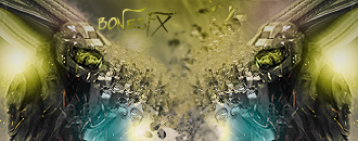
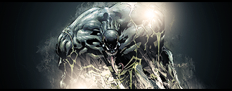
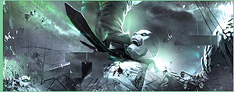
Bonesz's art
What's good? Skype: LukeLastorator


-
06-15-2007 #2
 Contributor

- Reputation
- 101
- Join Date
- Aug 2006
- Posts
- 405
- Thanks G/R
- 1/3
- Trade Feedback
- 0 (0%)
- Mentioned
- 0 Post(s)
- Tagged
- 0 Thread(s)
Re: Bonesz's art
vear nice , veary nice 4 , 8 is best
 Let's put a smile on that face.

-
06-15-2007 #3
Member
- Reputation
- 15
- Join Date
- May 2007
- Posts
- 28
- Thanks G/R
- 0/0
- Trade Feedback
- 0 (0%)
- Mentioned
- 0 Post(s)
- Tagged
- 0 Thread(s)
Re: Bonesz's art
some of them are a little messy
7 is the best imo
-
06-15-2007 #4
Active Member
- Reputation
- 18
- Join Date
- Jun 2006
- Posts
- 90
- Thanks G/R
- 0/0
- Trade Feedback
- 0 (0%)
- Mentioned
- 0 Post(s)
- Tagged
- 0 Thread(s)
Re: Bonesz's art
too messy.. dont like em
only ones i like are 1 and 3.. cause they the same- -
-
-
06-15-2007 #5
Contributor
- Reputation
- 158
- Join Date
- Dec 2006
- Posts
- 627
- Thanks G/R
- 0/0
- Trade Feedback
- 1 (100%)
- Mentioned
- 0 Post(s)
- Tagged
- 0 Thread(s)
Re: Bonesz's art
As stated before, bit to messy. Try calming down a bit. You know go for the 'simple but omfgirulesomuchithurts look'.
-
06-15-2007 #6
Active Member
- Reputation
- 190
- Join Date
- Nov 2006
- Posts
- 588
- Thanks G/R
- 0/0
- Trade Feedback
- 0 (0%)
- Mentioned
- 0 Post(s)
- Tagged
- 0 Thread(s)
Re: Bonesz's art
i like them all (cept that last 2 there just wierd) but dont listen to the other guys they dont know what there talking about :]

-
06-15-2007 #7
Active Member
- Reputation
- 51
- Join Date
- Jan 2007
- Posts
- 523
- Thanks G/R
- 0/0
- Trade Feedback
- 0 (0%)
- Mentioned
- 0 Post(s)
- Tagged
- 0 Thread(s)
Re: Bonesz's art
Thanks for the feedbackz guys, really nice to have.
 What's good? Skype: LukeLastorator
-
06-15-2007 #8
 Contributor

- Reputation
- 174
- Join Date
- Sep 2006
- Posts
- 930
- Thanks G/R
- 0/1
- Trade Feedback
- 0 (0%)
- Mentioned
- 0 Post(s)
- Tagged
- 0 Thread(s)

Re: Bonesz's art
1,2,4,7,8 are my faves lol

-
06-15-2007 #9
Member
- Reputation
- 39
- Join Date
- Apr 2007
- Posts
- 215
- Thanks G/R
- 0/0
- Trade Feedback
- 0 (0%)
- Mentioned
- 0 Post(s)
- Tagged
- 0 Thread(s)
Re: Bonesz's art
These are interesting, They're great backgrounds but the text sucks on EVERY one of them. This leads me to believe you have downloaded these as PSDs from various websites on the internet, usually used to help people understand how good artwork is made, then you've place your own bad text ontop and tried to pass the work off as your own.
BUT each one is the same size which could sorta prove they're all your own.
Anyway i like them but your text sucks big time and i agree with the others that some are messy. Finally your borders, They're too "Inconsistant" rather than being a suttle addition to neaten things up they're a complication. (Dunno if you'll understand this.)
1. 7/10 - Nice colouring
2. 8/10 - I don't know realy, but is that billy joe? if so it's a 0/10
3. Why is it the same as 1?
4. 8/10 - Nice colours
5. 7.5/10 - Render needs blending in and text is really bad colour
6. 9/10 - Good focal points on it. Just needs text(If you do put some on avoid using anything big or bright.)
7. 7/10 - Nice render and colours, just why has it wrapped around?
8. 7.5/10 - what are those pixelated squares on it?
9. 7/10 - pixelated in areas and border is F'd up.
10. I'm pretty sure i've seen that exact sig elsewhere.
11. 6/10 - Very bad, pixelated, bad text, messy, what is it?
12. 6/10 - what the hell? why's it so messy?
I see you put alot of effort into these so i've put alot of effort into this post. :biggthumpup:[imgl]https://img126.imageshack.us/img126/6729/avrsigpq7.png[/imgl]
-
06-15-2007 #10
Active Member
- Reputation
- 51
- Join Date
- Jan 2007
- Posts
- 523
- Thanks G/R
- 0/0
- Trade Feedback
- 0 (0%)
- Mentioned
- 0 Post(s)
- Tagged
- 0 Thread(s)
Re: Bonesz's art
Thanks for that post. But theese are not ripped...I have a graphics site that just opened a few days ago!
What's good? Skype: LukeLastorator
-
06-15-2007 #11
Member
- Reputation
- 39
- Join Date
- Apr 2007
- Posts
- 215
- Thanks G/R
- 0/0
- Trade Feedback
- 0 (0%)
- Mentioned
- 0 Post(s)
- Tagged
- 0 Thread(s)
Re: Bonesz's art
link?Originally Posted by bonesz
[imgl]https://img126.imageshack.us/img126/6729/avrsigpq7.png[/imgl]
-
06-15-2007 #12
Active Member
- Reputation
- 51
- Join Date
- Jan 2007
- Posts
- 523
- Thanks G/R
- 0/0
- Trade Feedback
- 0 (0%)
- Mentioned
- 0 Post(s)
- Tagged
- 0 Thread(s)
Re: Bonesz's art
I hope this doesn't count as advertising, but www.TragicGFX.net
What's good? Skype: LukeLastorator
-
06-16-2007 #13
Active Member
- Reputation
- 18
- Join Date
- Jun 2006
- Posts
- 90
- Thanks G/R
- 0/0
- Trade Feedback
- 0 (0%)
- Mentioned
- 0 Post(s)
- Tagged
- 0 Thread(s)
Re: Bonesz's art
I never said they werent good tho seph
i just dont like all the effects.
Keep goin bonesz--
-
06-16-2007 #14
Member
- Reputation
- 352
- Join Date
- Jan 2007
- Posts
- 1,502
- Thanks G/R
- 0/0
- Trade Feedback
- 0 (0%)
- Mentioned
- 0 Post(s)
- Tagged
- 0 Thread(s)

Re: Bonesz's art
yah they seem more like graffiti like a messy look but very tight bro keep on working
Hey Piggy
-
06-17-2007 #15
Member
- Reputation
- 43
- Join Date
- Jun 2007
- Posts
- 108
- Thanks G/R
- 0/0
- Trade Feedback
- 0 (0%)
- Mentioned
- 0 Post(s)
- Tagged
- 0 Thread(s)
Re: Bonesz's art
Sadly I can agree here, it does seem that way.Originally Posted by Avrsion
The borders aren't even, and the texts tend to just be thrown in there.
Regardless, if they are indeed yours, great work. I love a lot of your backgrounds.-[IMGL]https://i24.photobucket.com/albums/c26/Exidence/skeptik2.gif[/IMGL]-


 Reply With Quote
Similar Threads
-
Post Text-Art here!
By Sikonosos in forum Community ChatReplies: 34Last Post: 12-26-2006, 03:23 AM -
From Beginner To Pro: The Art of Machinimas
By Örpheus in forum World of Warcraft GuidesReplies: 5Last Post: 09-11-2006, 11:23 PM -
Do u like MMA(mixed Marshal ART)
By LightWave in forum Community ChatReplies: 3Last Post: 09-05-2006, 06:47 AM -
Discord art.
By Hunterorz in forum World of Warcraft GeneralReplies: 6Last Post: 08-30-2006, 11:44 AM -
MY 3d ART
By LightWave in forum Community ChatReplies: 3Last Post: 08-20-2006, 04:43 AM
-
OwnedCore Forums
casino news World of Warcraft Pokemon GO MMO Overwatch RTS Casino reviews www.planet-casino.com lucky 8 lucky8 no deposit codes bc game bc game lucky8 -
casino
Casino Gambling Online casinos Casino en ligne bc game bc game bc game no deposit bonus codes roobet Top 10 Casinos Casino reviews Bitcoin casino Paypal Casino Lucky8 1xbit heycasino Need some help fixing my CD-Keys for gold? [HELP] With a full info First Ever Scam - Need Free glider keys 45 druid bday present to Heeeeelp I start, you end. Need someone to extract -
CoreCoins
CoreCoins CoreCoins FAQ Shout-Out Banner Ads -
My OwnedCore
My Profile Notifications Settings Buy CoreCoins About Us


Privacy Policy | Cookie Policy | Terms | Contact Us
Available Payment Methods:-


-
Casino
casino | casino | casino | mystake | vave | casino | casino | amazon | casino | casino | casino | casino | amazon | amazon | casino | amazon | mystake | casino | casino | casino | amazon | mystake | casino | vave | mystake | vave | casino | amazon | casino | vave | vave | mystake | casino | casino | amazon | amazon | casino | amazon | casino | amazon | casino | casino | casino | casino | casino | casino | mystake | casino | amazon | amazon | casino | amazon | casino | casino | casino | vave | casino | amazon | casino | amazon