![[Show-Off] First Real Sig](https://www.ownedcore.com/forums/images/styles/OwnedCoreFX/addimg/menu4.svg)
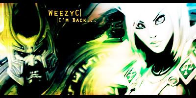
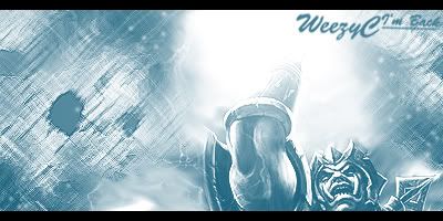
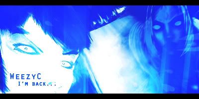
These are my first real signatures that ive tried to make look good.
No hard flaming please, Comment and Tell me what you think!

![[Show-Off] First Real Sig](https://www.ownedcore.com/forums/./ocpbanners/1/2/9/8/0/2/2/01d9781faec8bfe3abf9095ac9e57d1e.jpg)
![[Show-Off] First Real Sig](https://www.ownedcore.com/assets/mm/images/wits.png "TradeSafe Middleman")
![[Show-Off] First Real Sig](https://www.ownedcore.com/forums/images/styles/OwnedCoreFX/addimg/wicc.png "CoreCoins")

Shout-Out
User Tag List
Thread: [Show-Off] First Real Sig
Results 1 to 11 of 11
-
07-28-2010 #1
 Sergeant Major
- Reputation
- 33
- Join Date
- Mar 2010
- Posts
- 154
- Thanks G/R
- 0/0
- Trade Feedback
- 0 (0%)
- Mentioned
- 0 Post(s)
- Tagged
- 0 Thread(s)
[Show-Off] First Real Sig
Last edited by weezyC; 07-28-2010 at 04:04 PM.

![[Show-Off] First Real Sig](https://www.ownedcore.com/images/ba/g/b2.gif)
-
07-28-2010 #2
Banned
- Reputation
- 229
- Join Date
- Jun 2008
- Posts
- 990
- Thanks G/R
- 0/0
- Trade Feedback
- 0 (0%)
- Mentioned
- 0 Post(s)
- Tagged
- 0 Thread(s)


You should look into the composition a bit. It's also a bit too monotone for my taste. But it looks way better than your current one.
-
07-28-2010 #3
Contributor


- Reputation
- 127
- Join Date
- Apr 2010
- Posts
- 527
- Thanks G/R
- 0/5
- Trade Feedback
- 0 (0%)
- Mentioned
- 0 Post(s)
- Tagged
- 0 Thread(s)
goto: dafont.com find a good font and use that instead. The Font you use at the Moment doesnt fit it very goood. The color of the font is good, and the overall color is good. But you don't see enough of the render and u used standard photoshop "Filters" which usually don't look good.
-
07-28-2010 #4
Sergeant Major
- Reputation
- 33
- Join Date
- Mar 2010
- Posts
- 154
- Thanks G/R
- 0/0
- Trade Feedback
- 0 (0%)
- Mentioned
- 0 Post(s)
- Tagged
- 0 Thread(s)
Thanks for the responses :] I just looked at some photoshop tuts that i got from a post on here :] What Filters should i use?
-
07-28-2010 #5
Banned
- Reputation
- 229
- Join Date
- Jun 2008
- Posts
- 990
- Thanks G/R
- 0/0
- Trade Feedback
- 0 (0%)
- Mentioned
- 0 Post(s)
- Tagged
- 0 Thread(s)
Gradient Maps and Curves. Sometimes Photo Filter.
-
07-28-2010 #6
Sergeant Major
- Reputation
- 33
- Join Date
- Mar 2010
- Posts
- 154
- Thanks G/R
- 0/0
- Trade Feedback
- 0 (0%)
- Mentioned
- 0 Post(s)
- Tagged
- 0 Thread(s)
I used gradient map :/ well 1, lol
-
07-28-2010 #7
Contributor
- Reputation
- 121
- Join Date
- Aug 2008
- Posts
- 605
- Thanks G/R
- 0/0
- Trade Feedback
- 0 (0%)
- Mentioned
- 0 Post(s)
- Tagged
- 0 Thread(s)
Use a gradient map that brings out the highlights on one side and shadows on the other side, for example orange/purple on soft light(60%) is a nice one to use, or any theme color + black.
You also want to try to include your render in it's surroundings while still keeping depth, you can do that using the smudge tool, blur tool(don't over-do it) and the dodge/burn tools.
There are a lot of beginner tutorials in reflections thread up top as well as on the planetrenders.net, you should check em out.I WAS DRILL ROLLED BY GZ. AND I LOVED IT.

-
07-28-2010 #8
Banned
- Reputation
- 229
- Join Date
- Jun 2008
- Posts
- 990
- Thanks G/R
- 0/0
- Trade Feedback
- 0 (0%)
- Mentioned
- 0 Post(s)
- Tagged
- 0 Thread(s)
Set the blending option to color then.Originally Posted by weezyC
-
07-28-2010 #9
Legendary

- Reputation
- 783
- Join Date
- Mar 2008
- Posts
- 3,377
- Thanks G/R
- 1/2
- Trade Feedback
- 0 (0%)
- Mentioned
- 0 Post(s)
- Tagged
- 0 Thread(s)
I never use gradient maps over 50% opacity, unless it's a black/white set to luminosity or soft light. In most cases little is good but much is bad.
Freelance Digital Artist
https://reflectionartwork.deviantart.com
You did not desert me
My brothers in arms
-
07-28-2010 #10
Banned
- Reputation
- 145
- Join Date
- Jan 2009
- Posts
- 745
- Thanks G/R
- 0/0
- Trade Feedback
- 0 (0%)
- Mentioned
- 0 Post(s)
- Tagged
- 0 Thread(s)
I never use gradient maps. xD
-
07-28-2010 #11
Sergeant Major
- Reputation
- 33
- Join Date
- Mar 2010
- Posts
- 154
- Thanks G/R
- 0/0
- Trade Feedback
- 0 (0%)
- Mentioned
- 0 Post(s)
- Tagged
- 0 Thread(s)
Thanks for the replies :]

 Reply With Quote
Similar Threads
-
[Show-off] First sig in idk how long.
By BrightChild in forum Art & Graphic DesignReplies: 3Last Post: 06-23-2010, 07:50 AM -
[Show-Off]First Sig
By Krunkage in forum Art & Graphic DesignReplies: 5Last Post: 06-28-2008, 08:56 AM -
[show-off] first and seccond sigs by me
By Greenfork1 in forum Art & Graphic DesignReplies: 0Last Post: 04-06-2008, 10:02 PM -
[Show Off] First Sig
By Elitefrost in forum Art & Graphic DesignReplies: 4Last Post: 01-23-2008, 03:41 PM -
[Show-off] First Signature
By Imsh in forum Art & Graphic DesignReplies: 15Last Post: 12-26-2007, 11:40 PM
-
OwnedCore Forums
casino news World of Warcraft Pokemon GO MMO Overwatch RTS Casino reviews www.planet-casino.com lucky 8 lucky8 no deposit codes bc game bc game lucky8 -
casino
Casino Gambling Online casinos Casino en ligne bc game bc game bc game no deposit bonus codes roobet Top 10 Casinos Casino reviews Bitcoin casino Paypal Casino Lucky8 1xbit heycasino How can i get a bunch of 80 DK needs recalling? B.NET question wrong section sorry Options after Acc xfer? Free Glider Key! [Help] Need a good fake Need someone to ban Giving away blank account -
CoreCoins
CoreCoins CoreCoins FAQ Shout-Out Banner Ads -
My OwnedCore
My Profile Notifications Settings Buy CoreCoins About Us


Privacy Policy | Cookie Policy | Terms | Contact Us
Available Payment Methods:-
![[Show-Off] First Real Sig](https://www.ownedcore.com/images/paybutton/paypal.png)
![[Show-Off] First Real Sig](https://www.ownedcore.com/images/paybutton/skrill.png)
![[Show-Off] First Real Sig](https://www.ownedcore.com/images/paybutton/payop.png)
-
Casino
stake | shuffle | shuffle | this | shuffle | shuffle | shuffle | shuffle | casino | shuffle | shuffle | Bitstarz Tournament | Mirax Casino | shuffle | stake | shuffle | shuffle | shuffle | shuffle | this url | shuffle | shuffle | stake | Shuffle Casino | shuffle | stake | stake | shuffle | shuffle | shuffle | shuffle | russian | stake | shuffle | this | shuffle | shuffle | shuffle | shuffle | this url | shuffle | shuffle | mystake | here | shuffle | Aviator game casino | casino | shuffle | shuffle | shuffle | shuffle | stake | shuffle | shuffle | shuffle | HashLucky Casino | shuffle | stake | casino | shuffle