
Hi guys, please rate my signature. I also like critisism
(Note: This is my first signature, and first time using photoshop)


Shout-Out
User Tag List
Thread: Showoff - My First Signature
Results 1 to 14 of 14
-
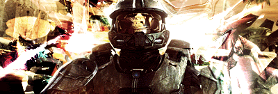
07-05-2010 #1
 Banned
- Reputation
- 182
- Join Date
- Mar 2010
- Posts
- 104
- Thanks G/R
- 0/0
- Trade Feedback
- 0 (0%)
- Mentioned
- 0 Post(s)
- Tagged
- 0 Thread(s)
Showoff - My First Signature
Last edited by Batesii; 07-05-2010 at 09:16 AM.

-
07-05-2010 #2
 Former Staff


- Reputation
- 705
- Join Date
- Dec 2007
- Posts
- 1,793
- Thanks G/R
- 7/8
- Trade Feedback
- 60 (100%)
- Mentioned
- 0 Post(s)
- Tagged
- 0 Thread(s)
Not bad, i don't like the render though, and to me the c4d's are too visible.
other than that, good job.( ͡°( ͡° ͜ʖ( ͡° ͜ʖ ͡°)ʖ ͡°) ͡°)
-
07-05-2010 #3
Legendary

- Reputation
- 783
- Join Date
- Mar 2008
- Posts
- 3,377
- Thanks G/R
- 1/2
- Trade Feedback
- 0 (0%)
- Mentioned
- 0 Post(s)
- Tagged
- 0 Thread(s)
Ditch the bleeding cowboys font and the outer glow. Rest is fine for your first time. Keep it up

Freelance Digital Artist
https://reflectionartwork.deviantart.com
You did not desert me
My brothers in arms
-
07-05-2010 #4
Banned
- Reputation
- 182
- Join Date
- Mar 2010
- Posts
- 104
- Thanks G/R
- 0/0
- Trade Feedback
- 0 (0%)
- Mentioned
- 0 Post(s)
- Tagged
- 0 Thread(s)
Why is the font bad?
Also, thanks for your opinion.
-
07-05-2010 #5
Legendary
- Reputation
- 783
- Join Date
- Mar 2008
- Posts
- 3,377
- Thanks G/R
- 1/2
- Trade Feedback
- 0 (0%)
- Mentioned
- 0 Post(s)
- Tagged
- 0 Thread(s)
It's overused, ugly and plain-out wrong for most signatures.
Freelance Digital Artist
https://reflectionartwork.deviantart.com
You did not desert me
My brothers in arms
-
07-05-2010 #6
Banned
- Reputation
- 182
- Join Date
- Mar 2010
- Posts
- 104
- Thanks G/R
- 0/0
- Trade Feedback
- 0 (0%)
- Mentioned
- 0 Post(s)
- Tagged
- 0 Thread(s)
Wow, you put that bluntly...
Thankyou for the help
I'm fixing it right now.
-
07-05-2010 #7
Banned
- Reputation
- 34
- Join Date
- Jun 2010
- Posts
- 87
- Thanks G/R
- 0/0
- Trade Feedback
- 0 (0%)
- Mentioned
- 0 Post(s)
- Tagged
- 0 Thread(s)
Well a lot of people who do signatures, or atleast in well known area's like PlanetRenders/GameRenders/Tagmonkey/FringeFx don't use text at all. If they do it's when they become a "Pro" at everything else.
Also, a good thing to know and look at is a color wheel. The colors you have don't mix.
So from that stand-point you can try to fix it using filters, or you can make it B&W.
-
07-05-2010 #8
Banned
- Reputation
- 182
- Join Date
- Mar 2010
- Posts
- 104
- Thanks G/R
- 0/0
- Trade Feedback
- 0 (0%)
- Mentioned
- 0 Post(s)
- Tagged
- 0 Thread(s)
Thankyou Reflection and Aestysu! I tried to fix it based on what you said.
Here is the changed version:

Now, I'm going to look at the Colour Wheel
Edit: I have applied some filters, and they have seemed to even the colour out a bit.

Last edited by Batesii; 07-05-2010 at 09:58 AM.
-
07-05-2010 #9
Legendary
- Reputation
- 783
- Join Date
- Mar 2008
- Posts
- 3,377
- Thanks G/R
- 1/2
- Trade Feedback
- 0 (0%)
- Mentioned
- 0 Post(s)
- Tagged
- 0 Thread(s)
Bevel & emboss is also a bit taboo inside of signatures as unless it's done right it'll look bad. Font is better but try to work with a smaller scaled text and place it a bit closer to the focal.
Freelance Digital Artist
https://reflectionartwork.deviantart.com
You did not desert me
My brothers in arms
-
07-05-2010 #10
Banned
- Reputation
- 182
- Join Date
- Mar 2010
- Posts
- 104
- Thanks G/R
- 0/0
- Trade Feedback
- 0 (0%)
- Mentioned
- 0 Post(s)
- Tagged
- 0 Thread(s)
Okay, I will do that.
Unfortunately I will have to continute my little project tommorow. (Due to lack of sleep)
-
07-06-2010 #11
Member
- Reputation
- 10
- Join Date
- Jul 2008
- Posts
- 162
- Thanks G/R
- 0/0
- Trade Feedback
- 0 (0%)
- Mentioned
- 0 Post(s)
- Tagged
- 0 Thread(s)

when i use fonts i usually use a basic one with little to no effects. it looks cleaner. but good for your first one
-
07-06-2010 #12
Banned
- Reputation
- 182
- Join Date
- Mar 2010
- Posts
- 104
- Thanks G/R
- 0/0
- Trade Feedback
- 0 (0%)
- Mentioned
- 0 Post(s)
- Tagged
- 0 Thread(s)
Okay, I have taken everyone's tips here, and attempted to make a better sig.

I'm actually quite proud of it.
-
07-07-2010 #13
Legendary
- Reputation
- 783
- Join Date
- Mar 2008
- Posts
- 3,377
- Thanks G/R
- 1/2
- Trade Feedback
- 0 (0%)
- Mentioned
- 0 Post(s)
- Tagged
- 0 Thread(s)
Much better
Freelance Digital Artist
https://reflectionartwork.deviantart.com
You did not desert me
My brothers in arms
-
07-08-2010 #14
Member
- Reputation
- 10
- Join Date
- Jul 2008
- Posts
- 162
- Thanks G/R
- 0/0
- Trade Feedback
- 0 (0%)
- Mentioned
- 0 Post(s)
- Tagged
- 0 Thread(s)
yea alot better, keep up the good work

 Reply With Quote
Similar Threads
-
[Showoff] My First Signature!
By Warriar in forum Art & Graphic DesignReplies: 8Last Post: 08-02-2009, 07:07 AM -
[ShowOff] My first signature ever.
By Zeroi9 in forum Art & Graphic DesignReplies: 5Last Post: 11-22-2008, 05:56 AM -
[Showoff] My First Signatures!
By Tropem in forum Art & Graphic DesignReplies: 4Last Post: 10-05-2008, 02:01 PM -
[Showoff] My new signature (first)
By Yann101 in forum Art & Graphic DesignReplies: 6Last Post: 02-23-2008, 11:55 AM -
[Rate/Showoff] First Signature
By The Metal in forum Art & Graphic DesignReplies: 9Last Post: 01-13-2008, 05:36 AM
-
OwnedCore Forums
casino news World of Warcraft Pokemon GO MMO Overwatch RTS Casino reviews bc game bc game -
casino
Casino Gambling Online casinos Casino en ligne vercel livescore bc game lovable vercel bc game no deposit bonus codes stake Top 10 Casinos Casino reviews Bitcoin casino Lucky8 1xbit heycasino -
CoreCoins
CoreCoins CoreCoins FAQ Shout-Out Banner Ads -
My OwnedCore
My Profile Notifications Settings Buy CoreCoins About Us


Privacy Policy | Cookie Policy | Terms | Contact Us
Available Payment Methods:-


-
Casino
stake | stake | stake | stake | stake | stake | stake | stake | stake | stake | stake | stake | stake | stake | stake | stake | stake | stake | stake | stake | stake | stake | stake | stake | stake | stake | stake | stake | stake | stake | stake | stake | stake | stake | stake | stake | stake | stake | stake | stake | stake | stake | stake | stake | stake | stake | stake | stake | stake | stake | stake | stake | stake | stake | stake | stake | stake | stake | stake | stake