![[Signature] Starting Up](https://www.ownedcore.com/forums/images/styles/OwnedCoreFX/addimg/menu4.svg)
Tell me what you think, I haven't gone on photoshop for about 2 months and im going to start up again.

![[Signature] Starting Up](https://www.ownedcore.com/forums/./ocpbanners/1/2/9/8/0/2/2/01d9781faec8bfe3abf9095ac9e57d1e.jpg)
![[Signature] Starting Up](https://www.ownedcore.com/assets/mm/images/wits.png "TradeSafe Middleman")
![[Signature] Starting Up](https://www.ownedcore.com/forums/images/styles/OwnedCoreFX/addimg/wicc.png "CoreCoins")

User Tag List
Thread: [Signature] Starting Up
Results 1 to 11 of 11
-
06-13-2010 #1
 Knight-Lieutenant
- Reputation
- 23
- Join Date
- Aug 2008
- Posts
- 260
- Thanks G/R
- 0/0
- Trade Feedback
- 0 (0%)
- Mentioned
- 0 Post(s)
- Tagged
- 0 Thread(s)
[Signature] Starting Up
![[Signature] Starting Up](https://www.ownedcore.com/images/ba/g/b2.gif)
-
06-16-2010 #2
Contributor

- Reputation
- 104
- Join Date
- Nov 2008
- Posts
- 262
- Thanks G/R
- 0/0
- Trade Feedback
- 0 (0%)
- Mentioned
- 0 Post(s)
- Tagged
- 0 Thread(s)


Pretty good.


-
06-16-2010 #3
 Established Member

- Reputation
- 72
- Join Date
- Aug 2009
- Posts
- 321
- Thanks G/R
- 0/0
- Trade Feedback
- 0 (0%)
- Mentioned
- 0 Post(s)
- Tagged
- 0 Thread(s)
Nice, very good for first one. Did you put the C4D's on that render on it was it already like that?
EDIT: gz on contributor LOLLast edited by Dobbs; 06-16-2010 at 04:24 PM.
-
06-16-2010 #4
Member
- Reputation
- 3
- Join Date
- Oct 2007
- Posts
- 16
- Thanks G/R
- 0/0
- Trade Feedback
- 0 (0%)
- Mentioned
- 0 Post(s)
- Tagged
- 0 Thread(s)
I like it good work, colours work great, the text fits well and I like the simplistic style. One thing I would say which is my person preference is that I would possibly add a vignette or something, it looks a little empty with the image and text both central and the background being the same throughout. But that's just my opinion

Last edited by Beorn17; 06-16-2010 at 05:14 PM.
-
06-17-2010 #5
Knight-Lieutenant
- Reputation
- 23
- Join Date
- Aug 2008
- Posts
- 260
- Thanks G/R
- 0/0
- Trade Feedback
- 0 (0%)
- Mentioned
- 0 Post(s)
- Tagged
- 0 Thread(s)
@ Dobbs
I put the C4Ds on the render besides whats in her hand i didnt do
---------- Post added at 08:53 PM ---------- Previous post was at 07:53 PM ----------
Tried something new all though i think the text isnt in a great spot and the blending didnt go so well

-
06-18-2010 #6
 Former Staff


- Reputation
- 705
- Join Date
- Dec 2007
- Posts
- 1,793
- Thanks G/R
- 7/8
- Trade Feedback
- 60 (100%)
- Mentioned
- 0 Post(s)
- Tagged
- 0 Thread(s)
Originally Posted by Agent Orange
text would look great to the right of his ear the way he is faceing.
Blend it a little better with a smaller brush, maybe 20-30px and smudge around it.
Possibly add more the the background? Other than that i cant see anything wrong with it.( ͡°( ͡° ͜ʖ( ͡° ͜ʖ ͡°)ʖ ͡°) ͡°)
-
06-18-2010 #7
Knight-Lieutenant
- Reputation
- 23
- Join Date
- Aug 2008
- Posts
- 260
- Thanks G/R
- 0/0
- Trade Feedback
- 0 (0%)
- Mentioned
- 0 Post(s)
- Tagged
- 0 Thread(s)
Better?

-
06-18-2010 #8
Banned
- Reputation
- 229
- Join Date
- Jun 2008
- Posts
- 990
- Thanks G/R
- 0/0
- Trade Feedback
- 0 (0%)
- Mentioned
- 0 Post(s)
- Tagged
- 0 Thread(s)
I would make the red colors on him a bit brighter, so it fits better with the background.Originally Posted by Agent Orange
Try use the smudge tool to blend him in a bit.
I would consider changing the text to a reddish/purple color instead. Or one that matches the yellow spell he's casting. When at the text, I would, especially if changed to red/purple, remove the glow effect, and add some shadow to it instead. Just a tiny bit, so it becomes a bit more visible, if you were to change color.
And try to add some gradient maps maybe, also to blend the render in a bit more.
-
06-18-2010 #9
Established Member
- Reputation
- 72
- Join Date
- Aug 2009
- Posts
- 321
- Thanks G/R
- 0/0
- Trade Feedback
- 0 (0%)
- Mentioned
- 0 Post(s)
- Tagged
- 0 Thread(s)
Nice, try to add some effects to the fireball in his hand.
-
06-18-2010 #10
Sergeant
- Reputation
- 15
- Join Date
- May 2010
- Posts
- 35
- Thanks G/R
- 0/0
- Trade Feedback
- 0 (0%)
- Mentioned
- 0 Post(s)
- Tagged
- 0 Thread(s)
Also either try to add effects on the top end of the staff (1) and blend or change the render with the other one I've posted:

Because that glowing red lightning effect doesn't blend in. I left it there in purpoise so if someone wants to use it along with adding effects on their own.
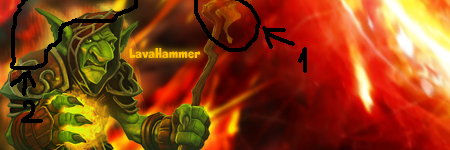
Also, I do not know if you wanned to achieve the effect in (2) but it's very nice one. Looks like raging fire kind of aura. Try to achieve that effect with the whole render.
And lastly: use the other part of the sig. Don't pile up everything in the left part.Last edited by BlakeRSH; 06-18-2010 at 11:07 AM.


-
06-18-2010 #11
Knight-Lieutenant
- Reputation
- 23
- Join Date
- Aug 2008
- Posts
- 260
- Thanks G/R
- 0/0
- Trade Feedback
- 0 (0%)
- Mentioned
- 0 Post(s)
- Tagged
- 0 Thread(s)
Thanks for the tips. Il see what i can do when i have time


 Reply With Quote
Similar Threads
-
[Signature] Looking to start some form of graphics design, Give me ideas. ( Signatures, Anything)
By Networkz in forum Art & Graphic DesignReplies: 15Last Post: 02-01-2016, 04:24 PM -
Getting over AB walls before it starts
By Freakyea in forum World of Warcraft ExploitsReplies: 8Last Post: 07-20-2006, 05:20 PM -
Priest Starting Guide
By Bossman4 in forum World of Warcraft GuidesReplies: 0Last Post: 06-01-2006, 04:22 PM -
New Signature!
By janzi9 in forum World of Warcraft GeneralReplies: 5Last Post: 05-05-2006, 02:10 PM -
Yeh umm i cant get in the ah anymore since i started using syndrom
By case in forum World of Warcraft GeneralReplies: 4Last Post: 03-23-2006, 12:37 AM
-
OwnedCore Forums
casino news World of Warcraft Pokemon GO MMO Overwatch RTS Casino reviews www.planet-casino.com lucky 8 lucky8 no deposit codes bc game bc game lucky8 -
casino
Casino Gambling Online casinos Casino en ligne bc game bc game bc game no deposit bonus codes roobet Top 10 Casinos Casino reviews Bitcoin casino Paypal Casino Lucky8 1xbit heycasino Buying Scammed accounts Help me please loot scammed account? [HELP] WoW:WotLK Beta [REQUEST] Any ACTIVE US [SERVICE] Photoshop 4 acivated eu accounts Get this account banned I need help with a -
CoreCoins
CoreCoins CoreCoins FAQ Shout-Out Banner Ads -
My OwnedCore
My Profile Notifications Settings Buy CoreCoins About Us


Privacy Policy | Cookie Policy | Terms | Contact Us
Available Payment Methods:-
![[Signature] Starting Up](https://www.ownedcore.com/images/paybutton/paypal.png)
![[Signature] Starting Up](https://www.ownedcore.com/images/paybutton/skrill.png)
![[Signature] Starting Up](https://www.ownedcore.com/images/paybutton/payop.png)